-

-

-

-

-

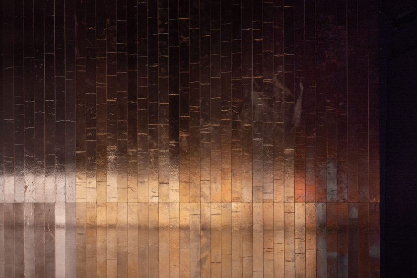
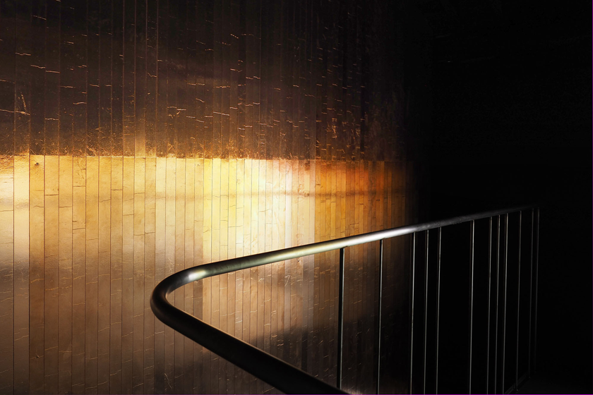
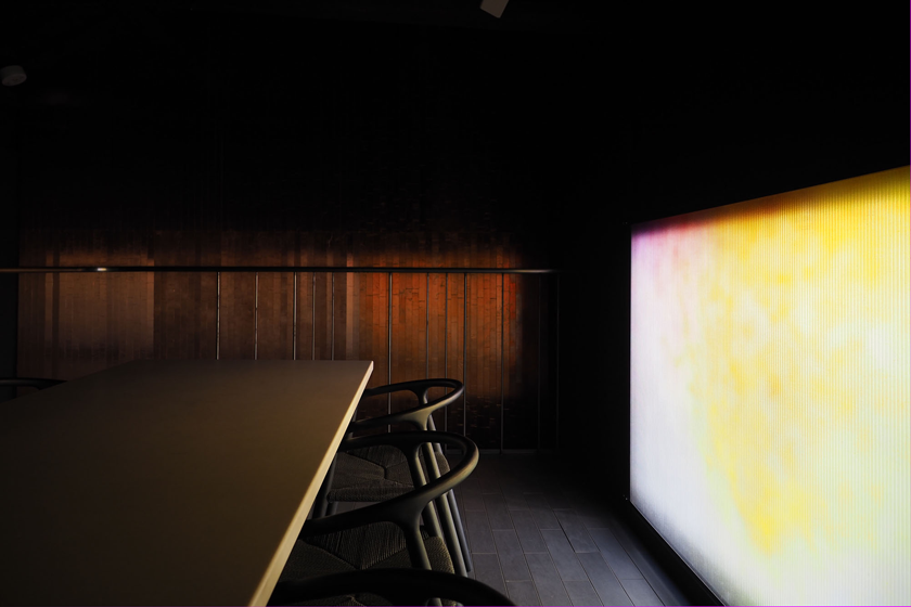
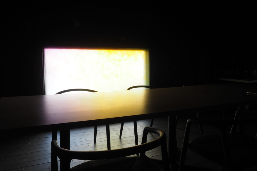
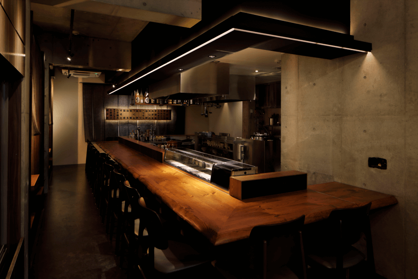
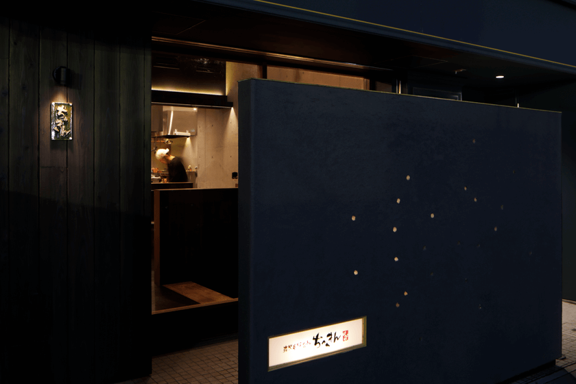
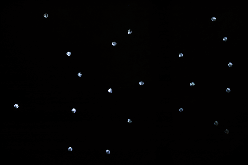
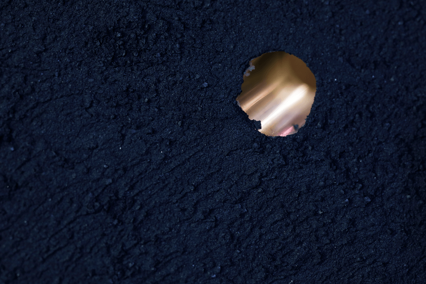
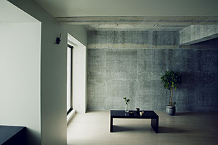
029
-

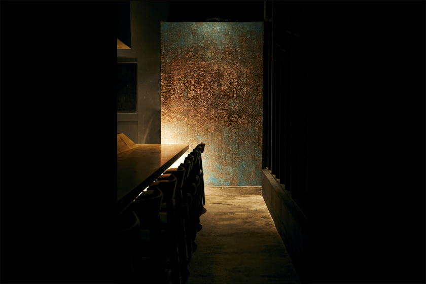
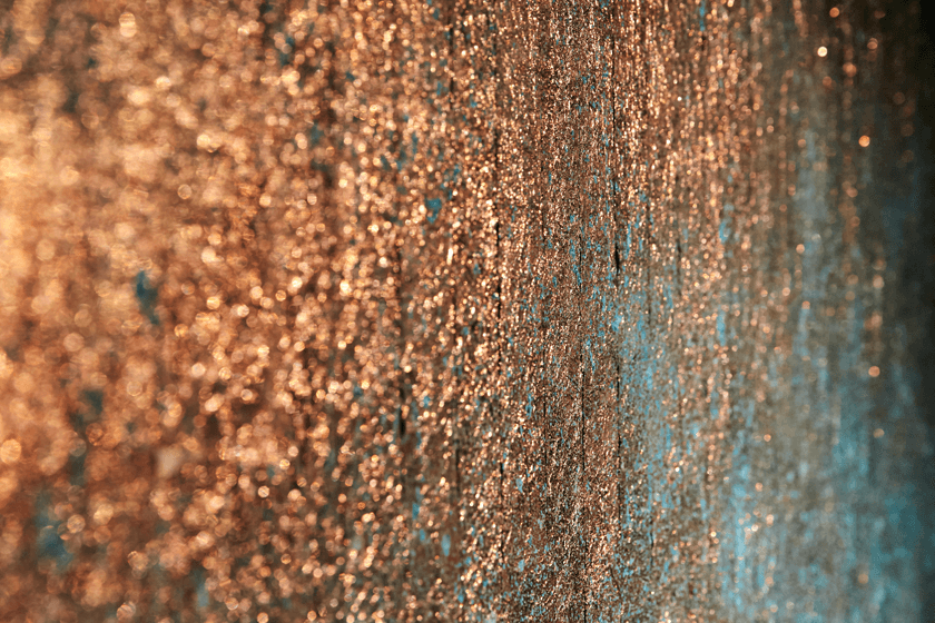
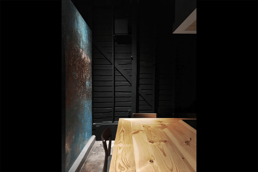
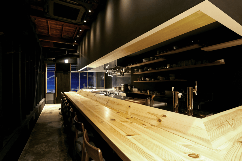
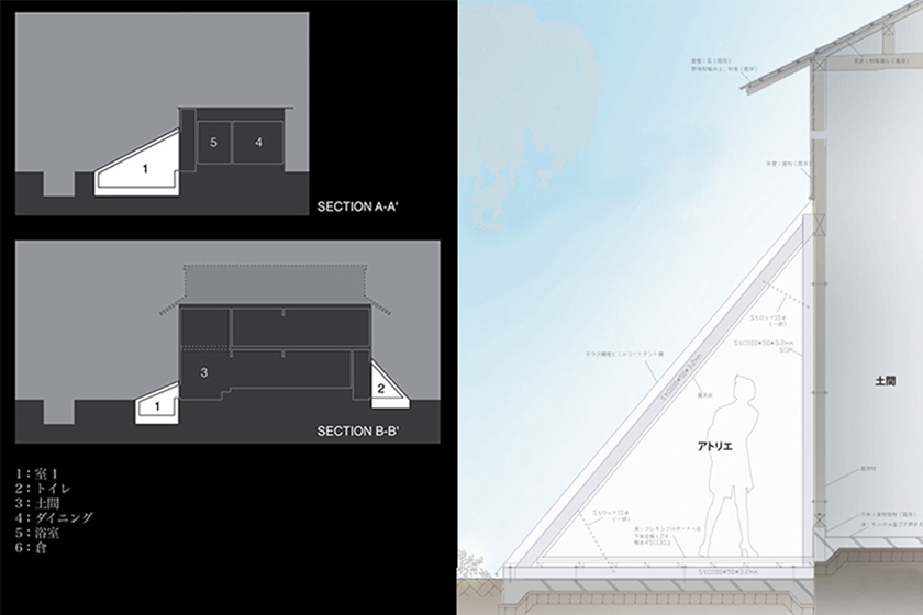
028
-

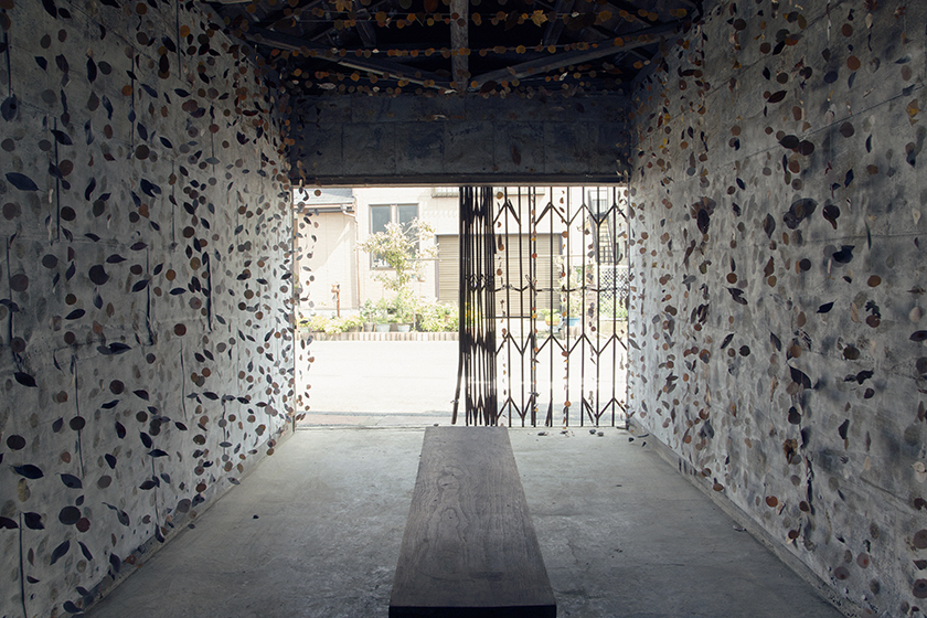
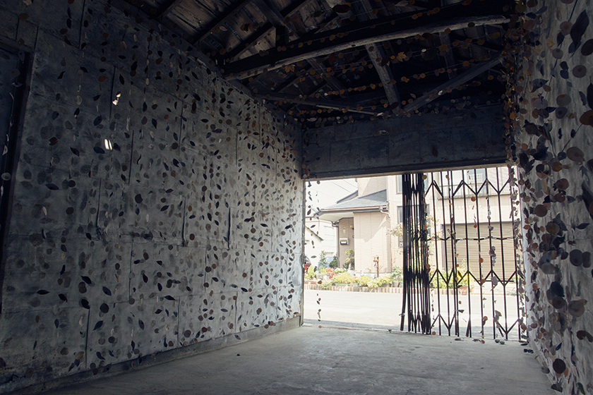
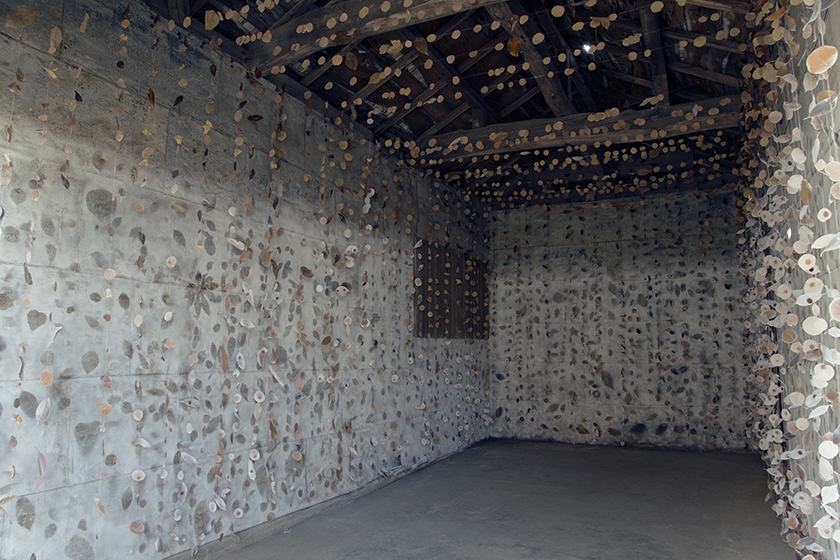
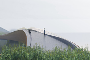
027
-
026
-
025
-
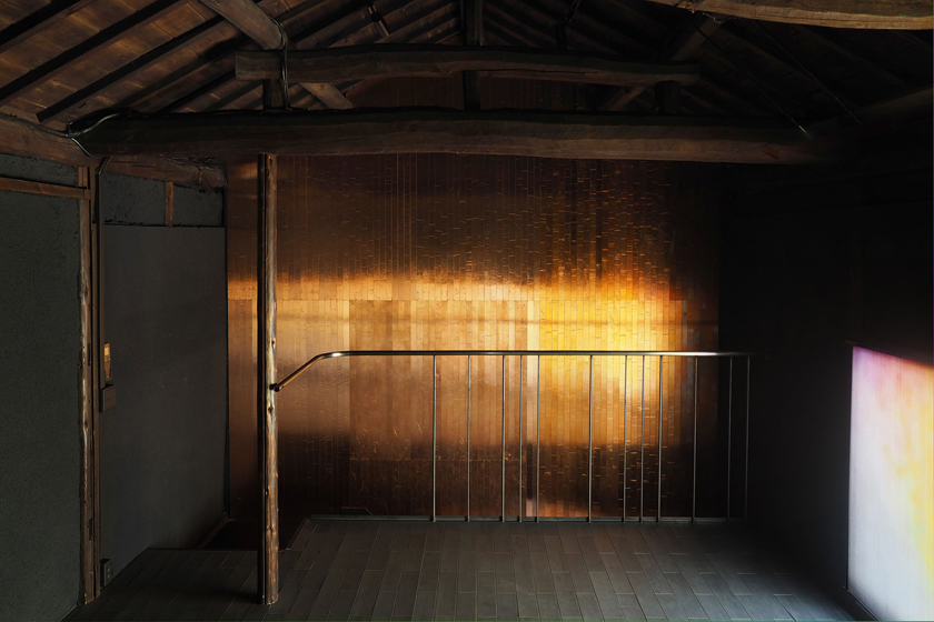
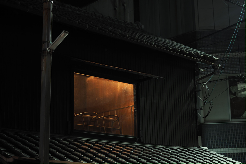
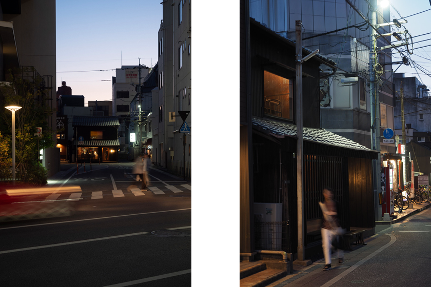
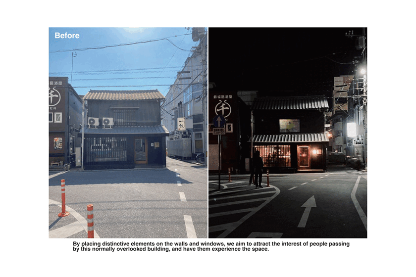
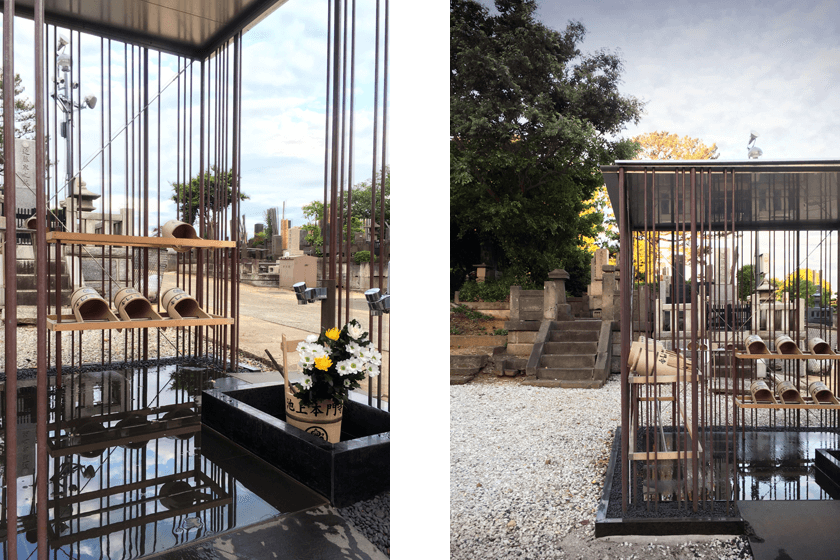
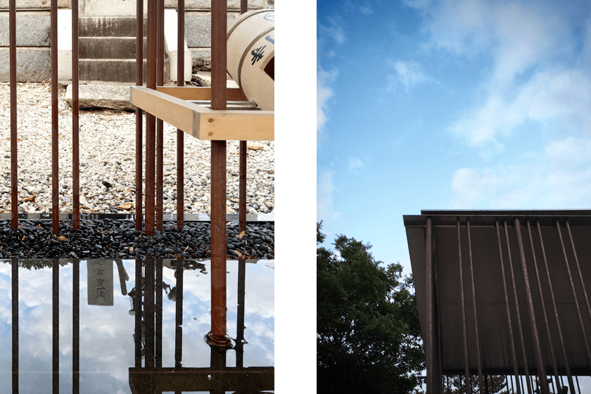
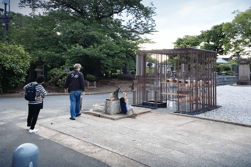
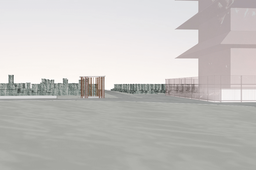
024
-
023
-
022
-
021
-

020
-
019
-

018
-

017
-
016
-

015
-
014
-

013
-
012
-
011
-
010
-
009
-

008
-
007
-
006
-
005
-
004
-

003
-
002
-

001
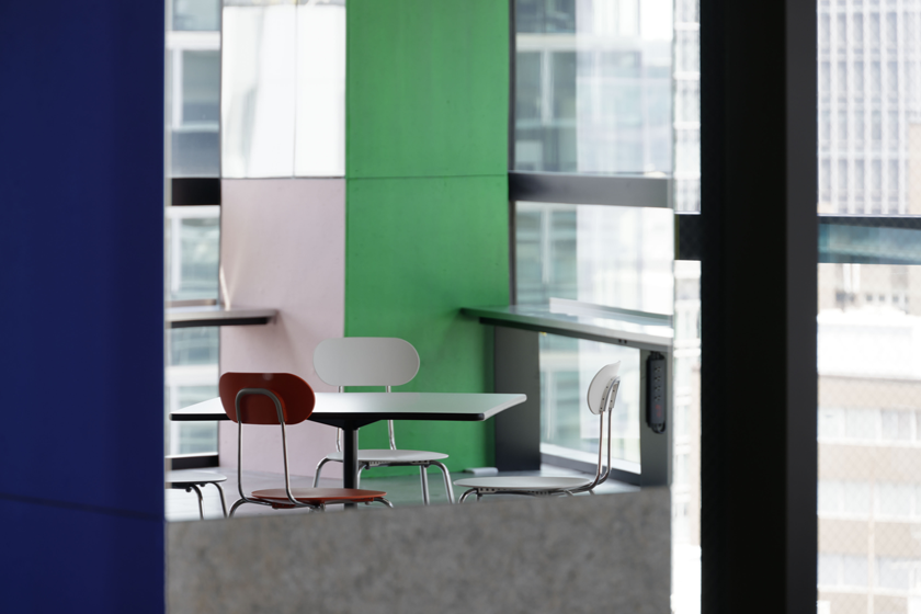
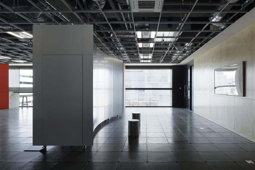
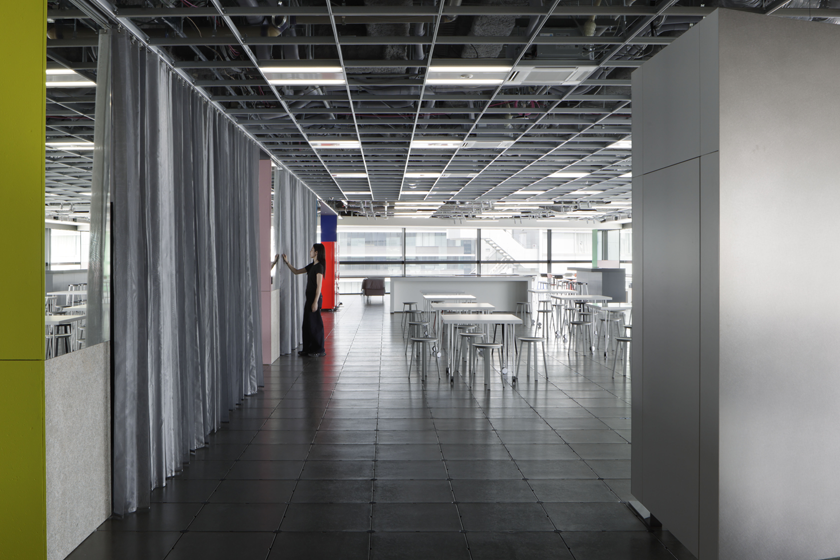
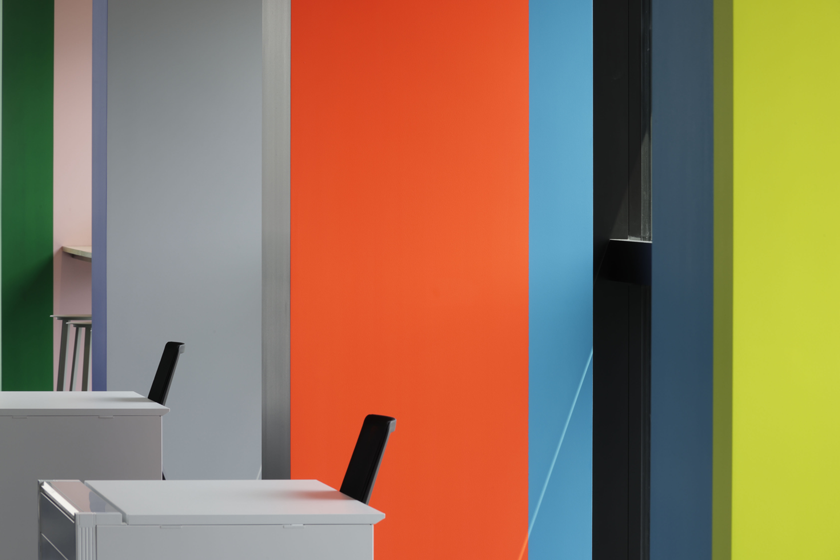
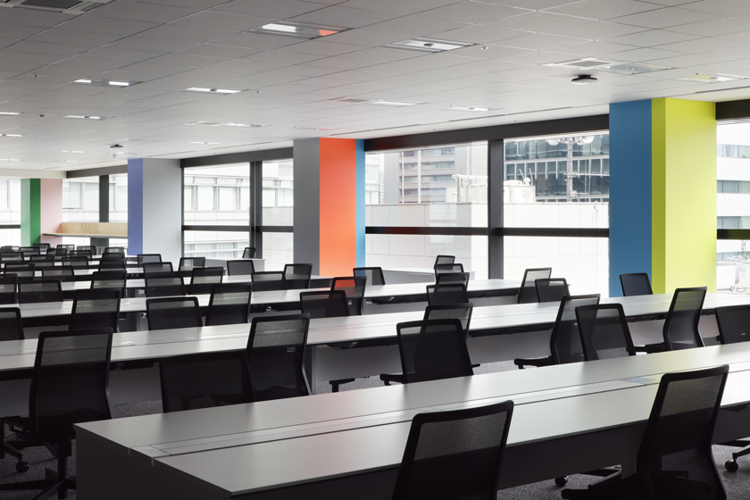
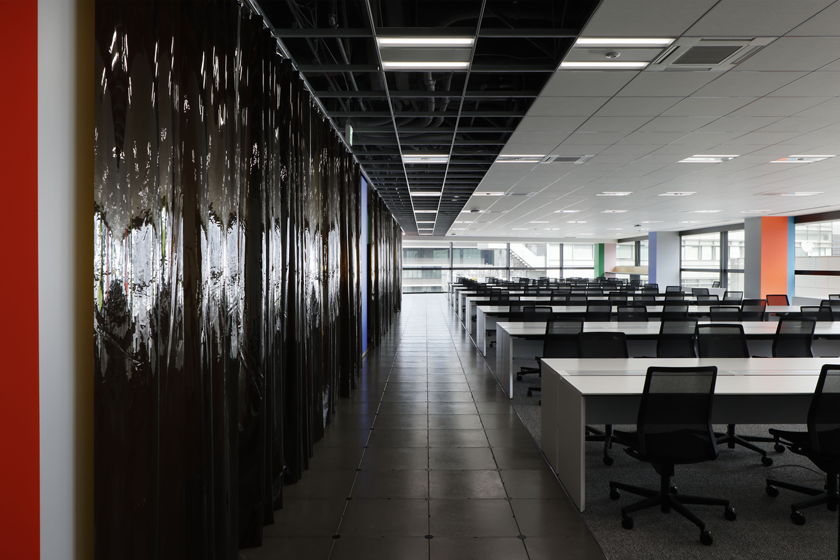
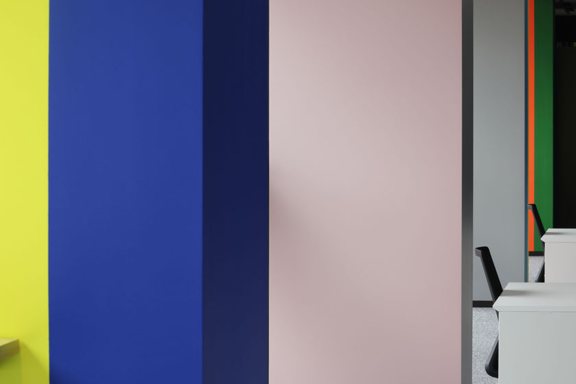
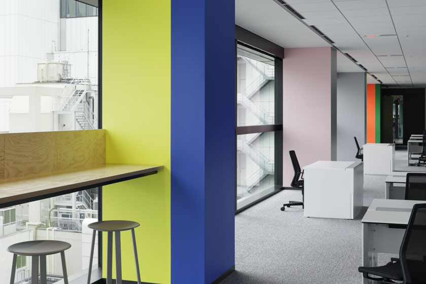
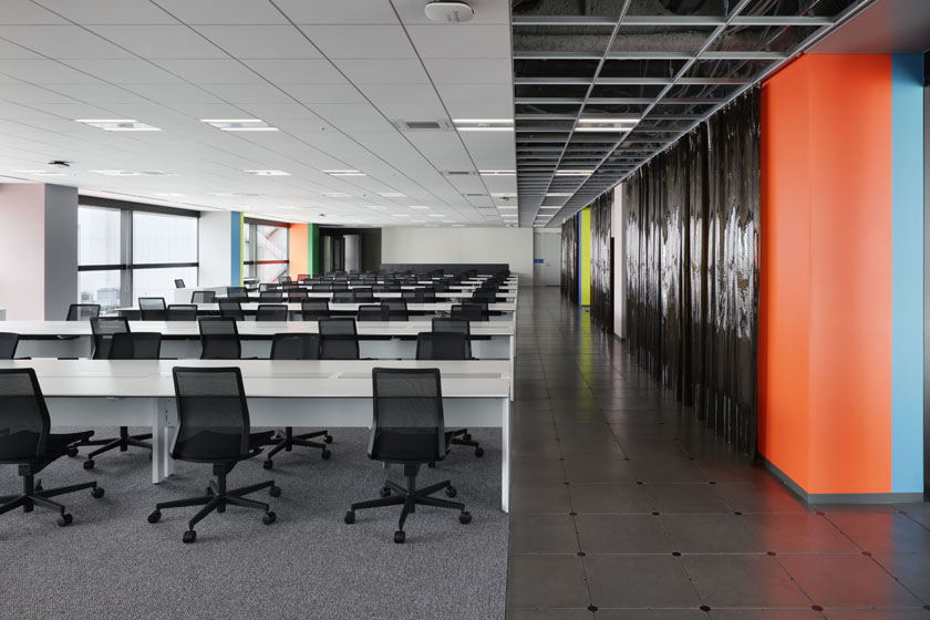
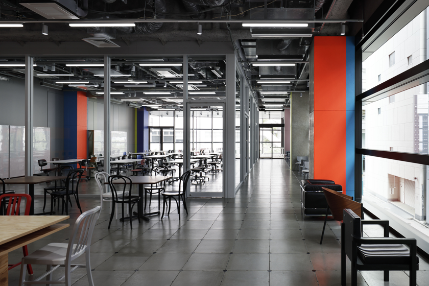
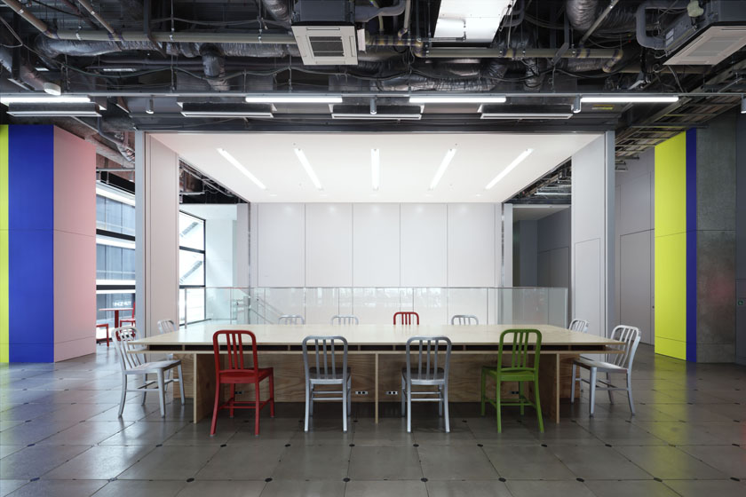
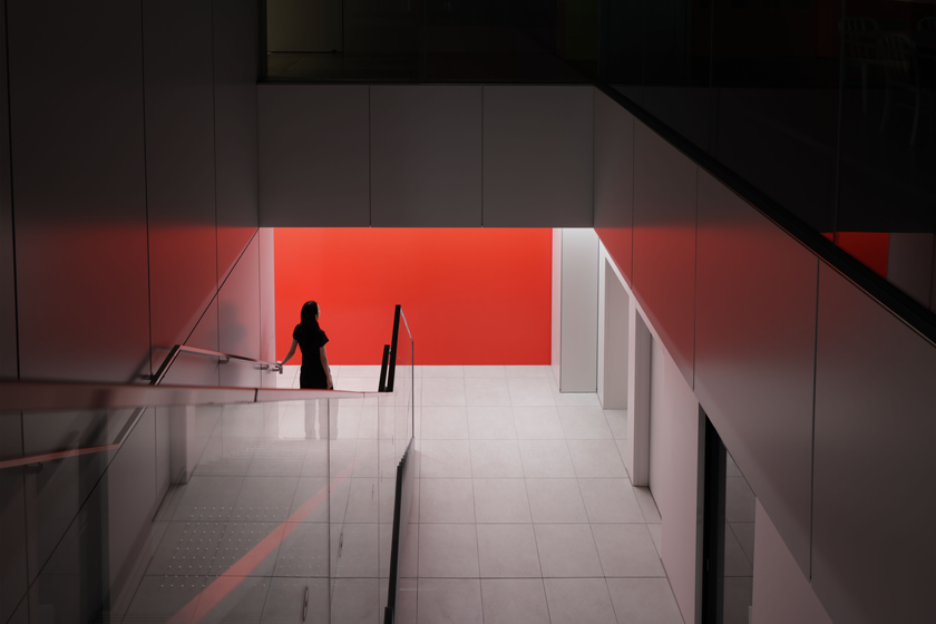
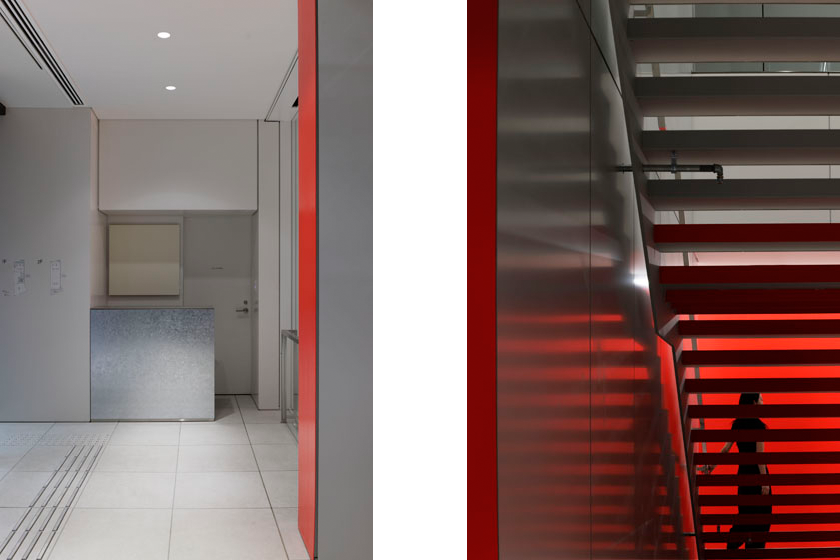
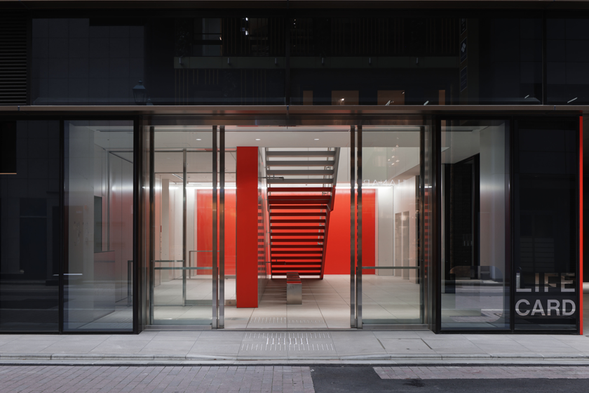
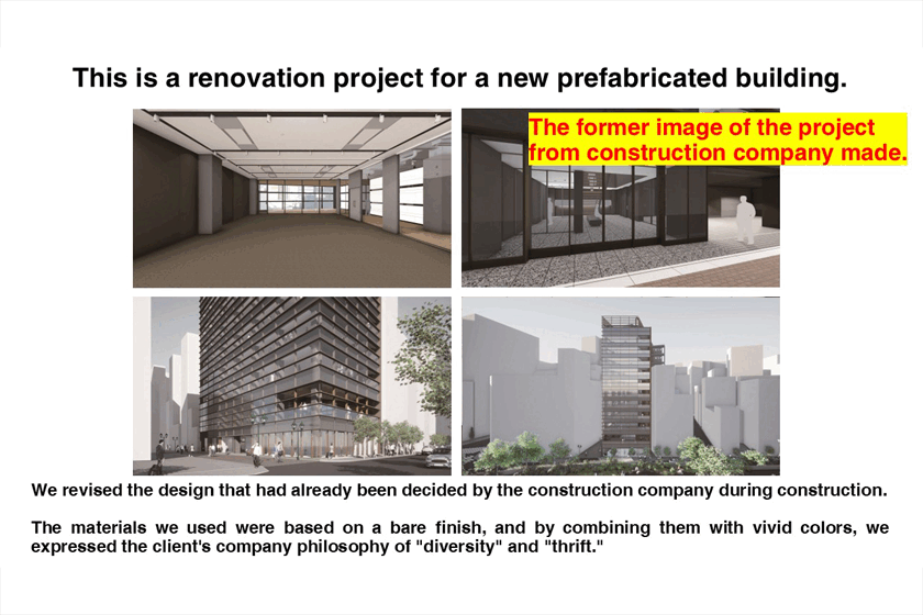
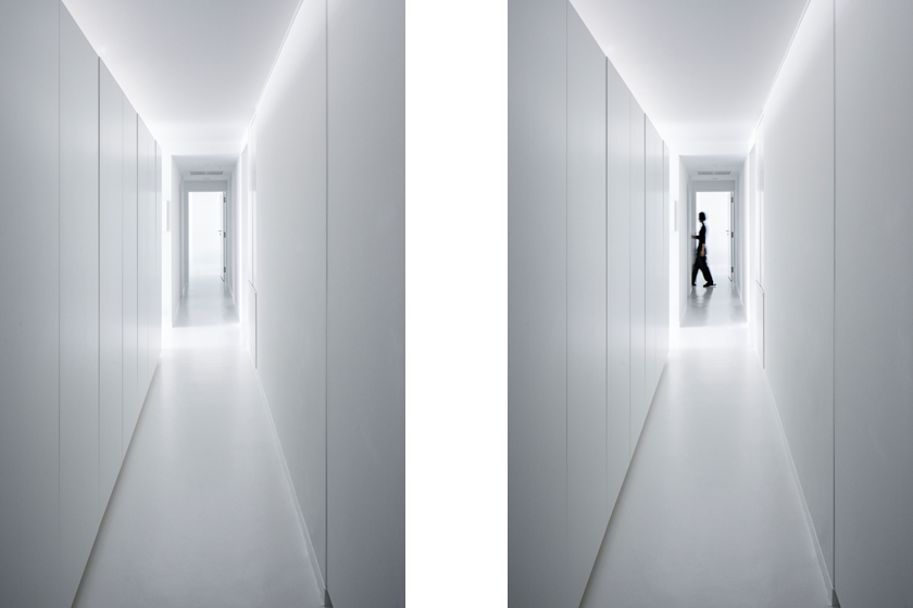
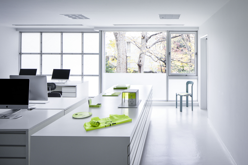
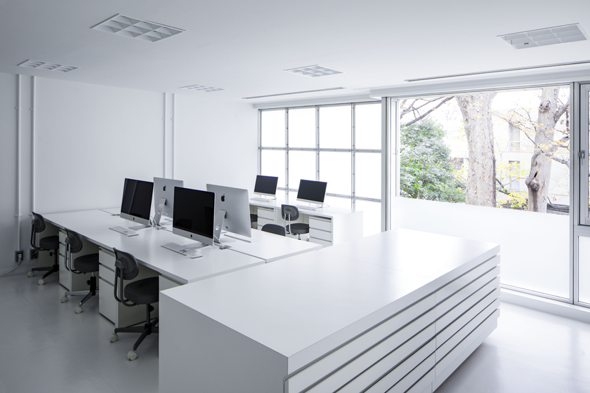
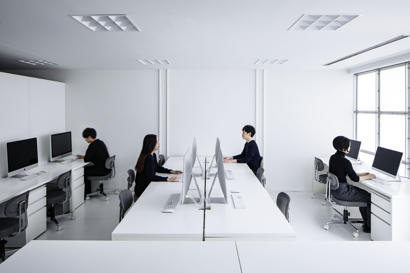
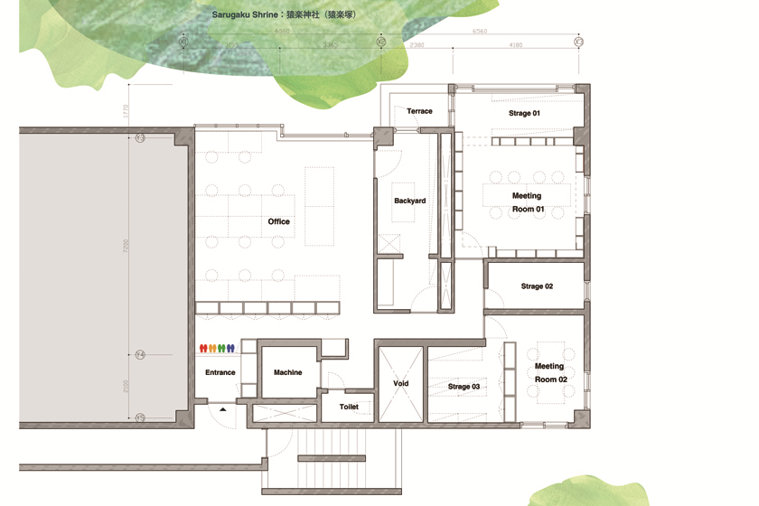
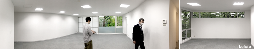
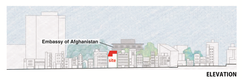
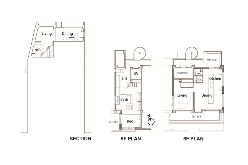
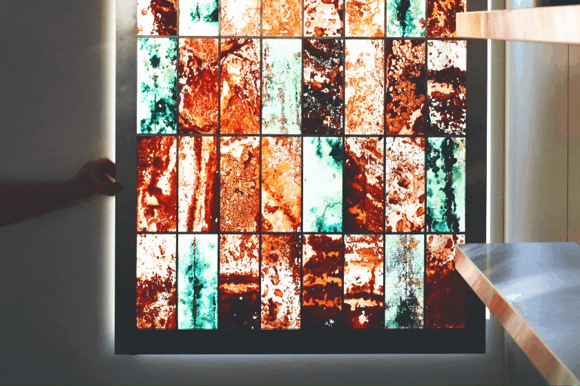
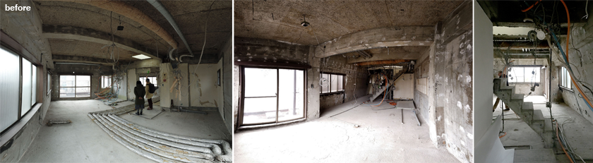
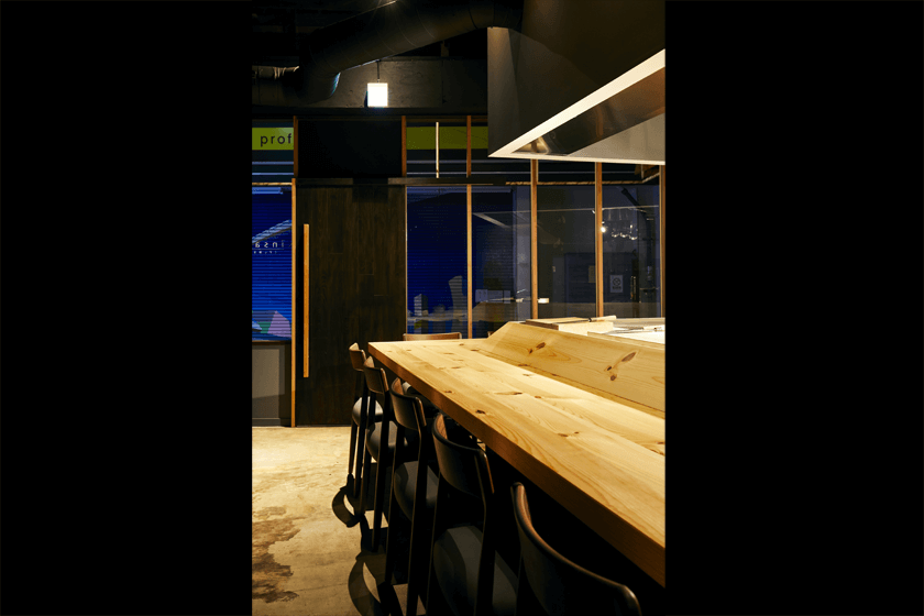
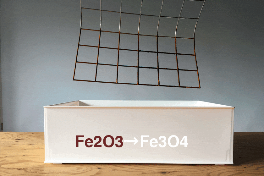
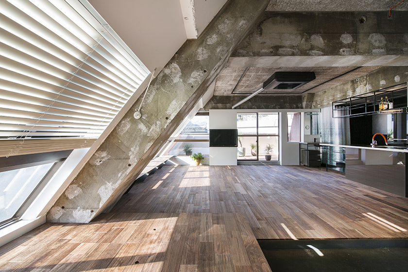
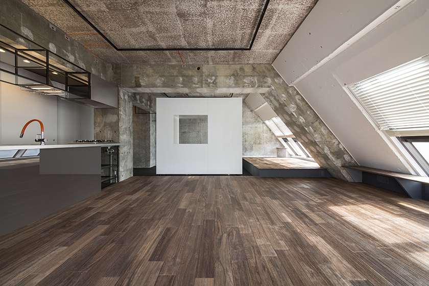
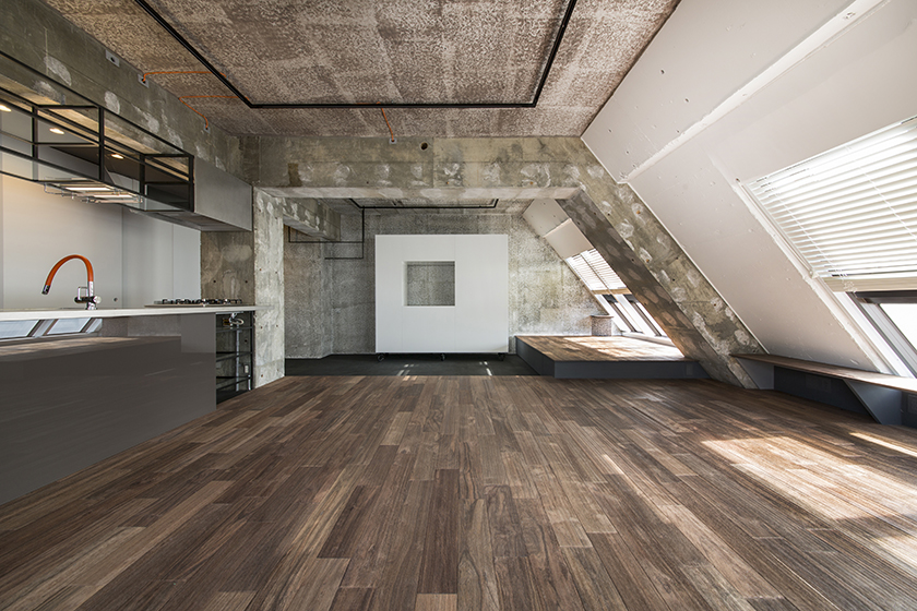
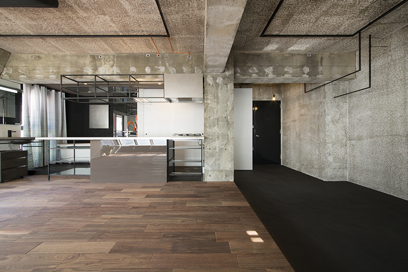
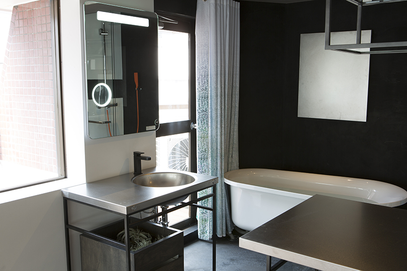
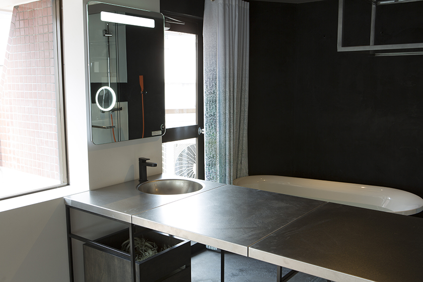
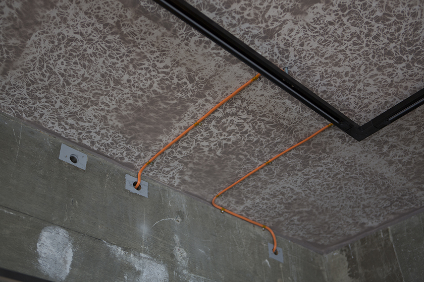
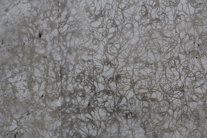
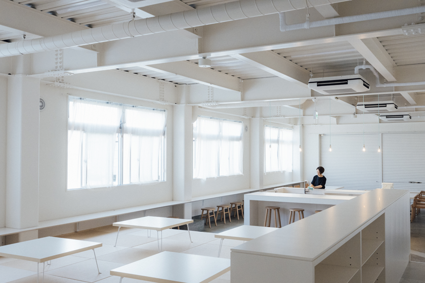
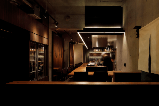
- 029LIFE CARD 銀座ビル | LIFE CARD GINZA BUILDING
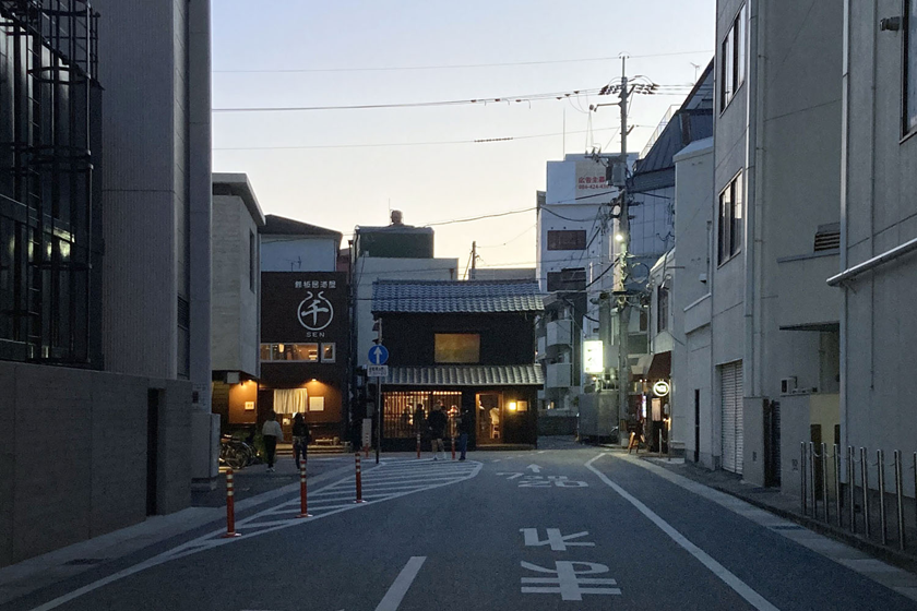
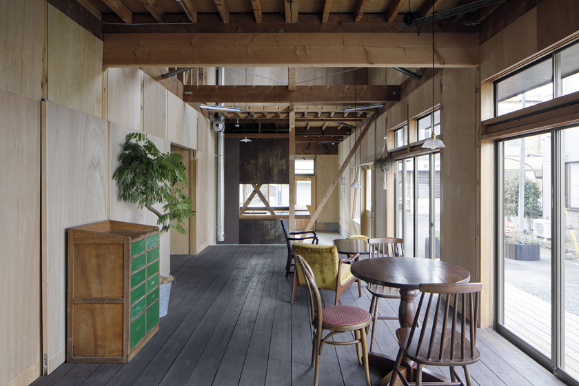
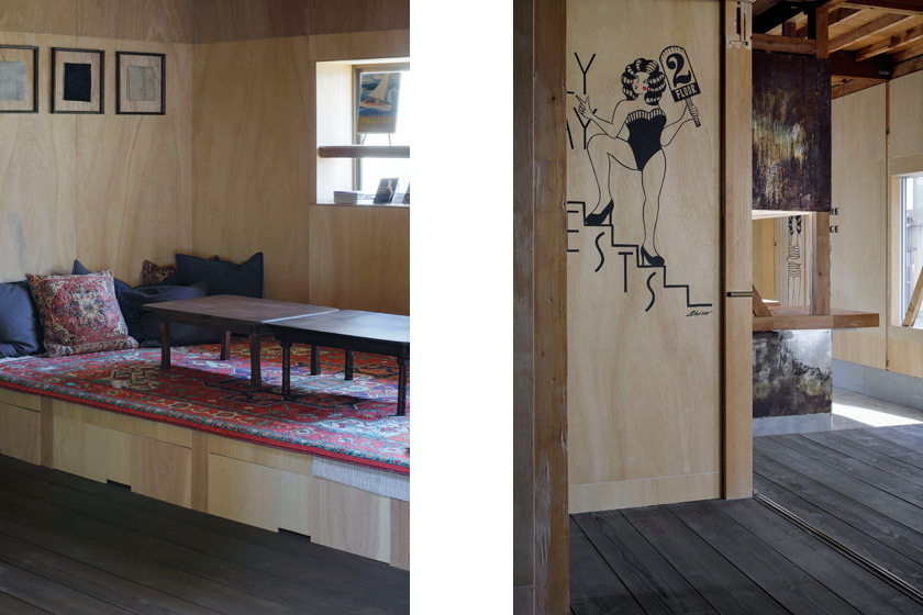
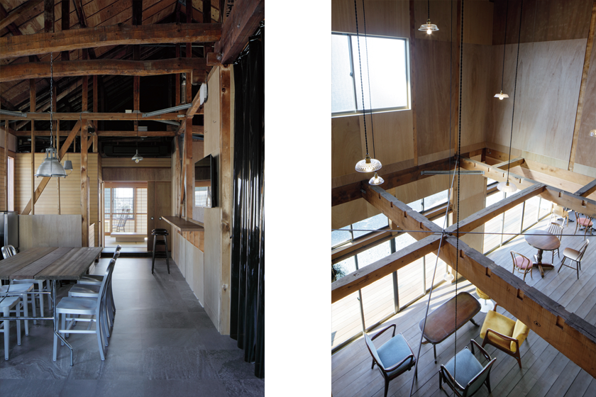
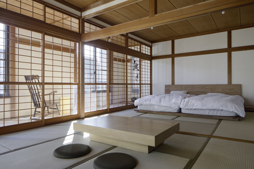
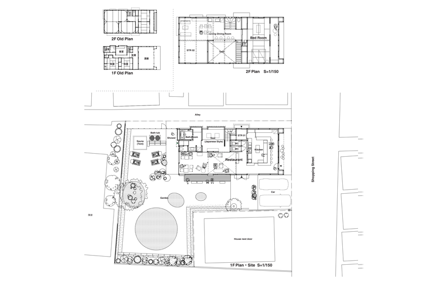
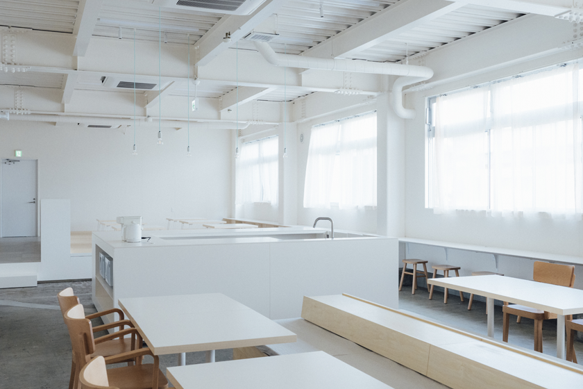
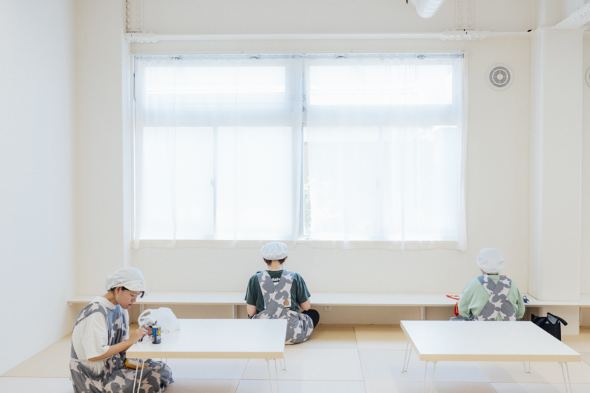
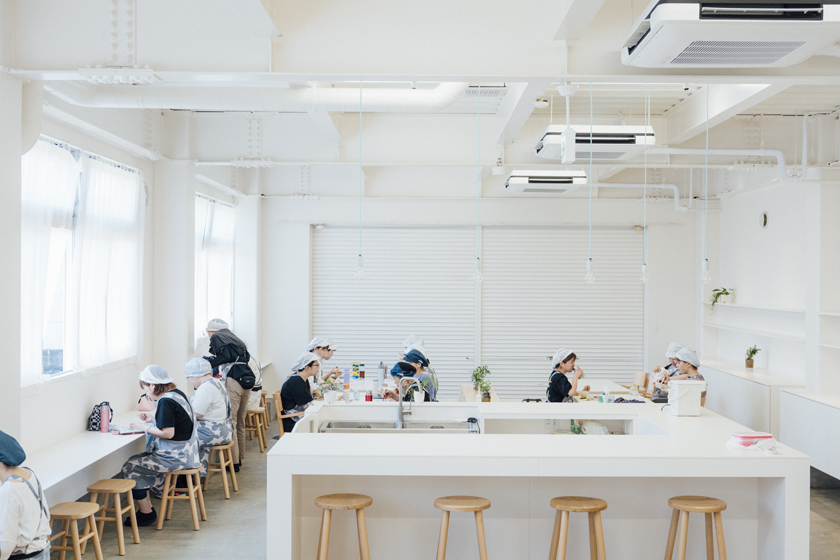
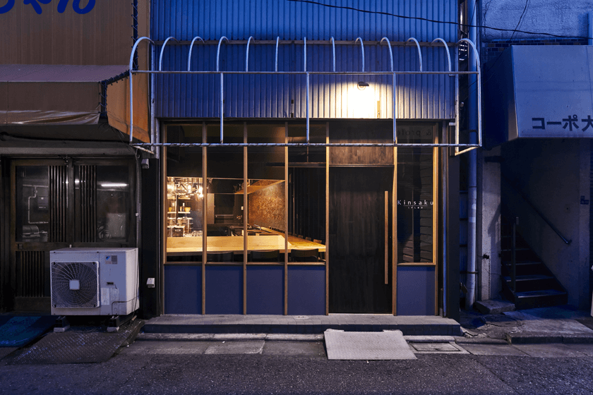
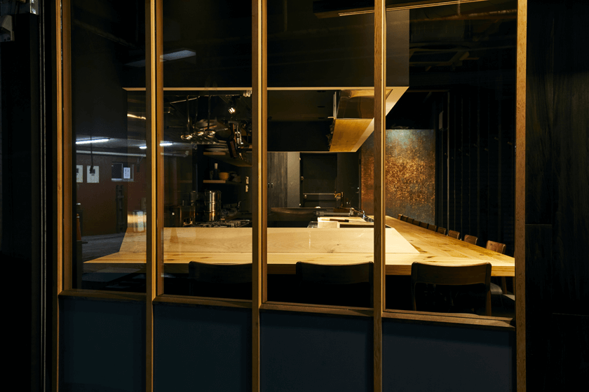
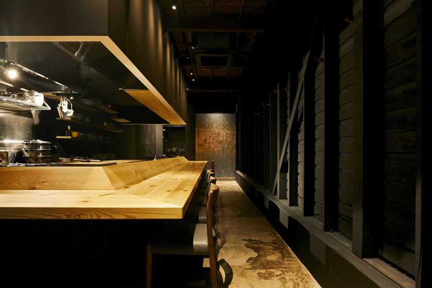
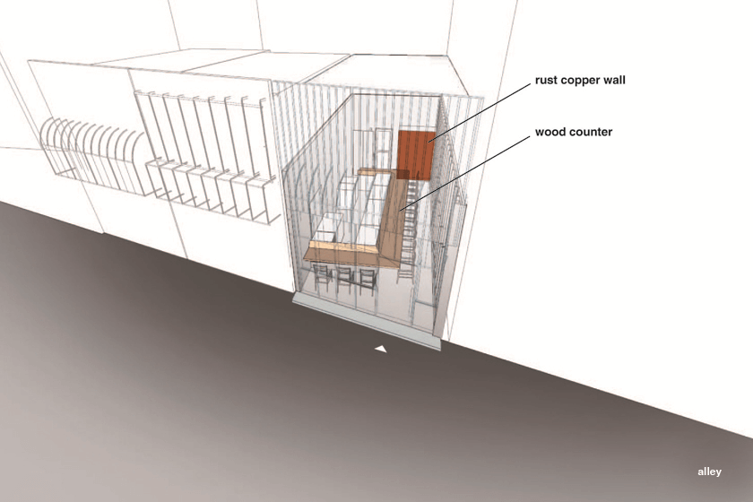
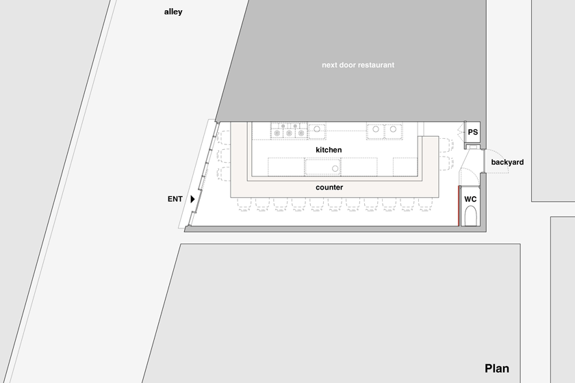
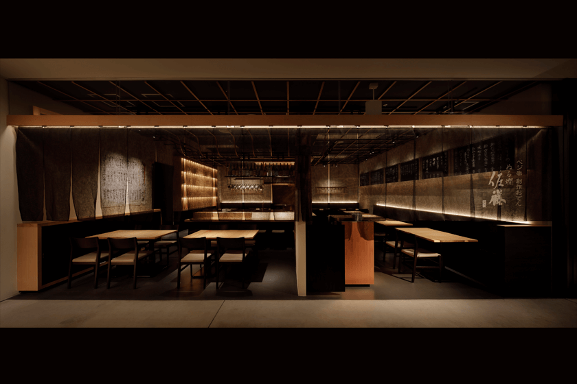
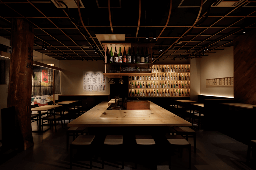
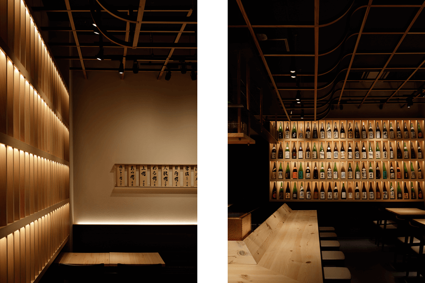
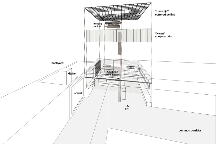
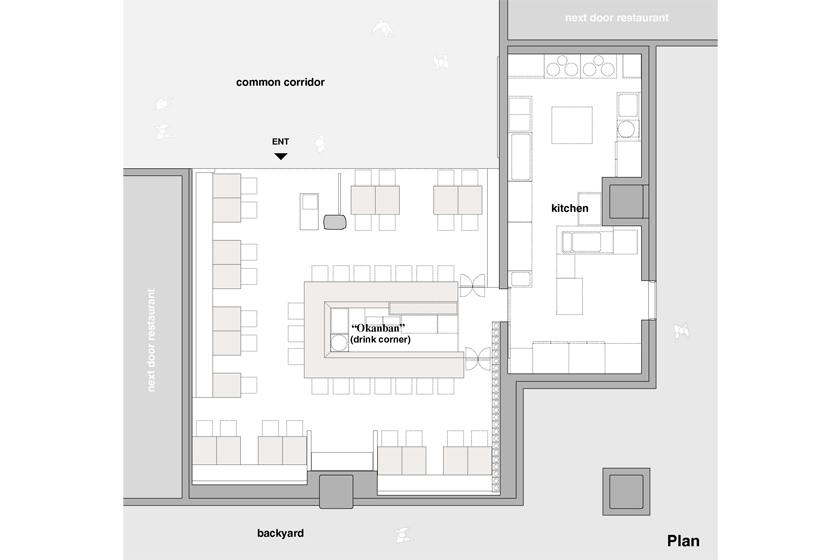
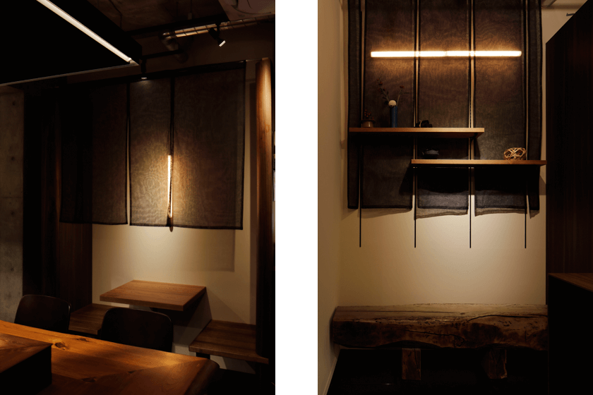
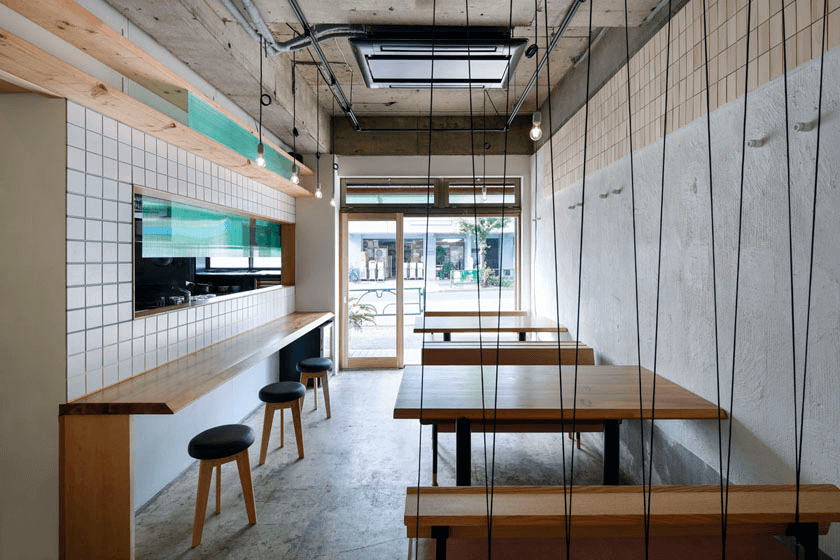
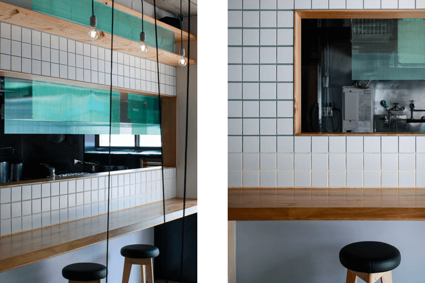
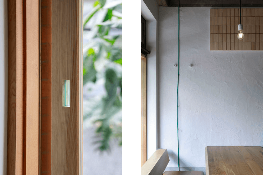
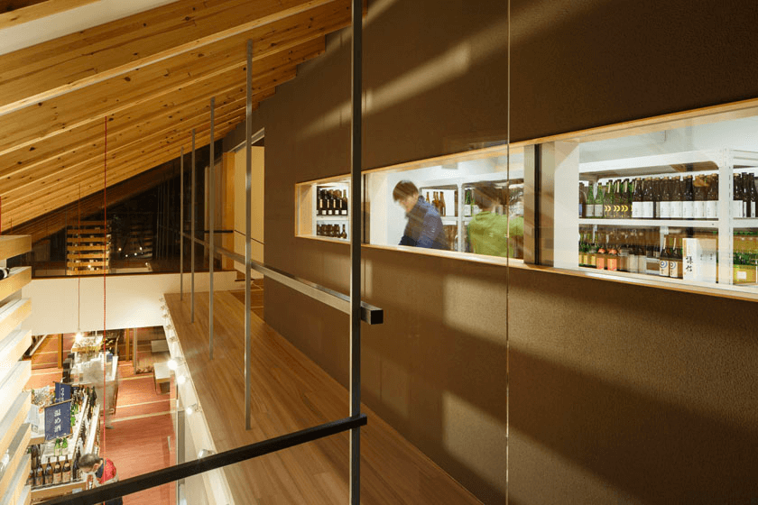
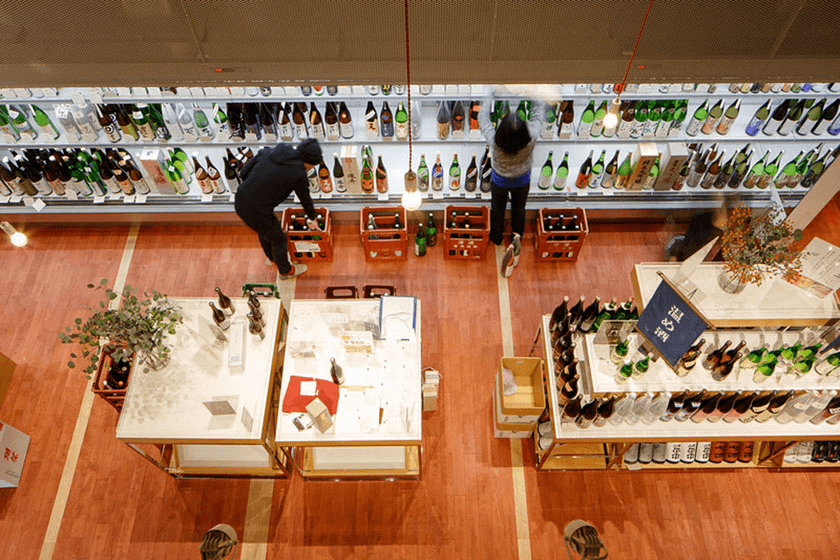
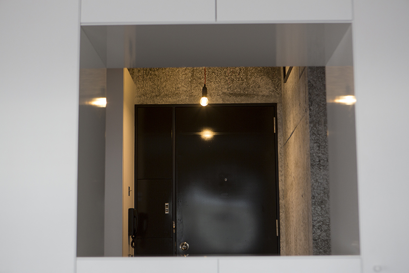
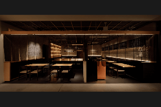
- 028倉敷の二階 -焼鳥かしわ屋 こばやし- | Upstairs of Yakitori Restaurant
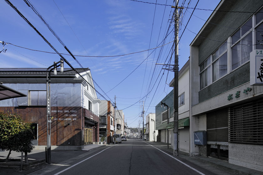
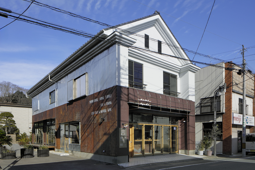
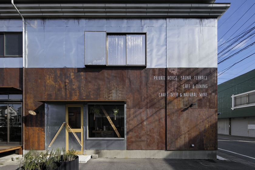
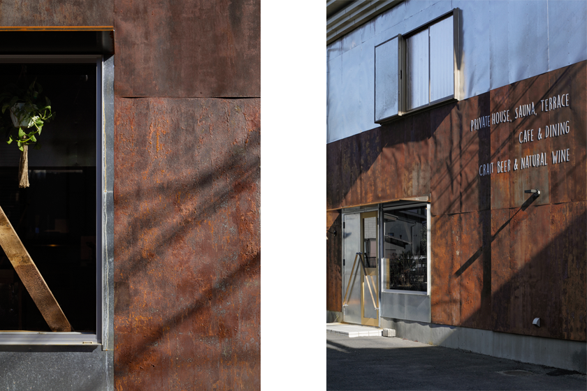
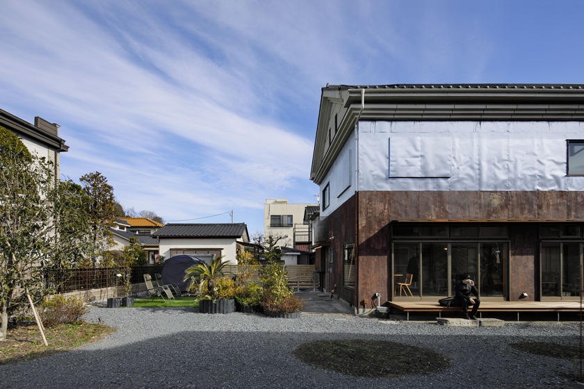
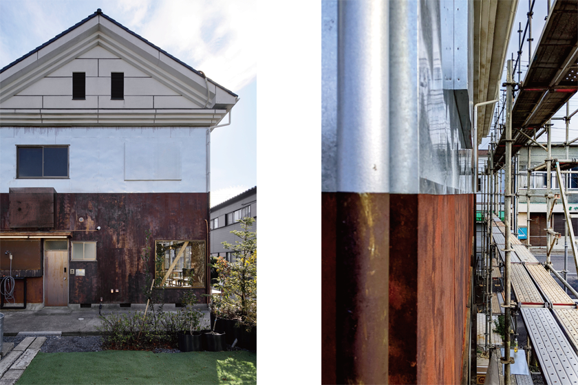
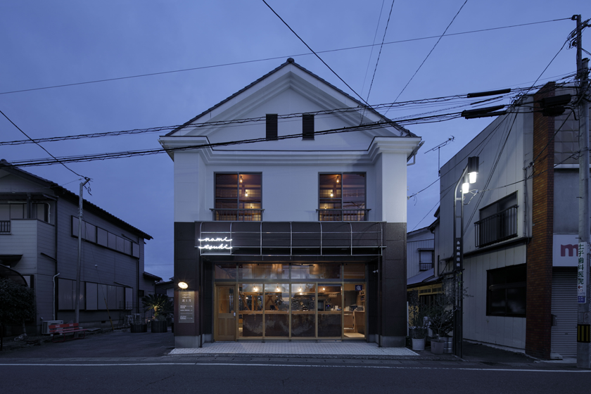
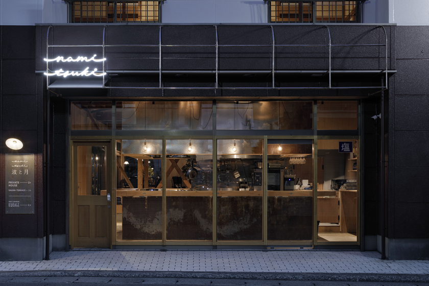
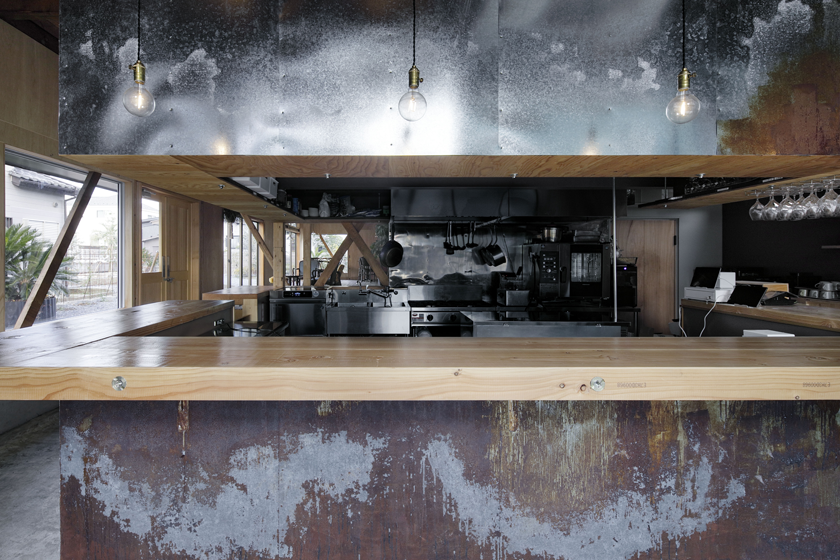
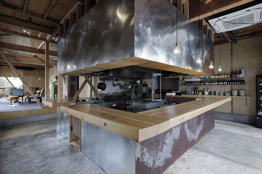
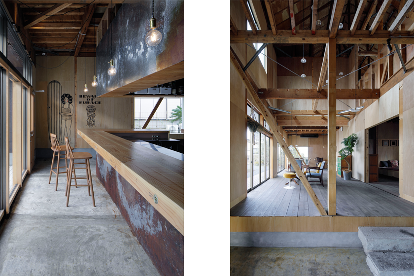
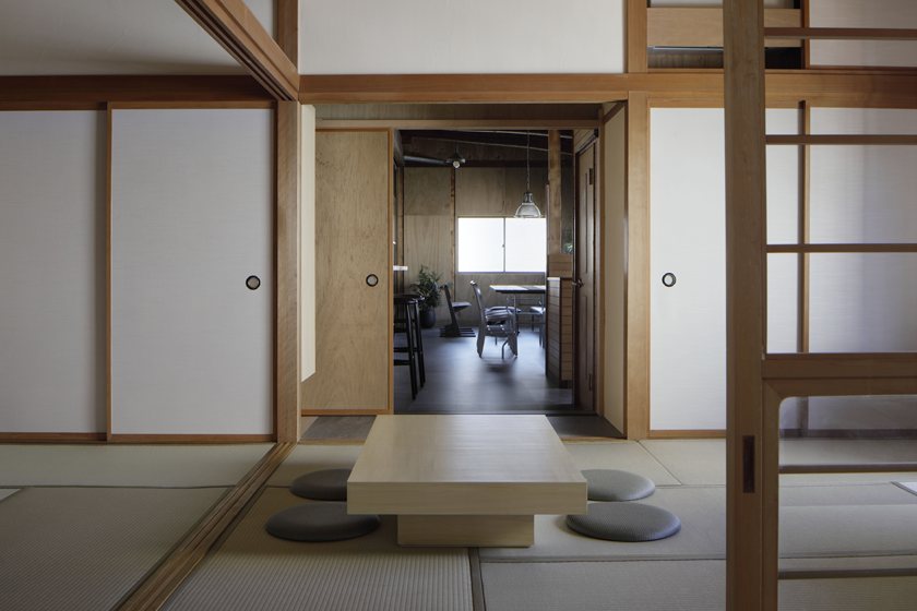
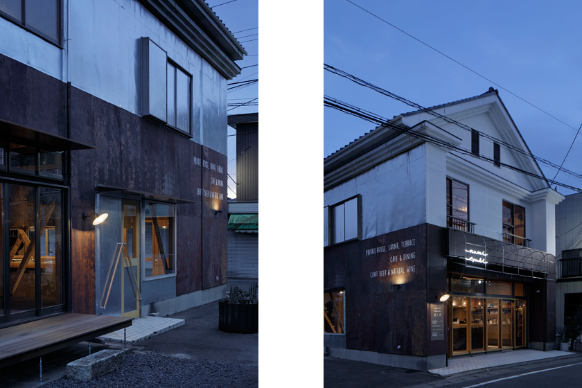
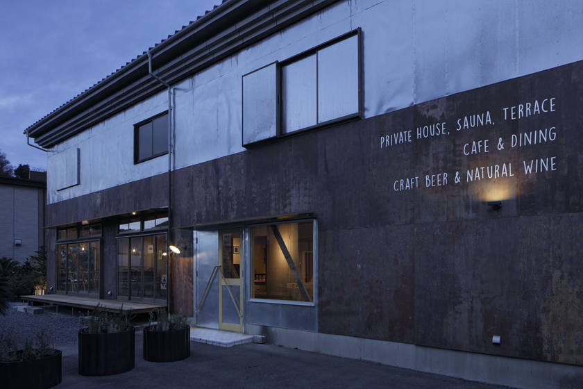
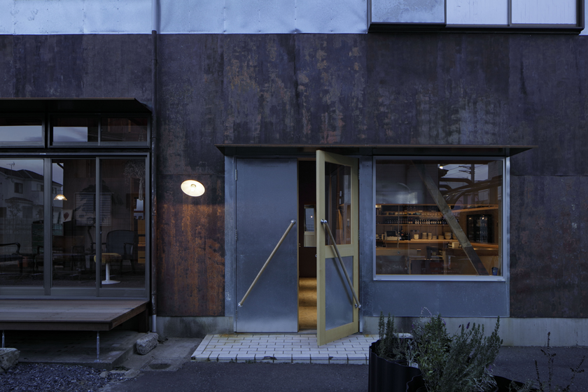
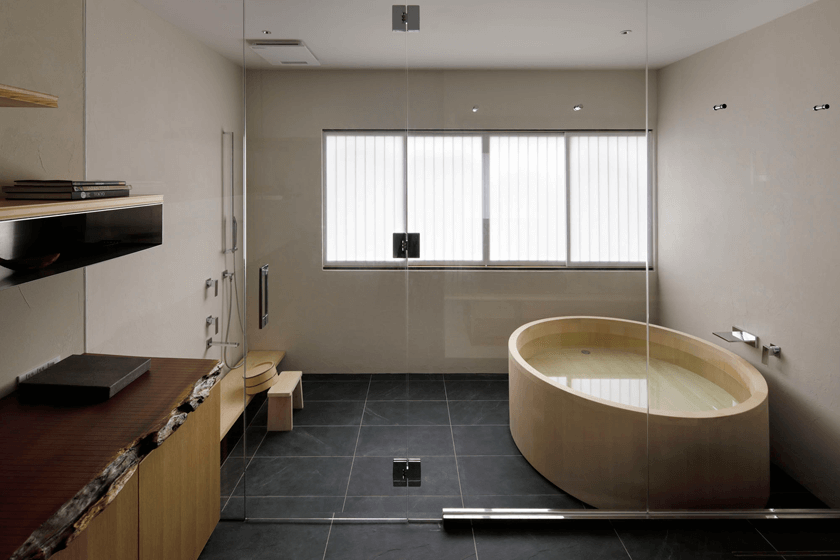
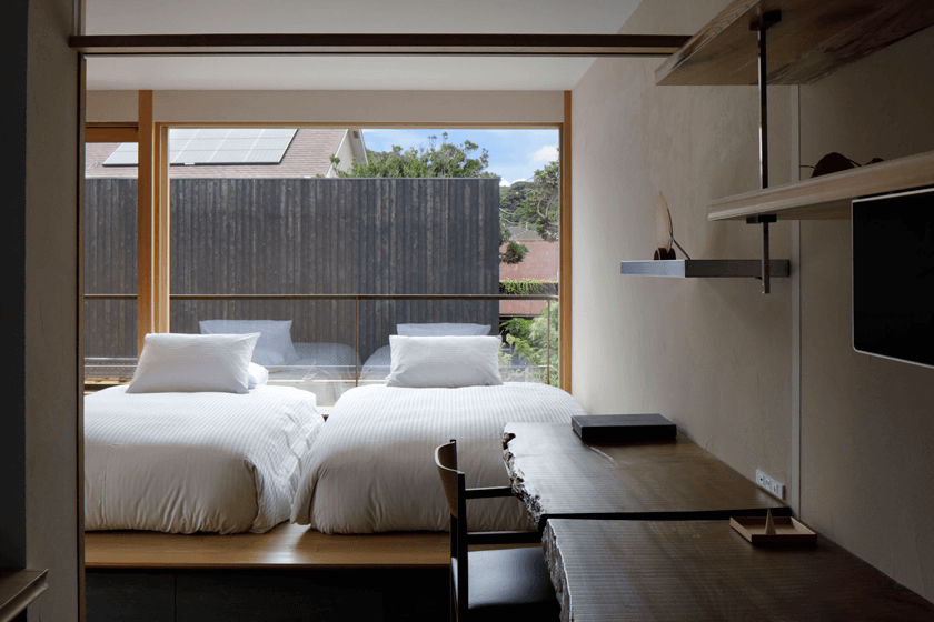
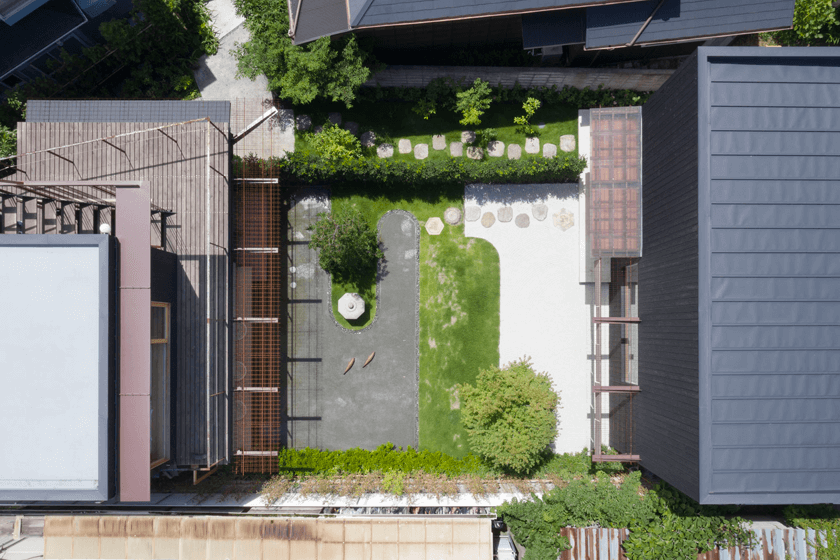
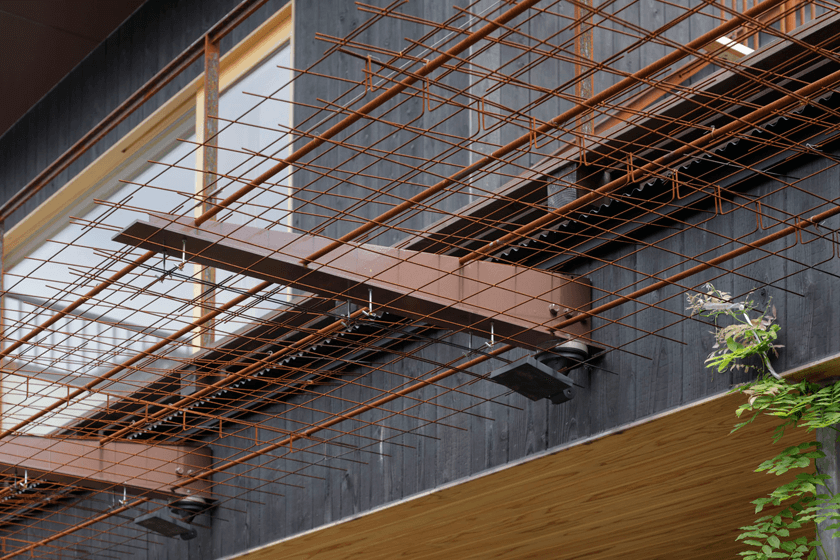
- 027ナミトツキ | NAMI TO TSUKI- Hotel & Dininng in small port town
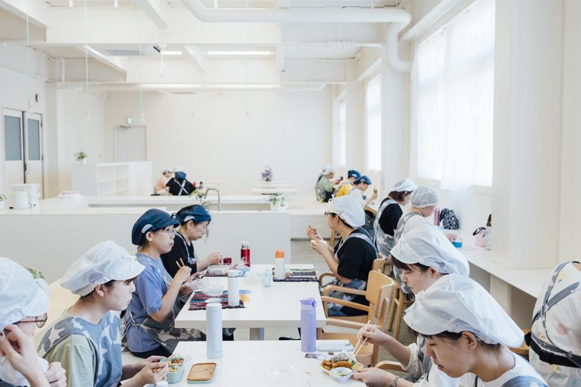
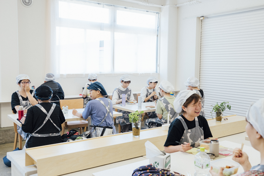
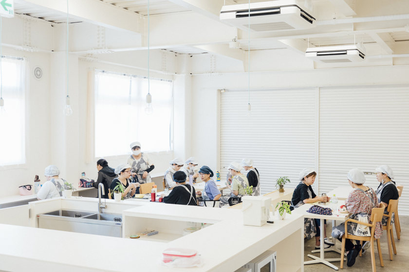
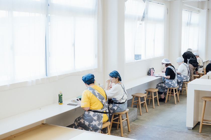
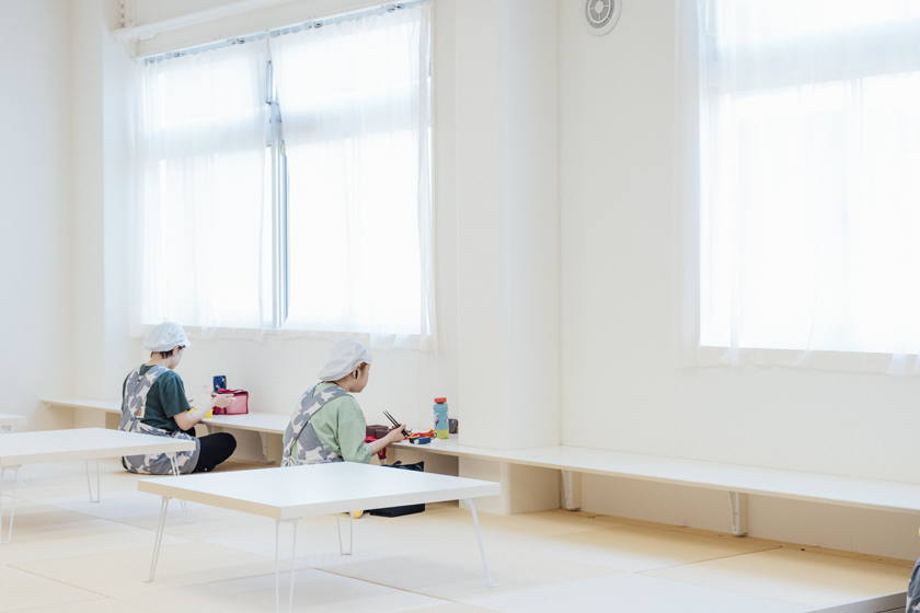
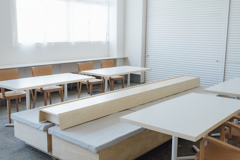
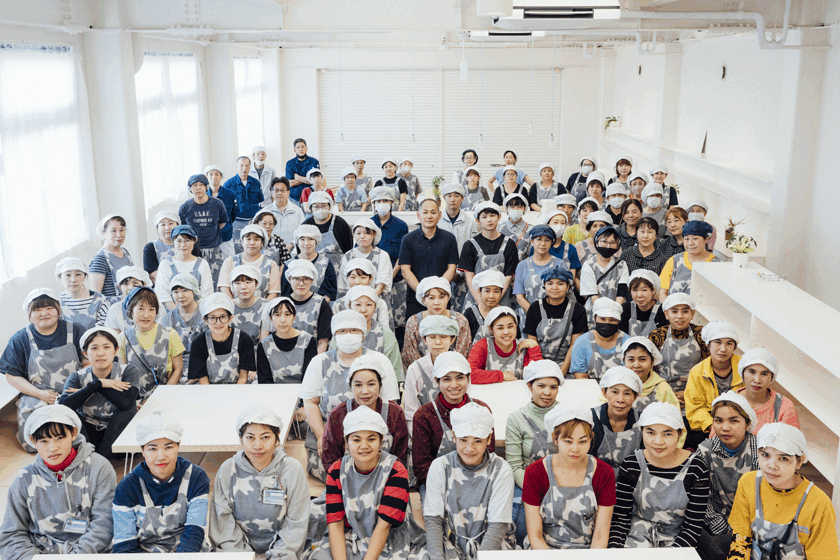
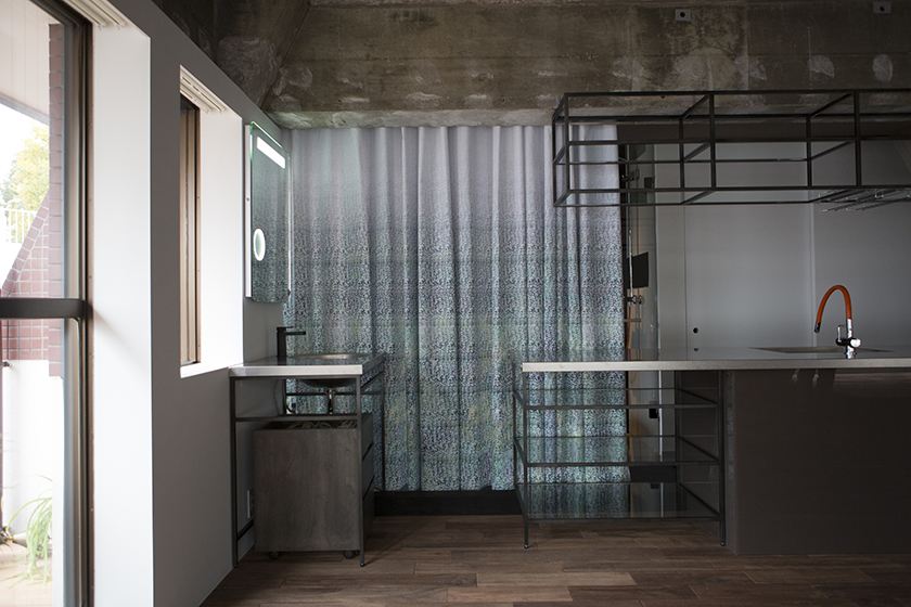
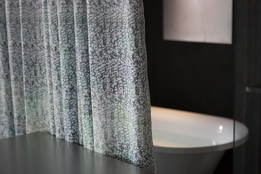
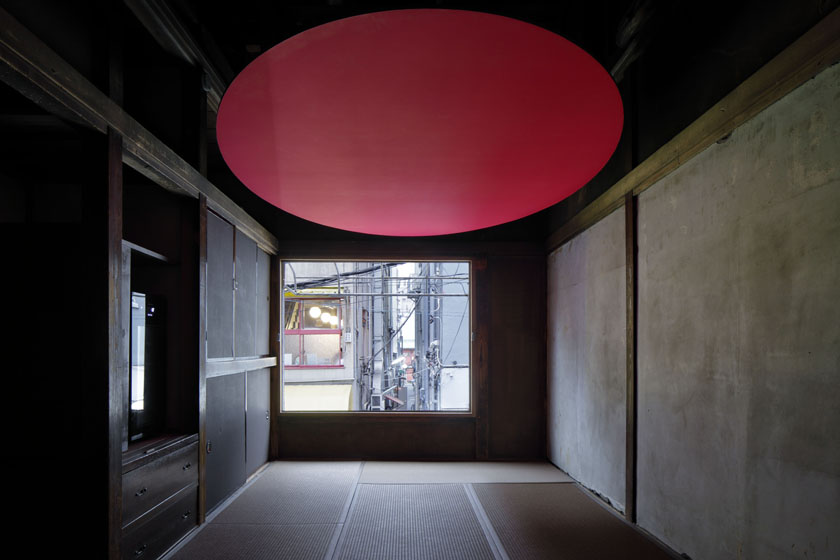
- 026縫製会社の大広間 | A Large Room
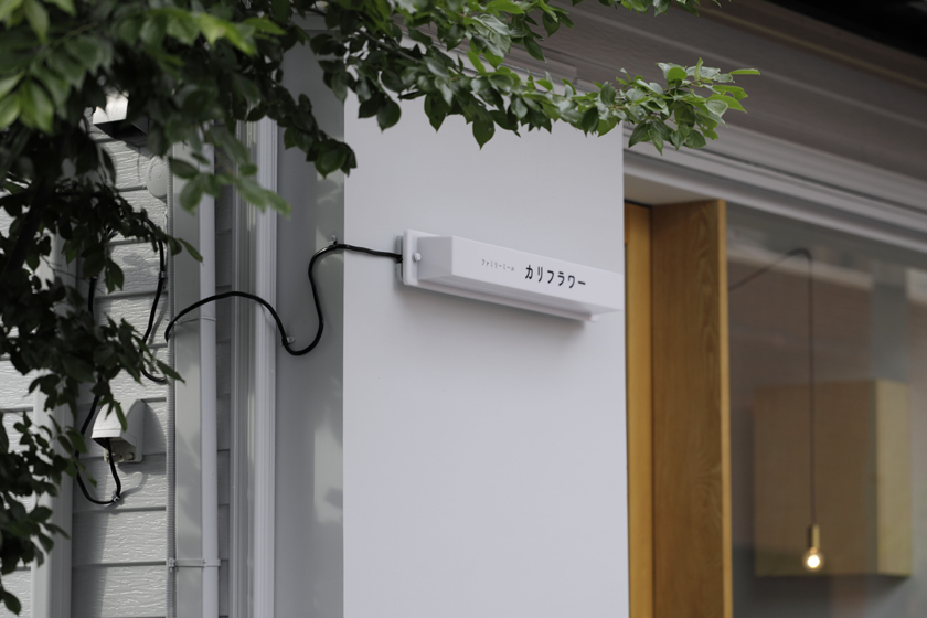
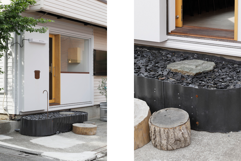
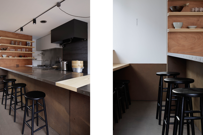
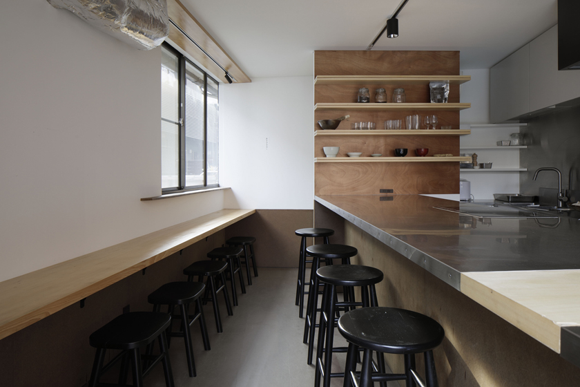
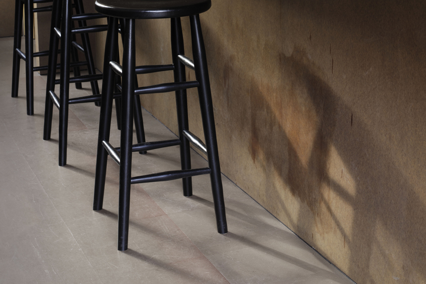
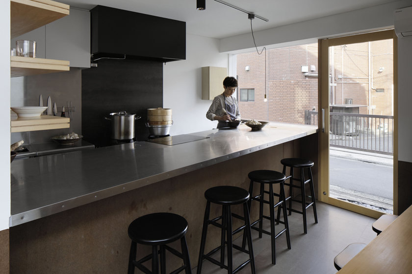
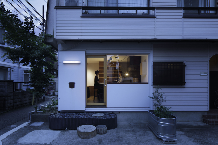
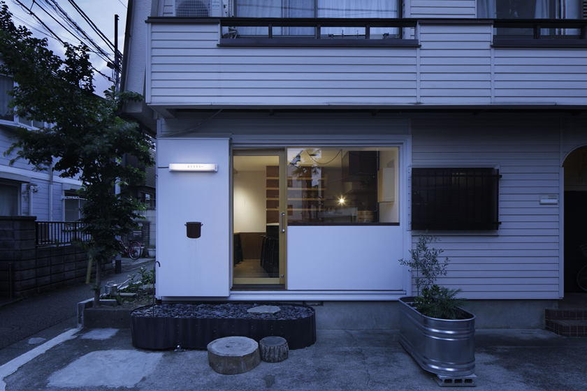
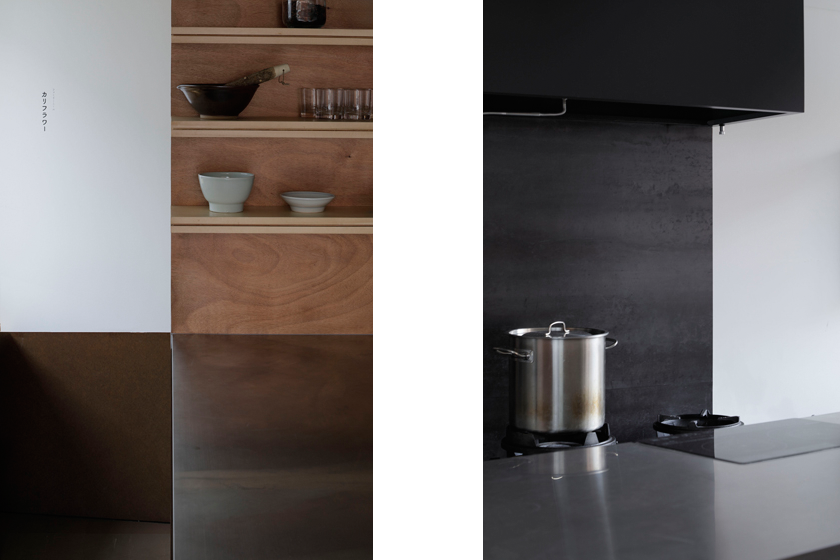
- 025ファミリーミール カリフラワー | Family Meal Cauliflower
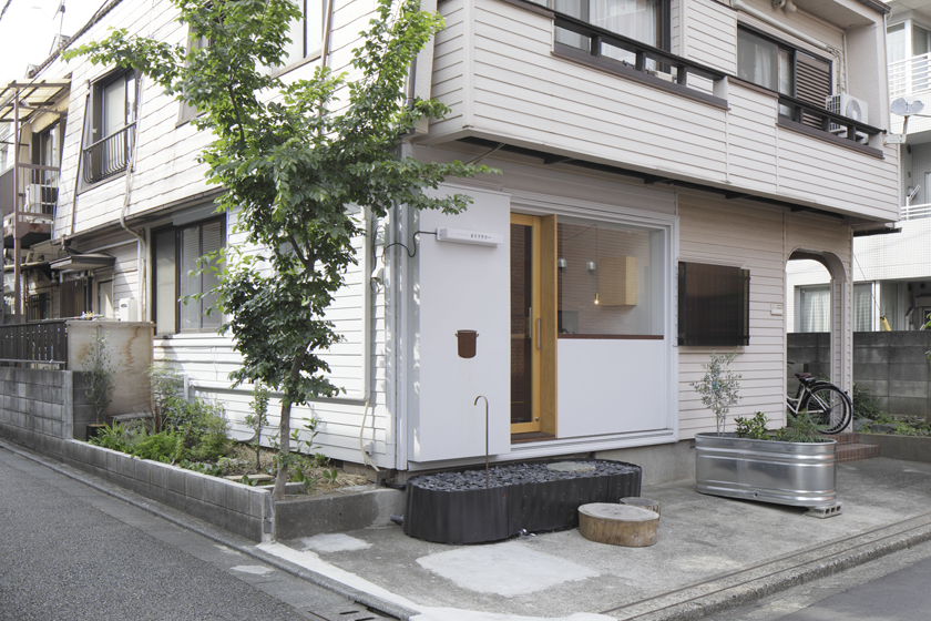
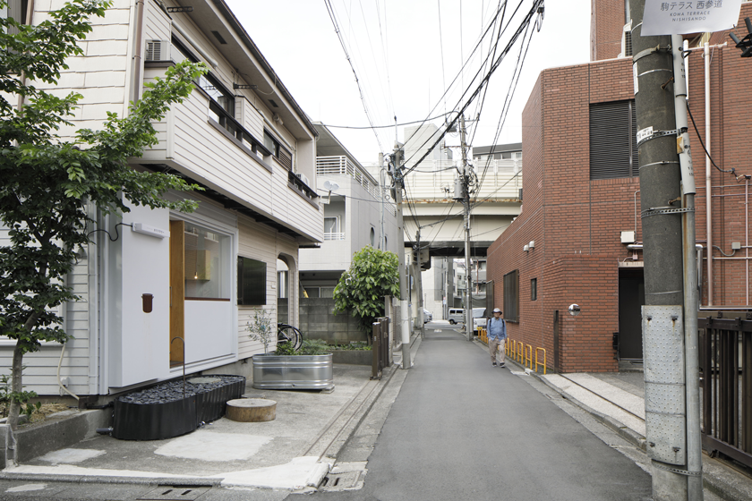
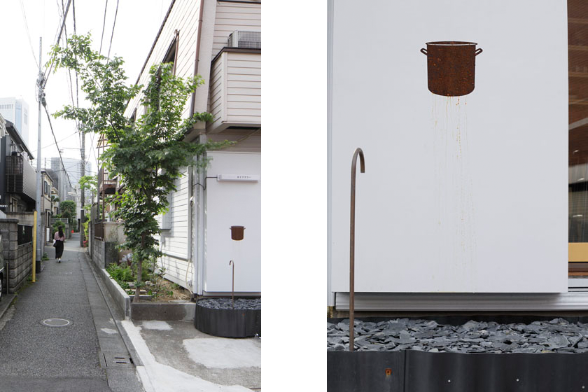
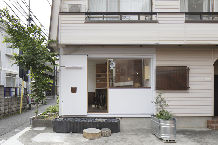
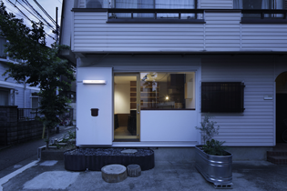
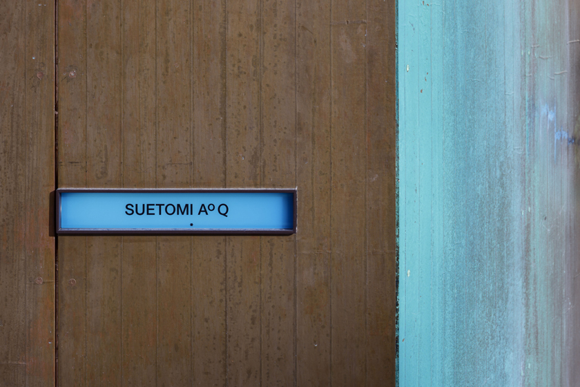
- 024末富 青久 カフェスタンド | SUETOMI AoQ Cafe Stand
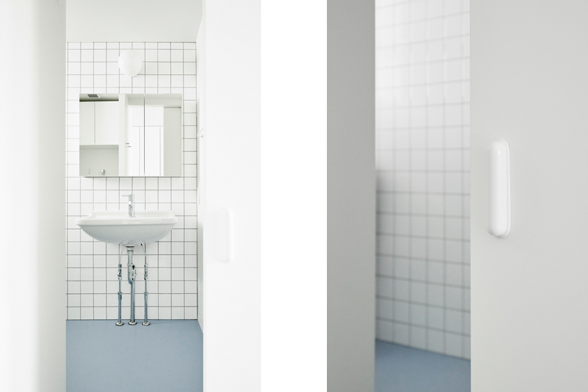
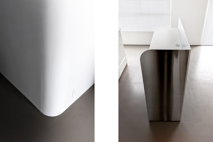
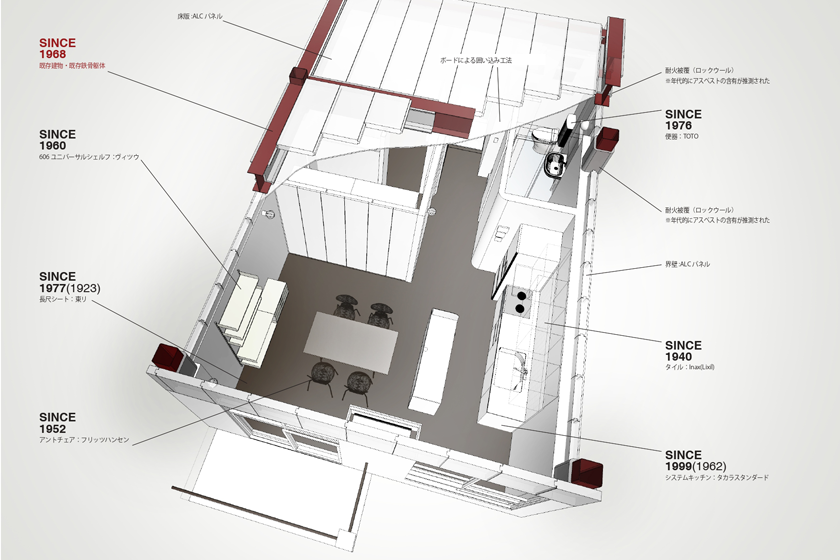
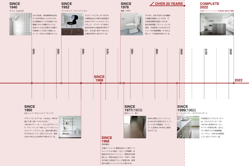
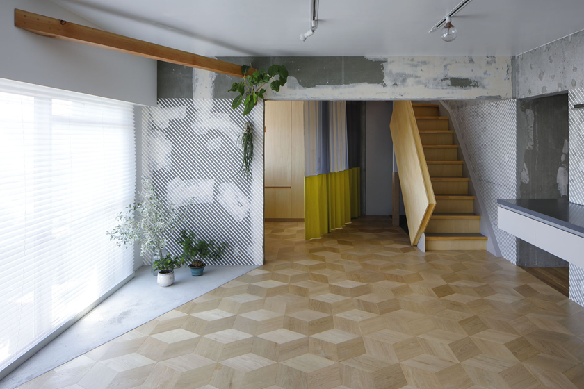
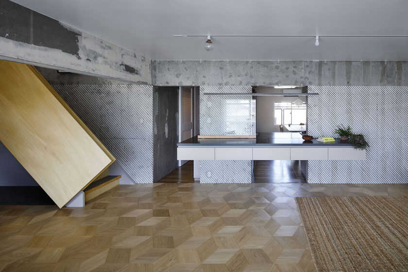
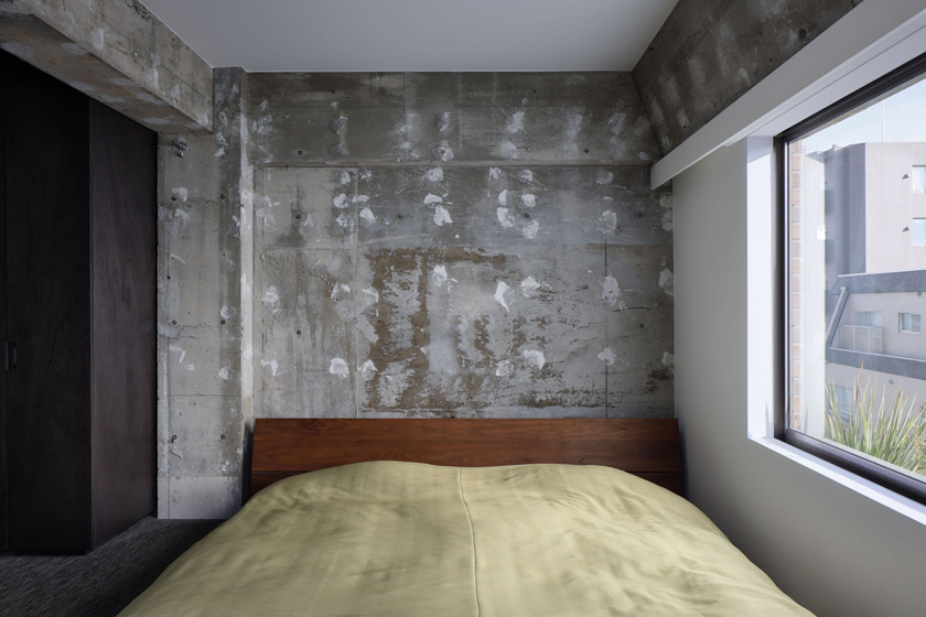
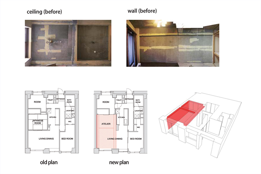
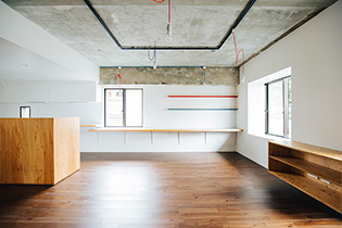
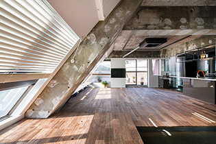
- 023杉並のリノベーション | A Room Since 1968
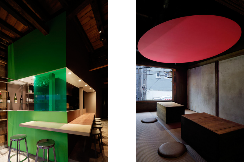
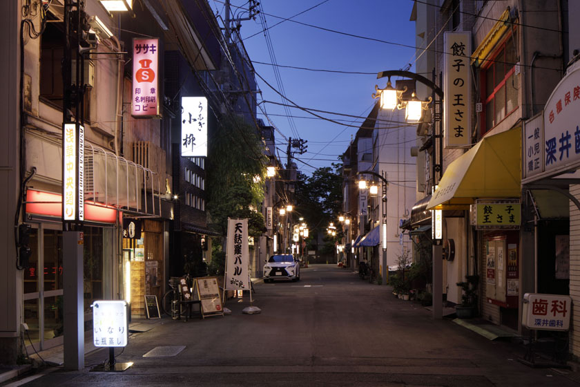
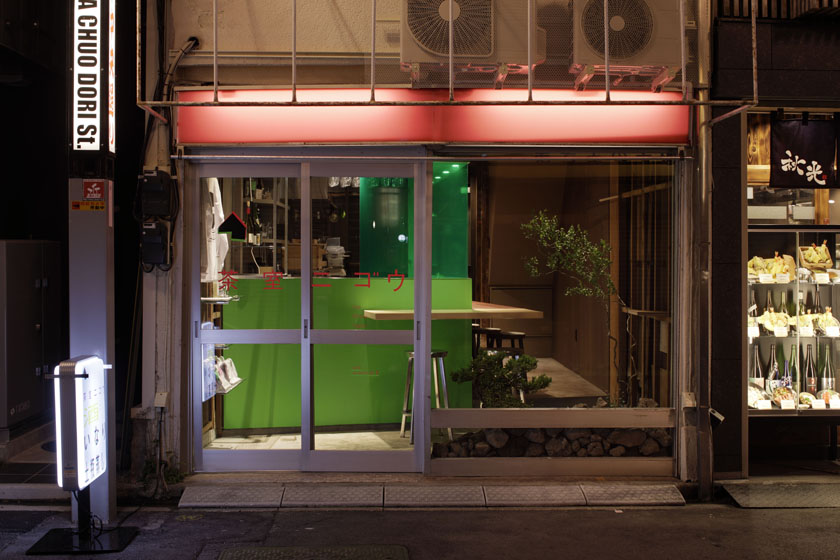
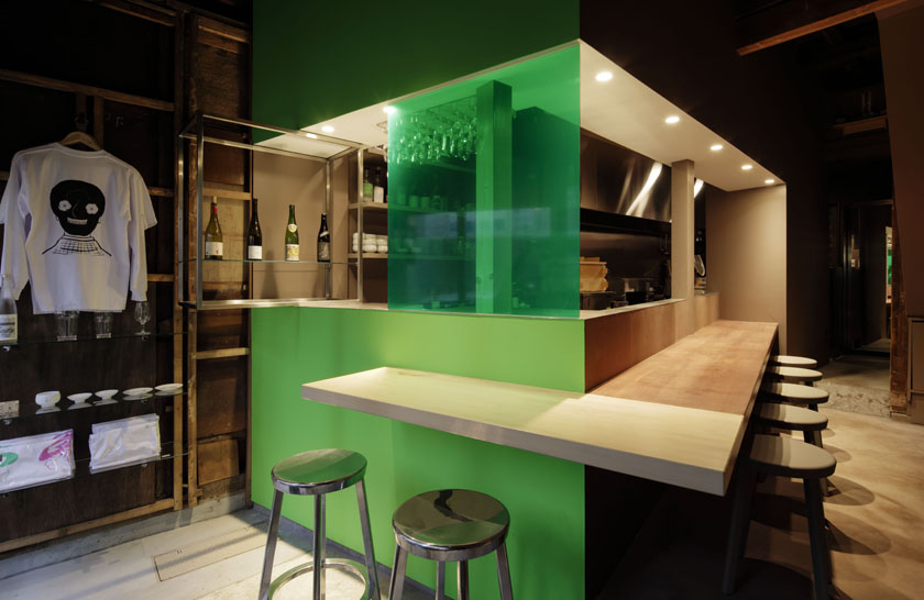
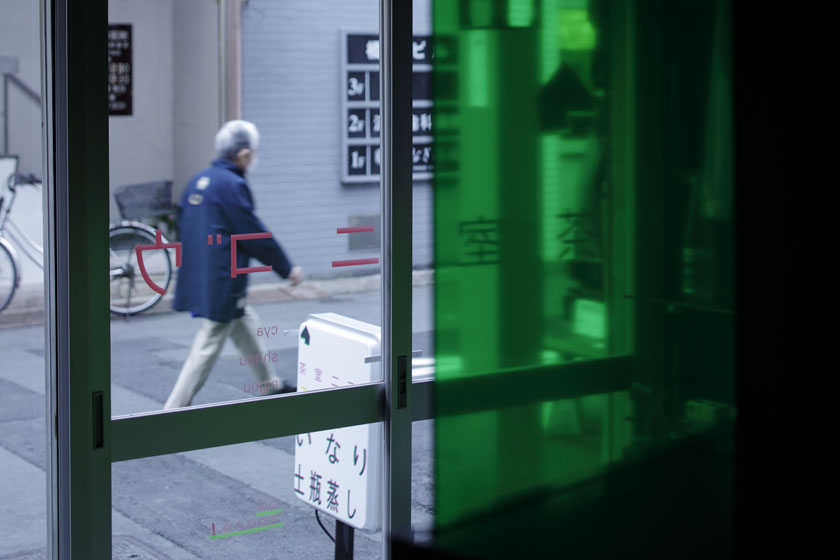
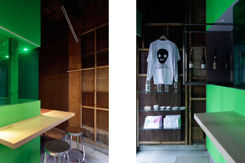
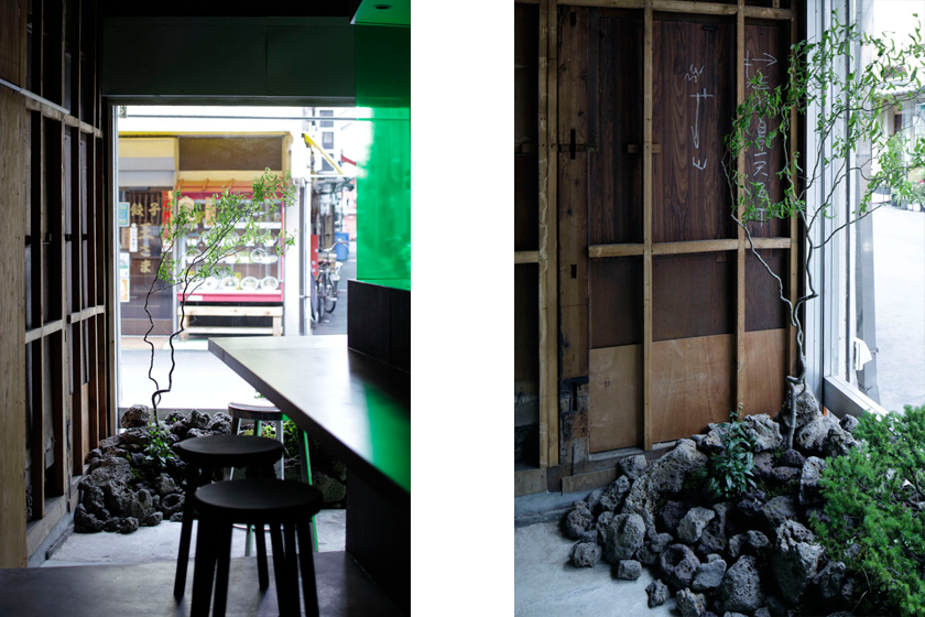
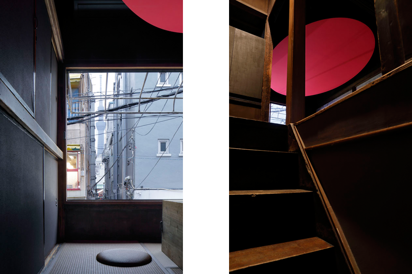
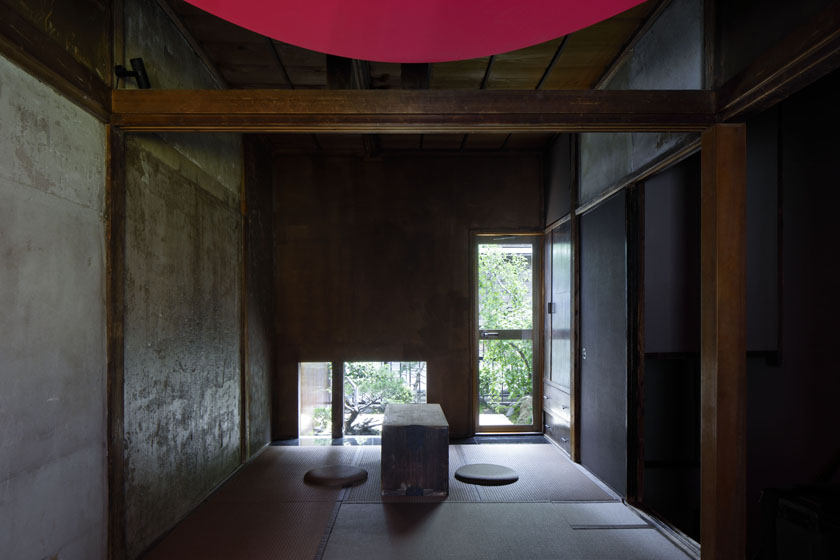
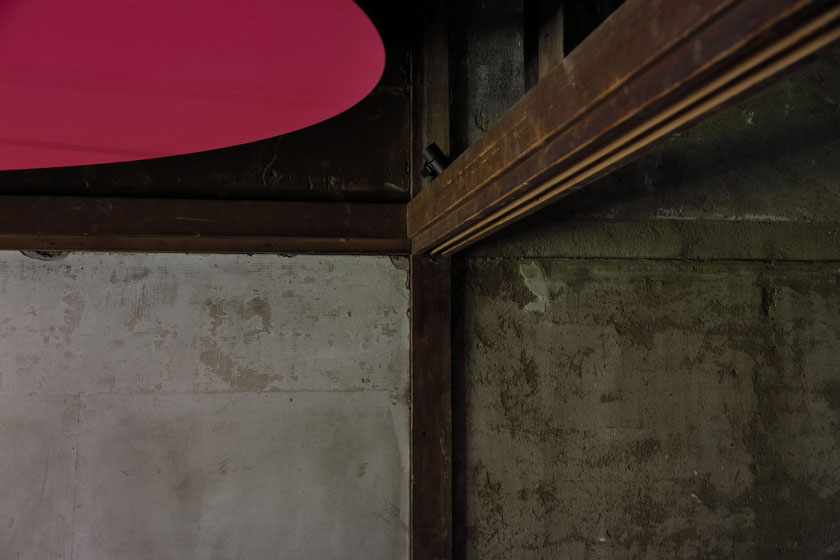
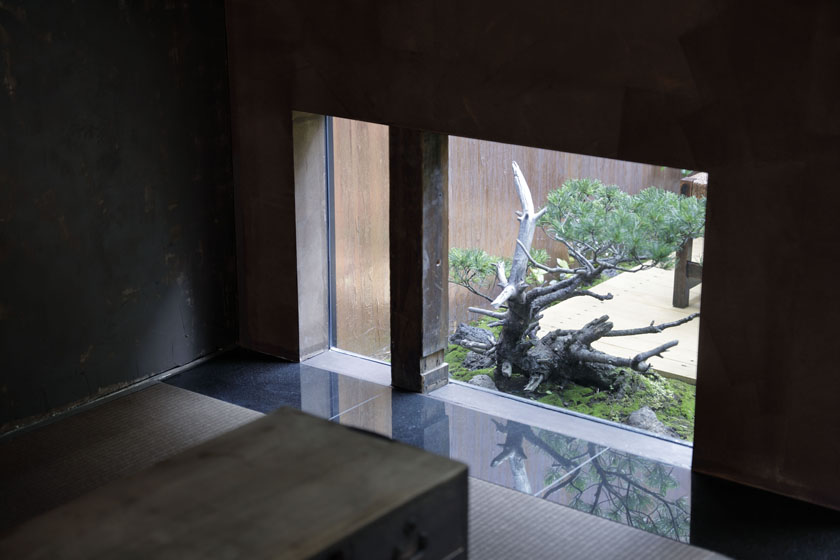
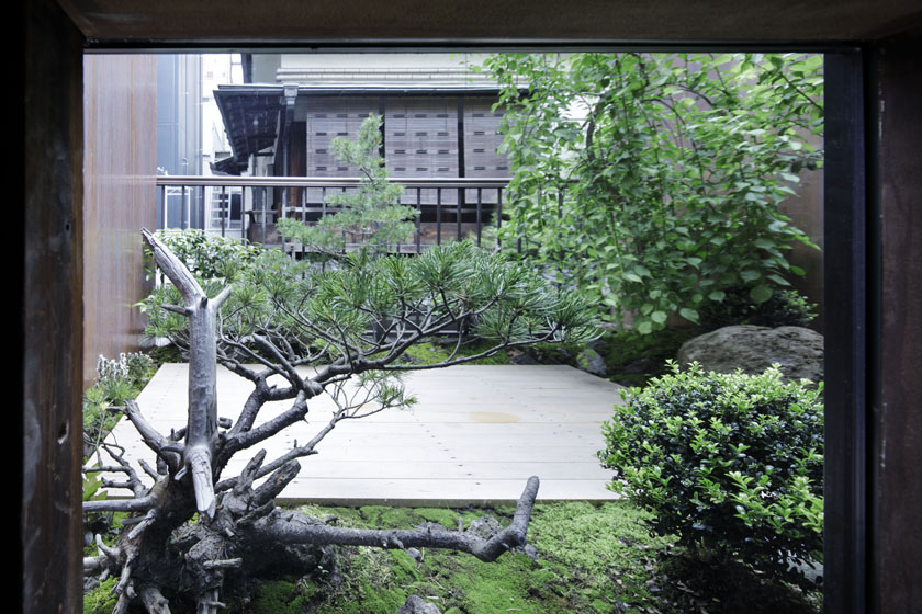
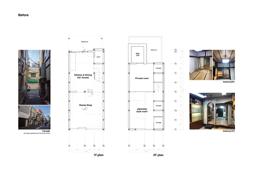
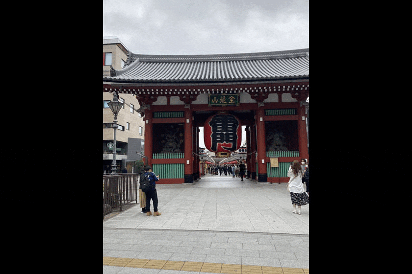
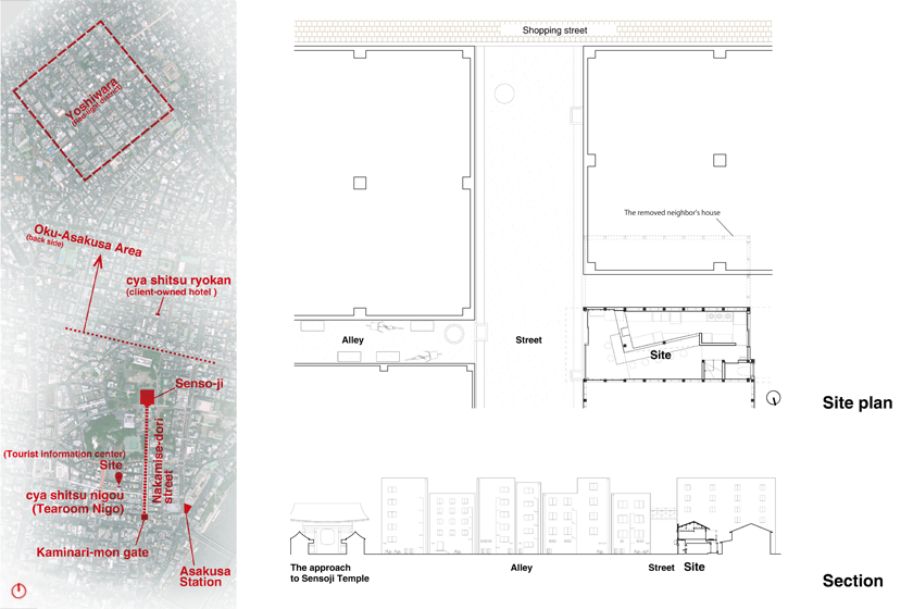
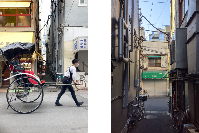
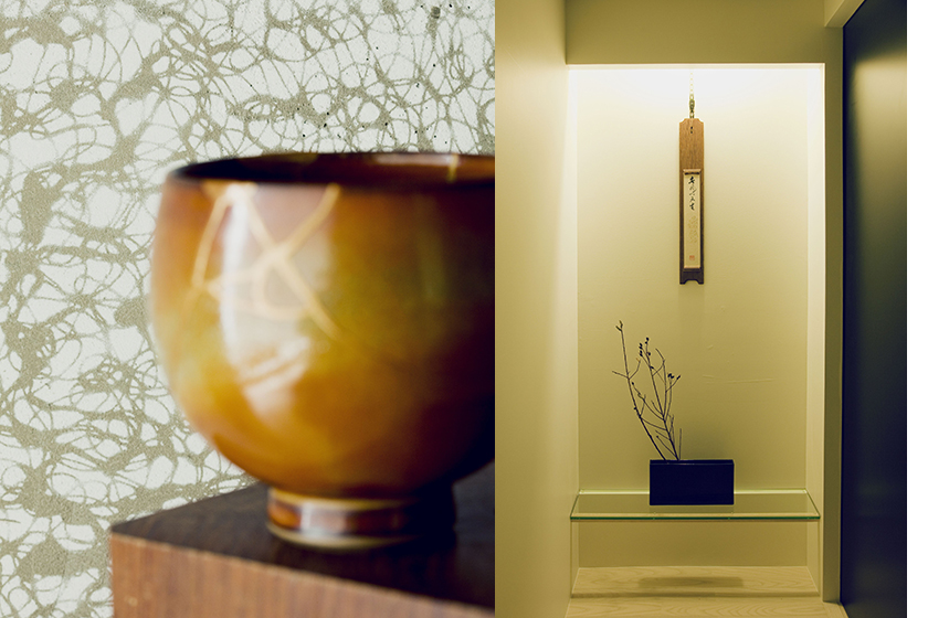
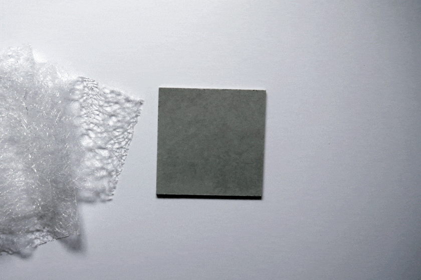
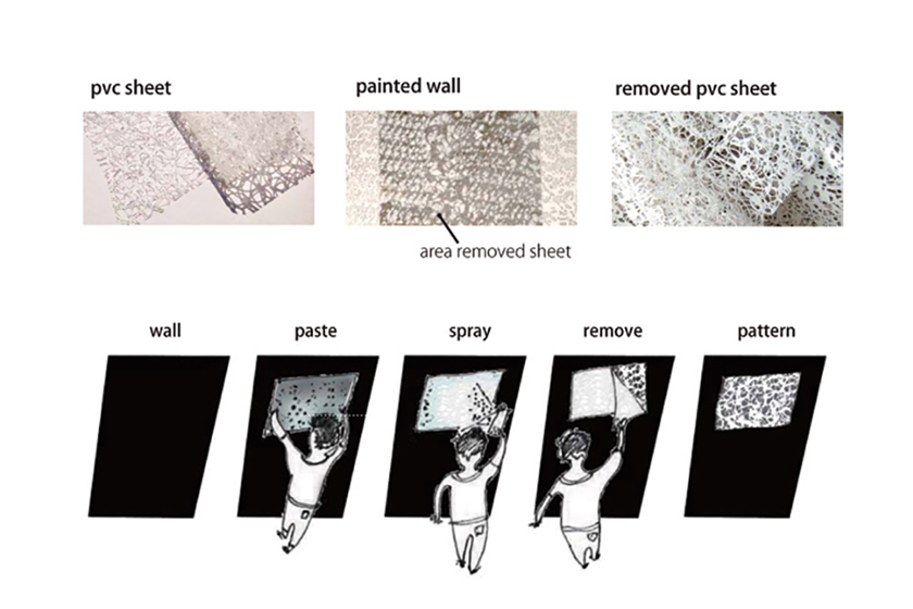
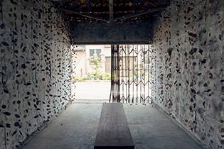
- 022茶室ニゴウ | cya shitu nigou (Tearoom Nigo )
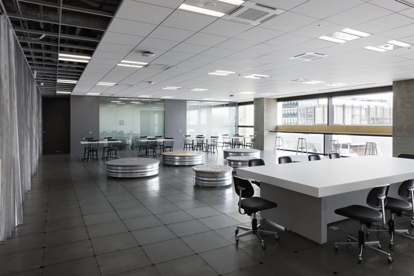
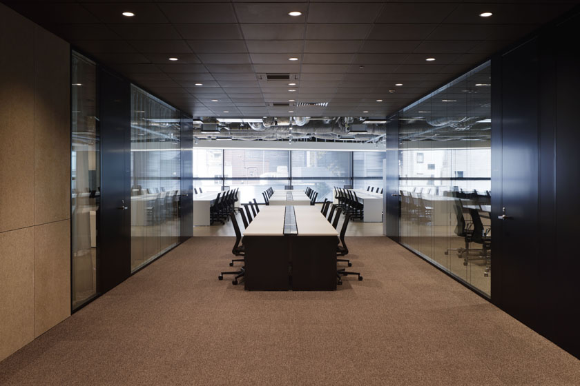
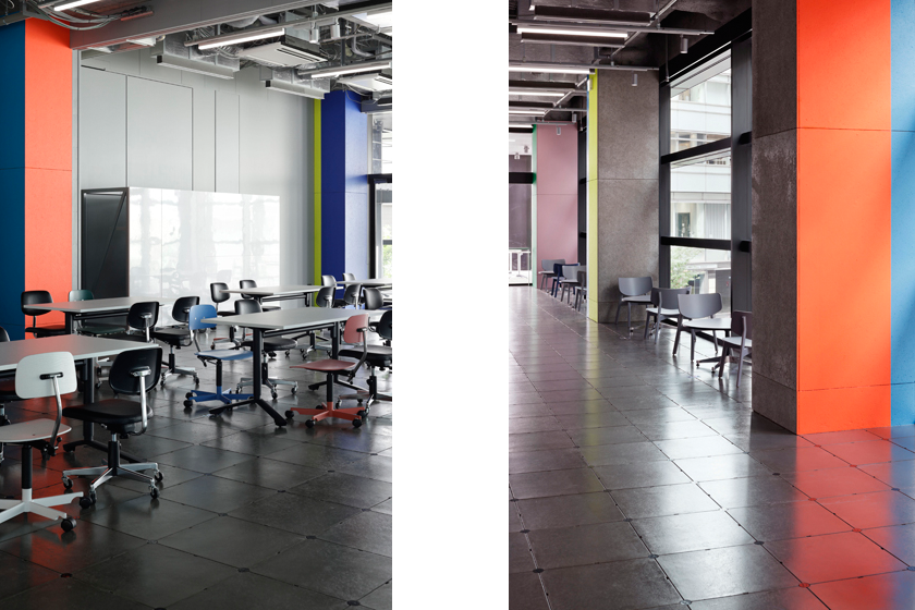
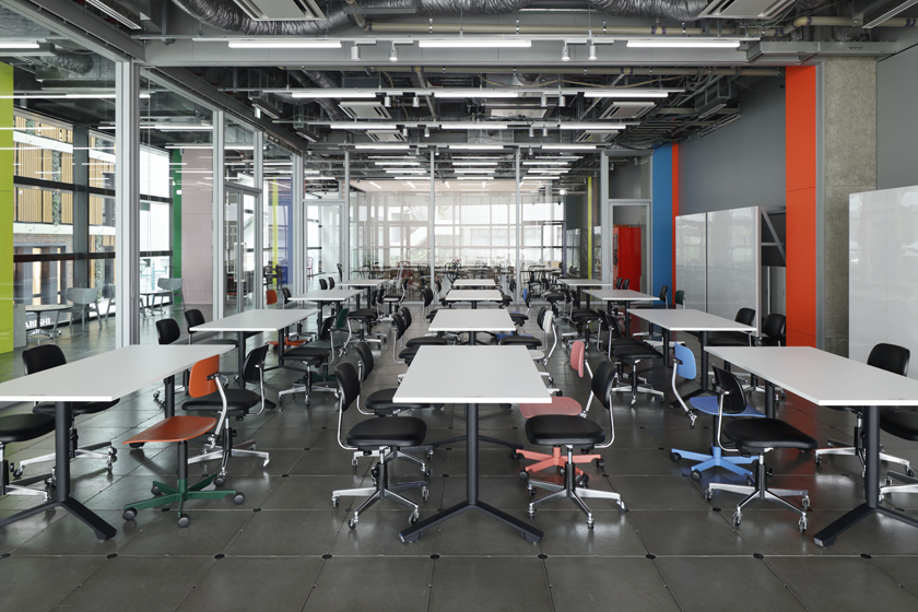
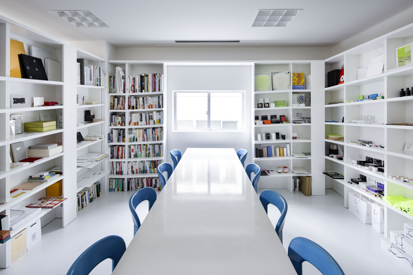
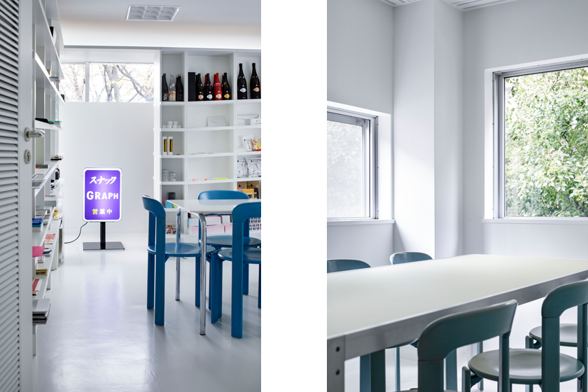
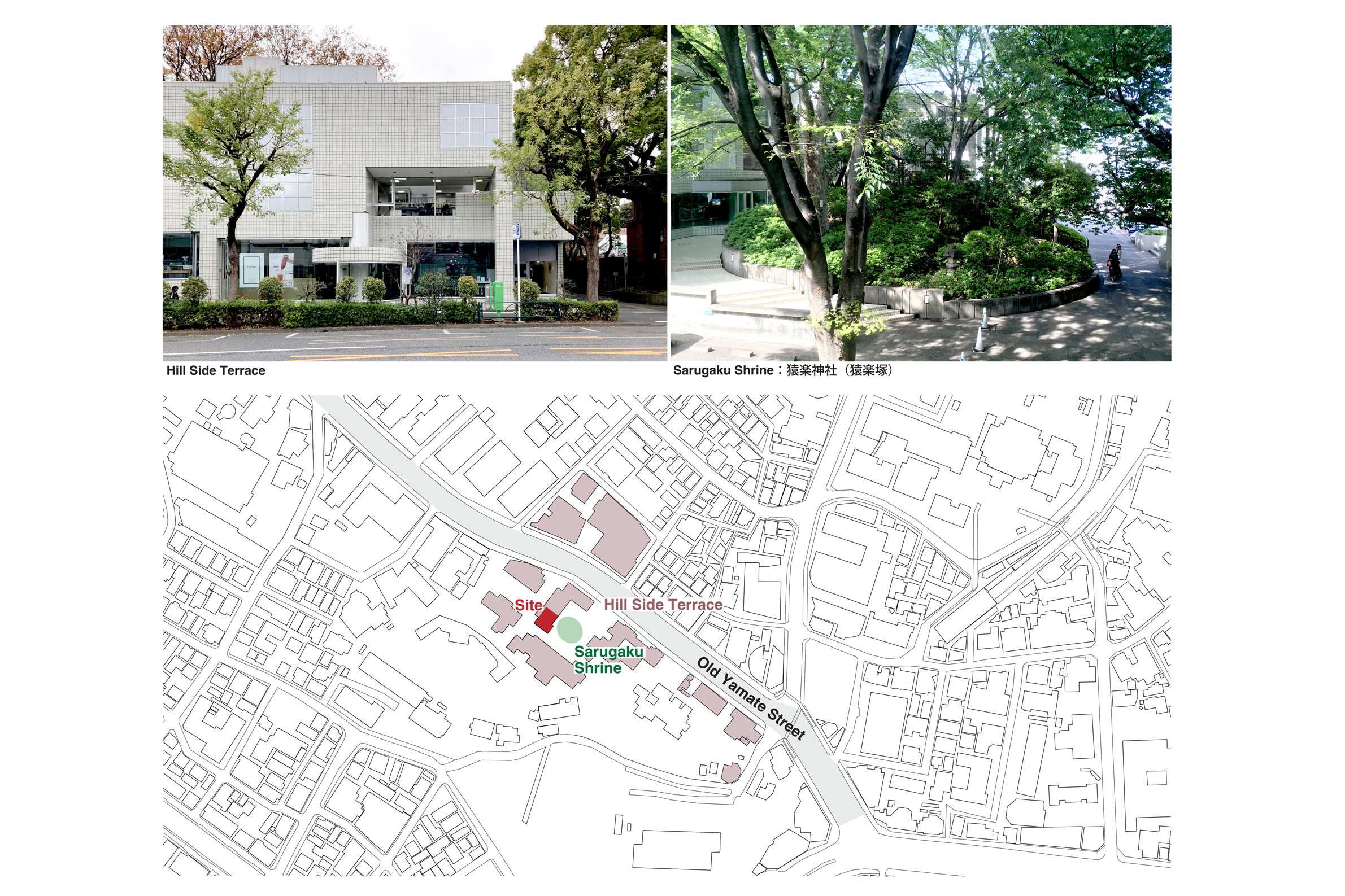
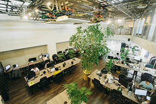
- 021ヒルサイドテラスのオフィス | GRAPH Tokyo Head Office
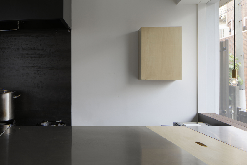
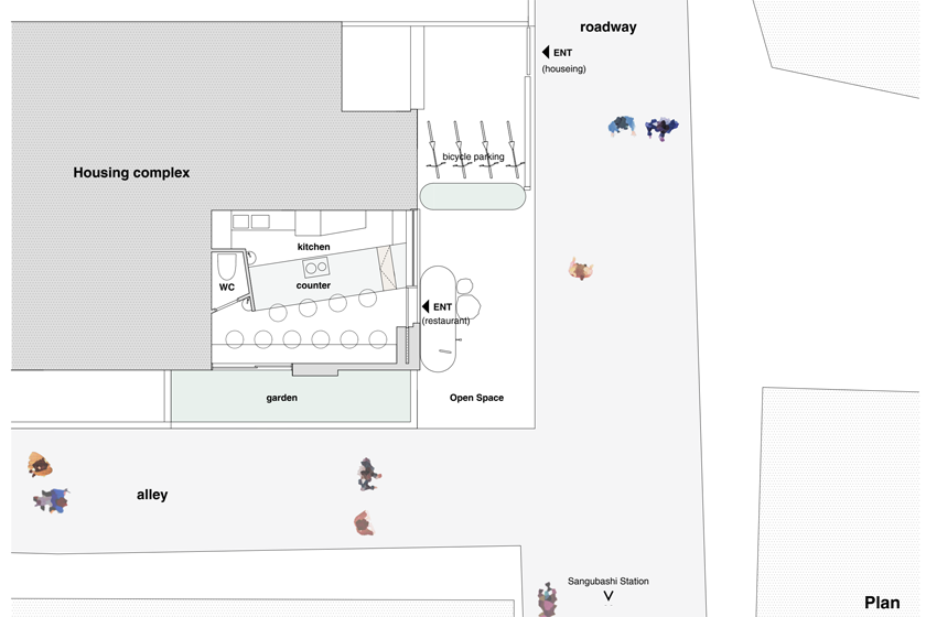
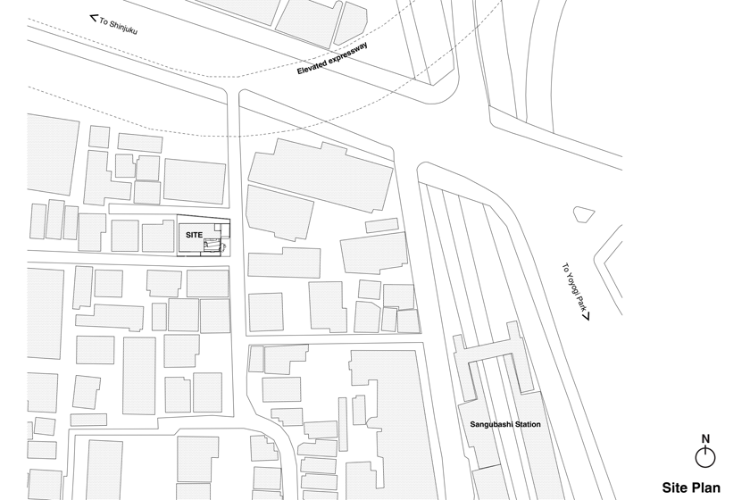
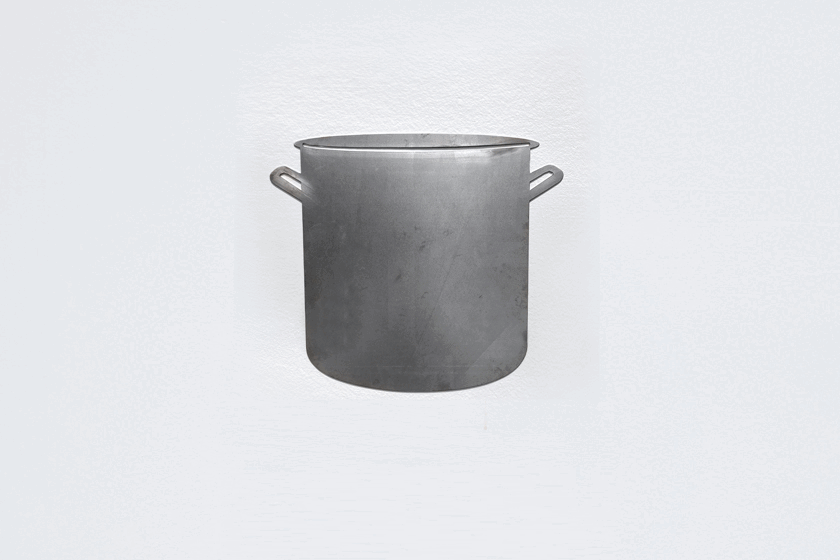
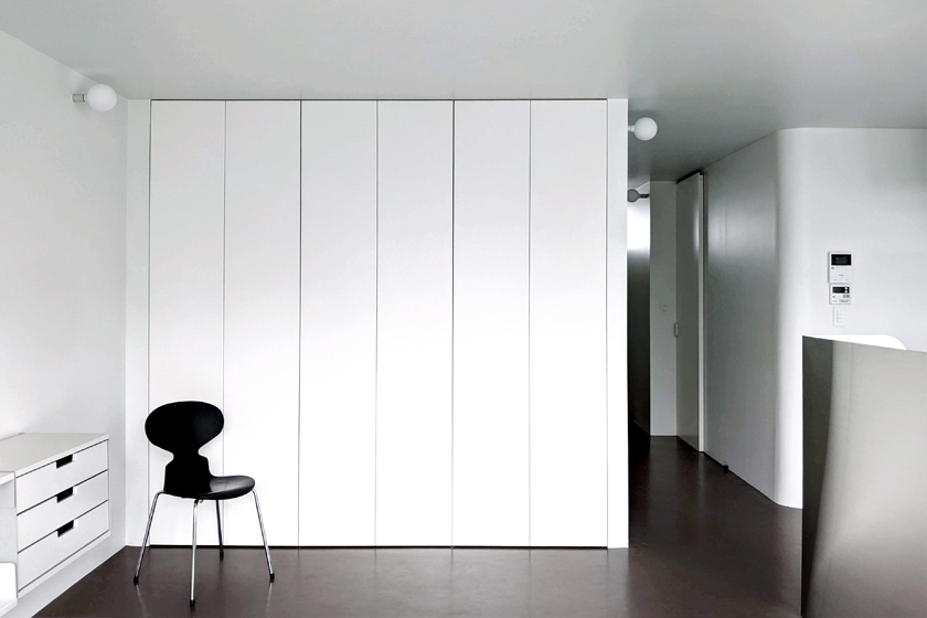
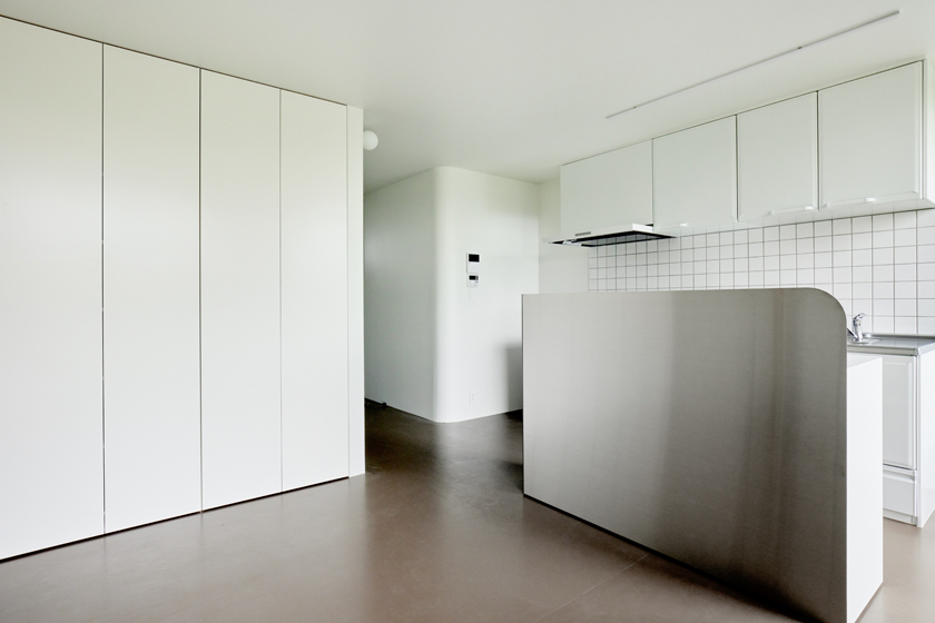
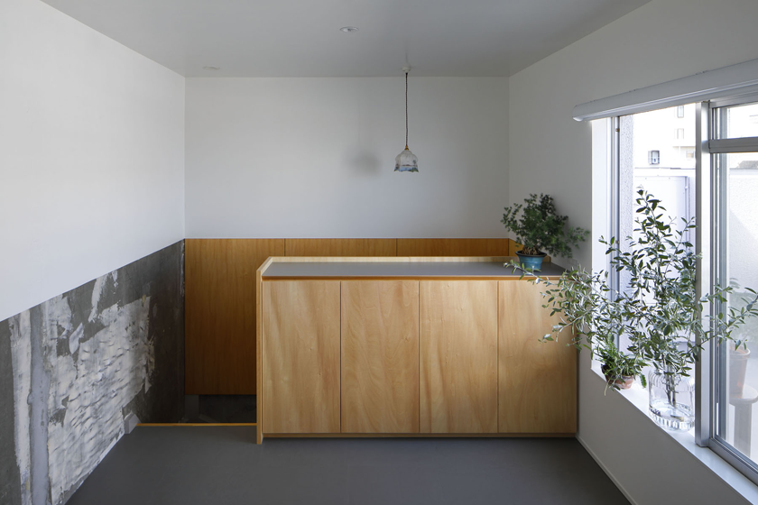
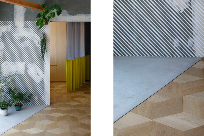
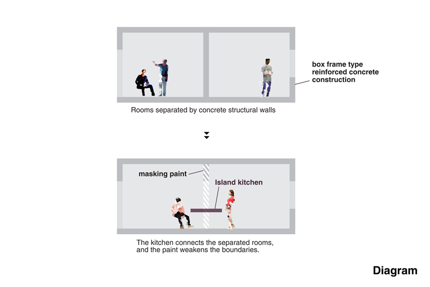
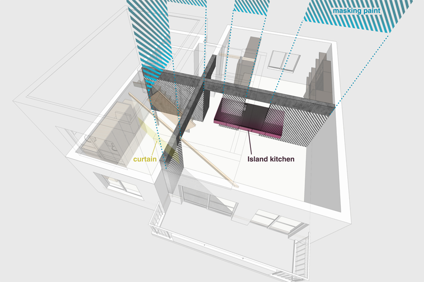
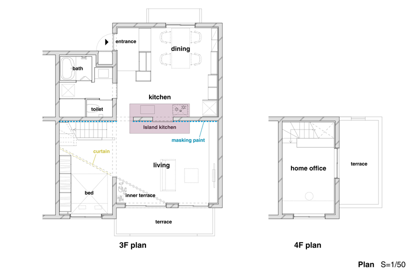
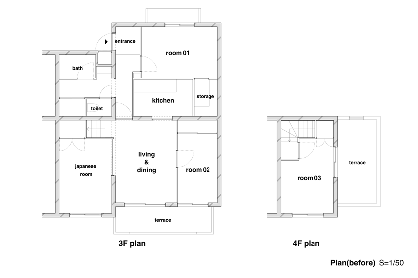
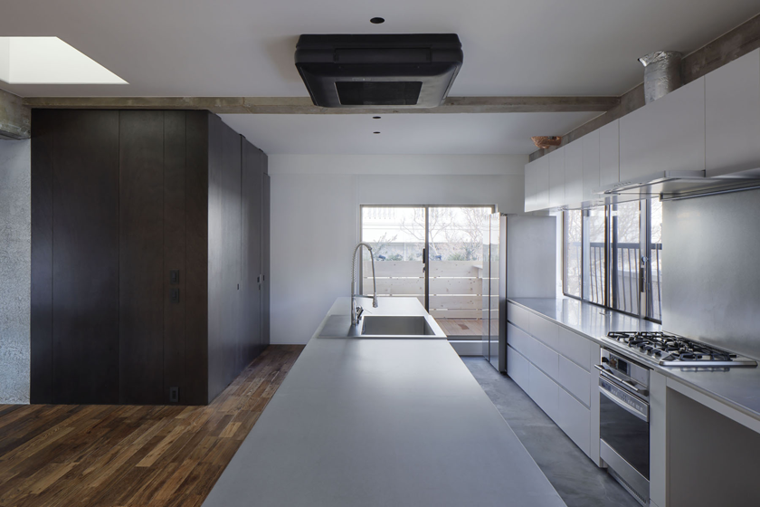
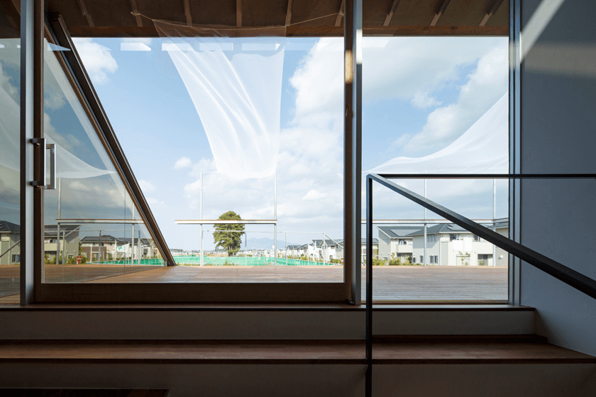
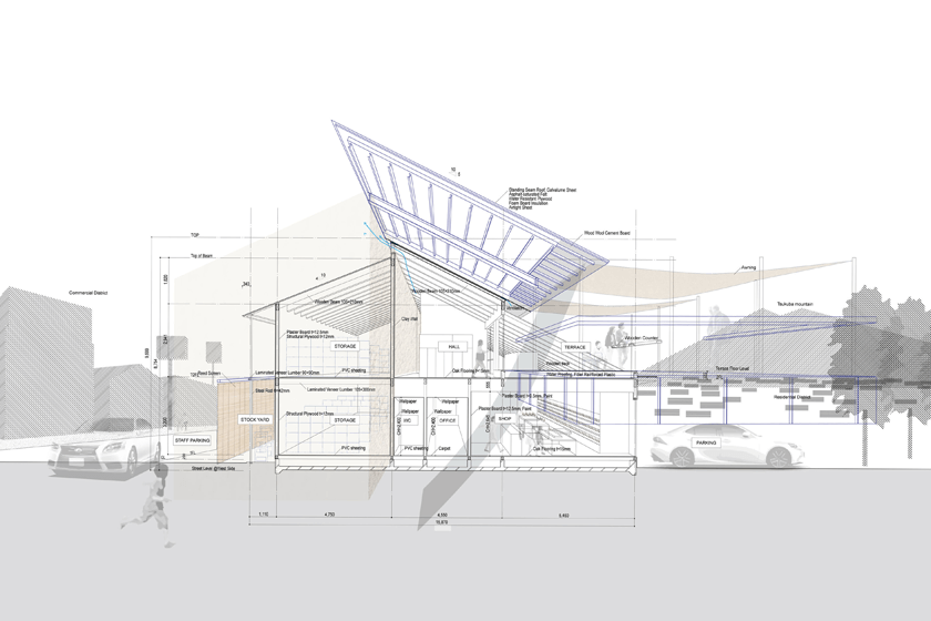
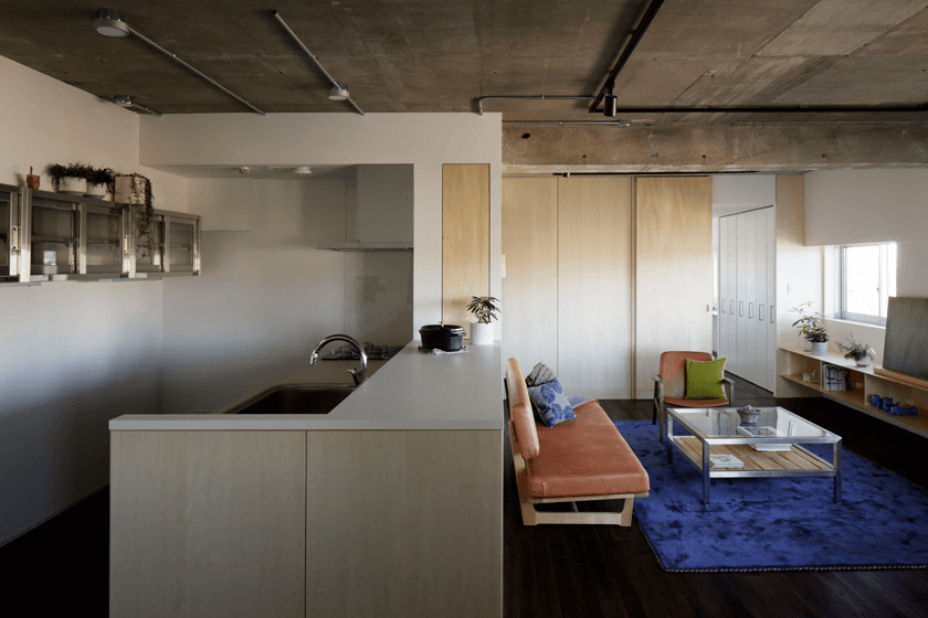
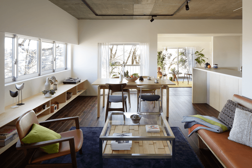
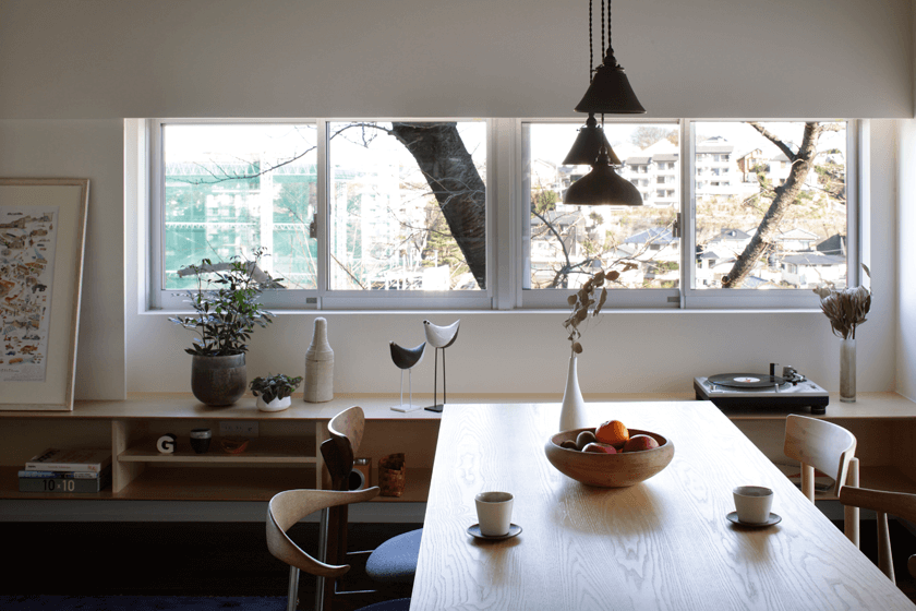
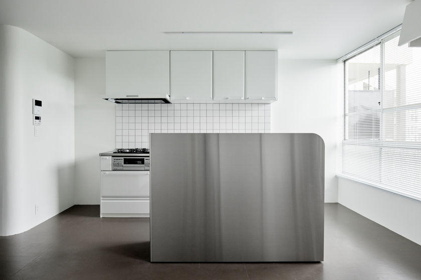
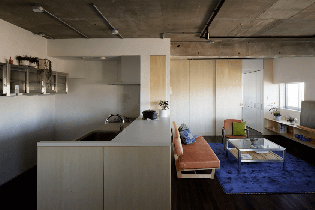
- 020アイランドキッチンの家 | The Island Kitchen Home
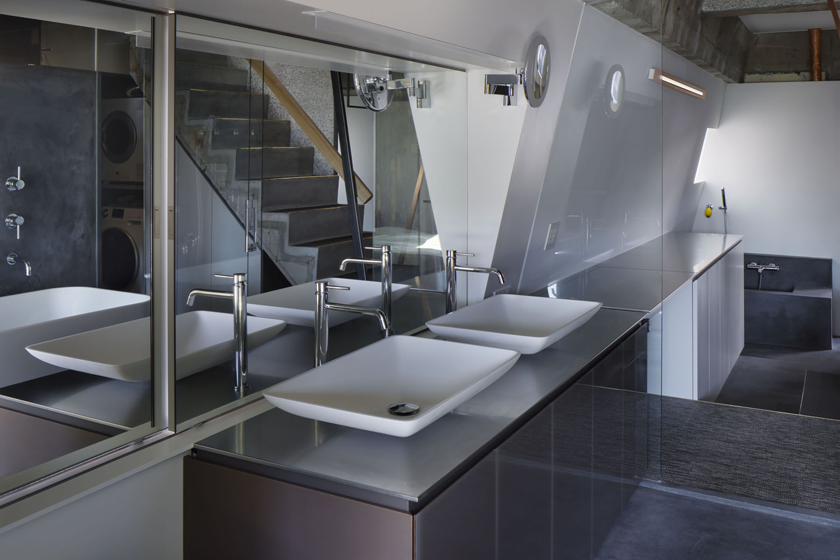
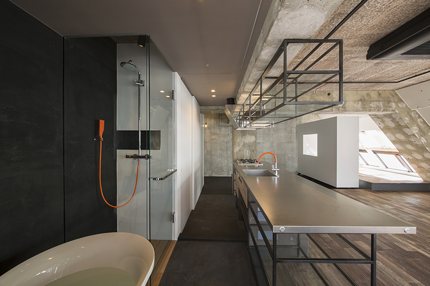
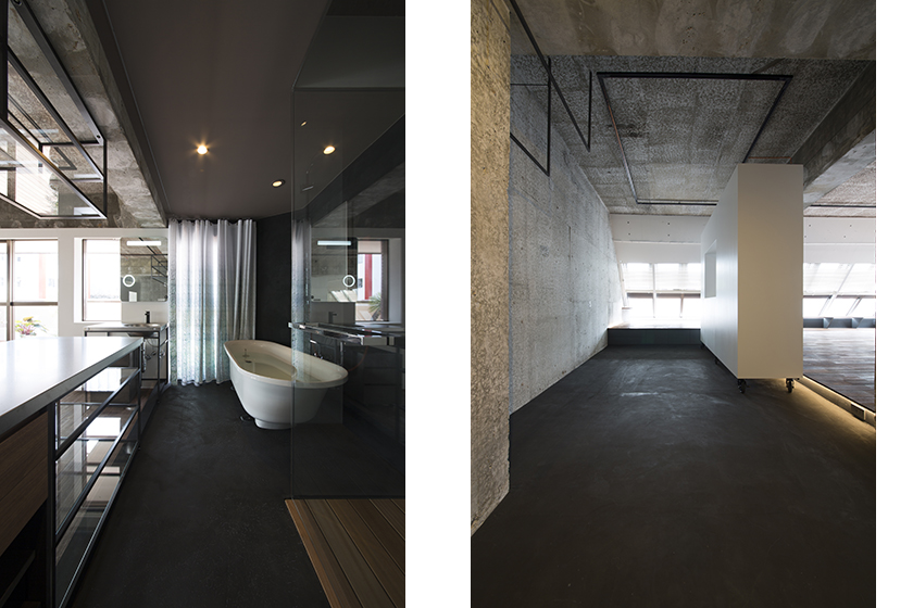
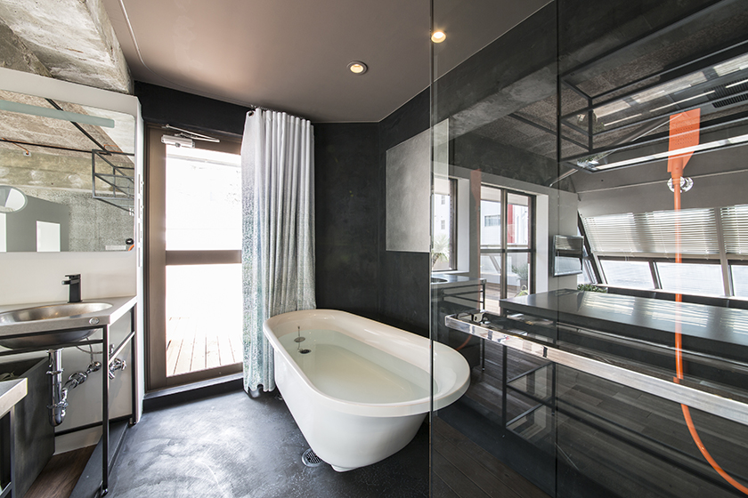
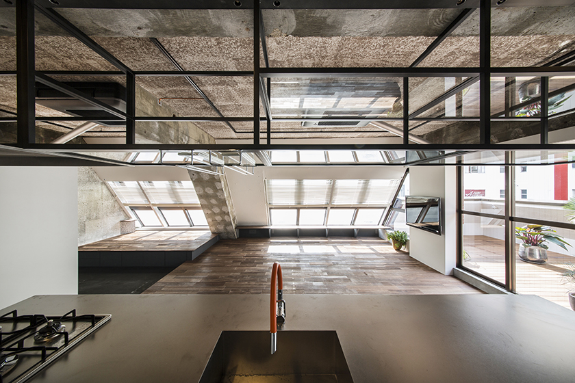
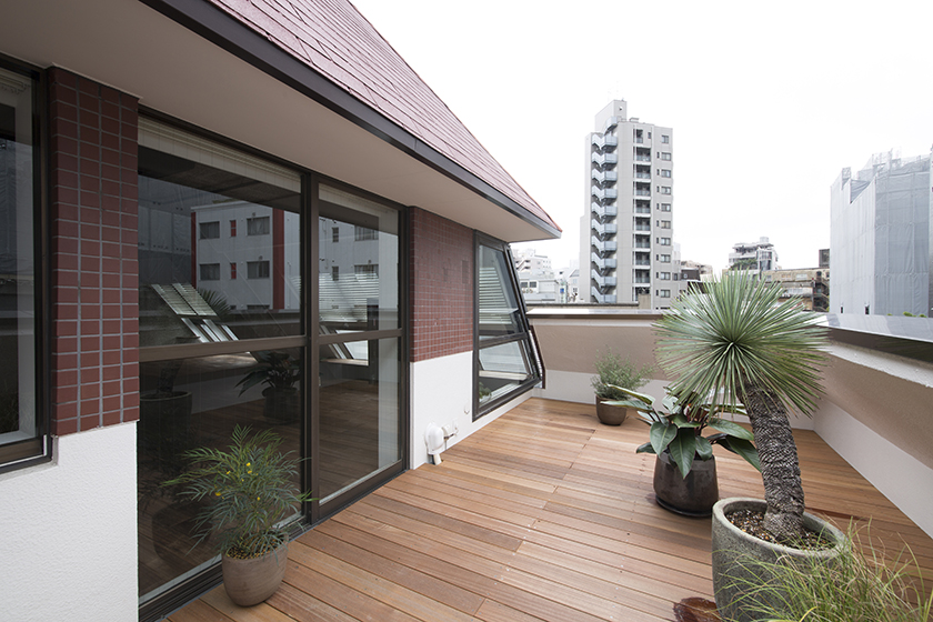
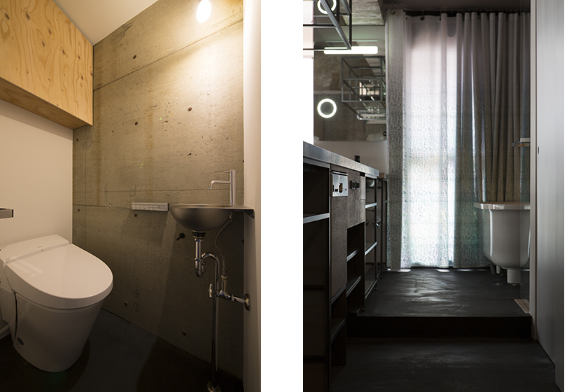
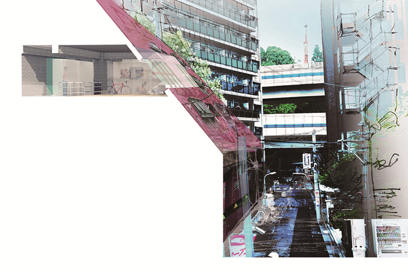
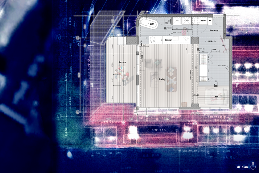
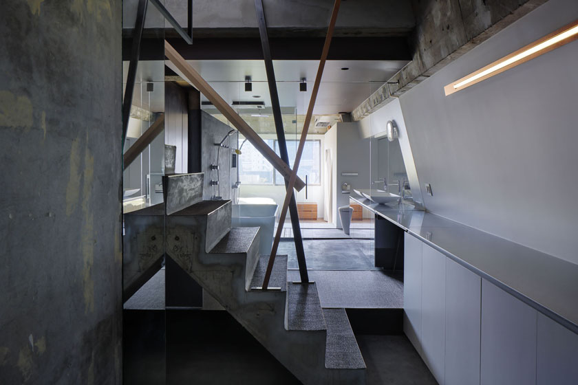
- 019麻布のペントハウス | Tokyo Penthouse
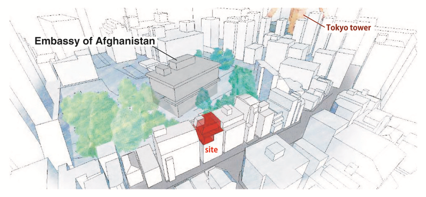
- 018糀谷のくずし割烹 | aging and materials
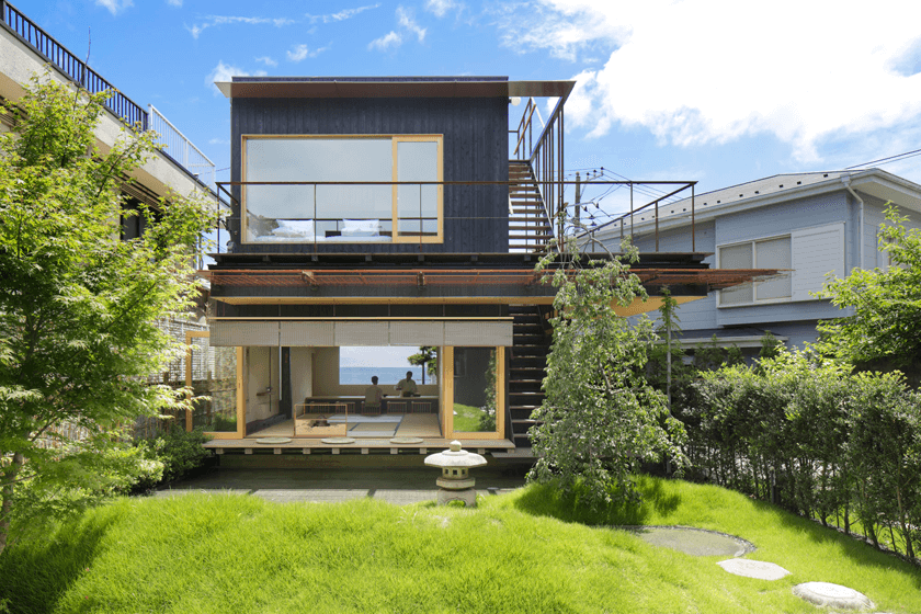
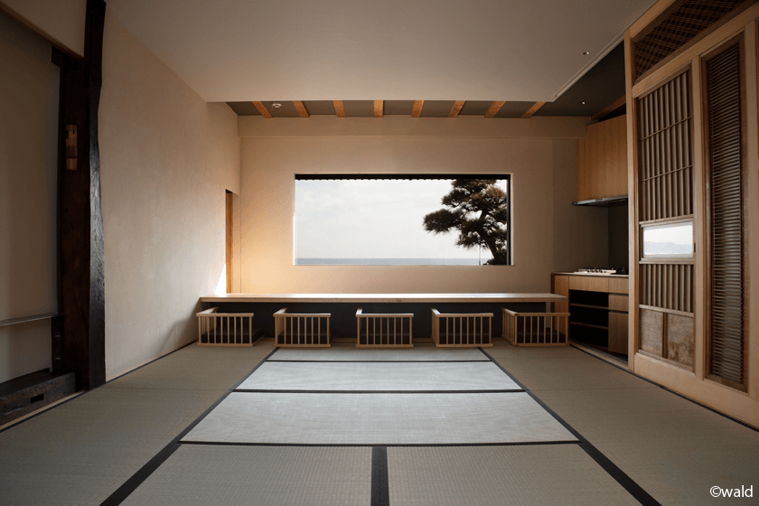
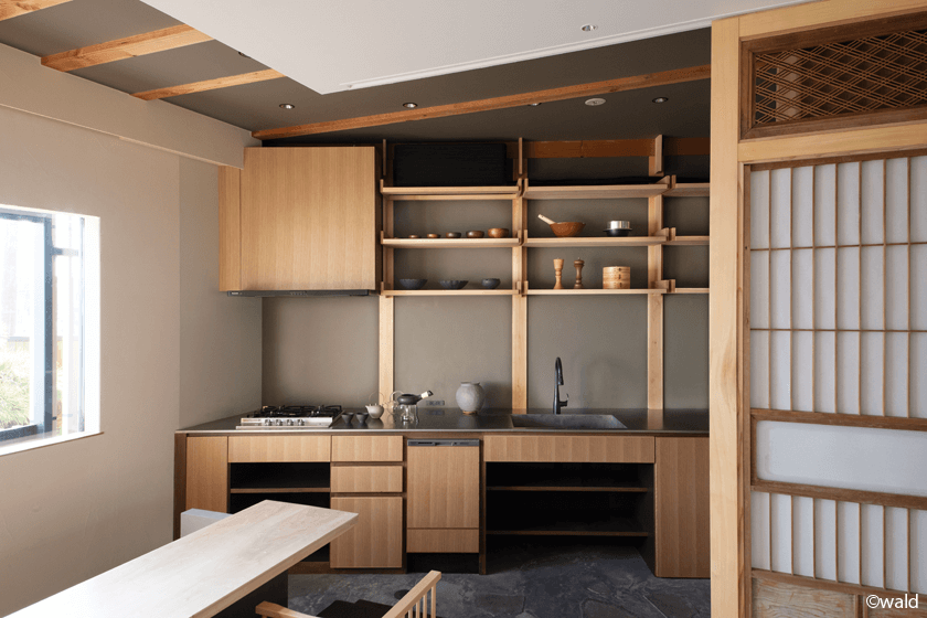
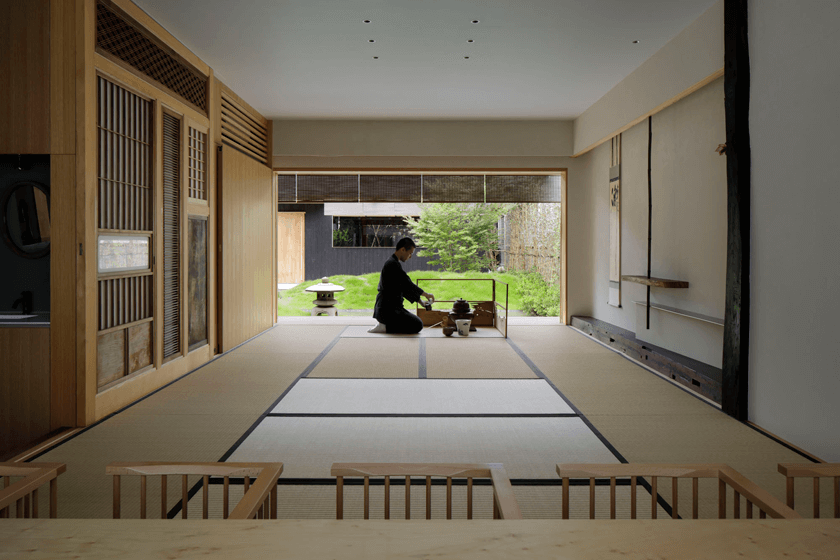
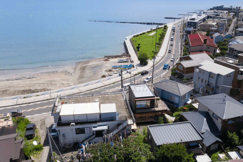
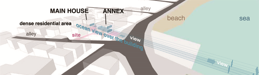
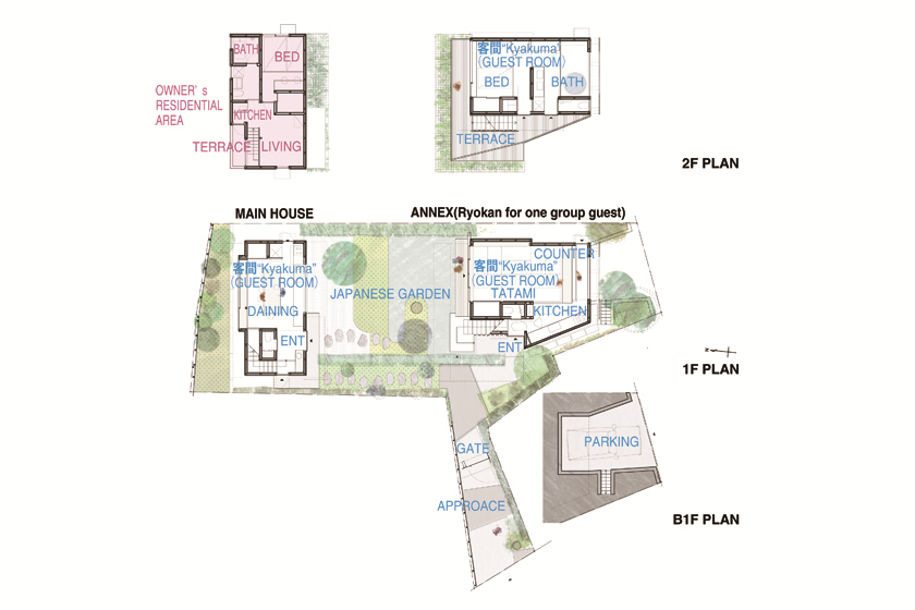
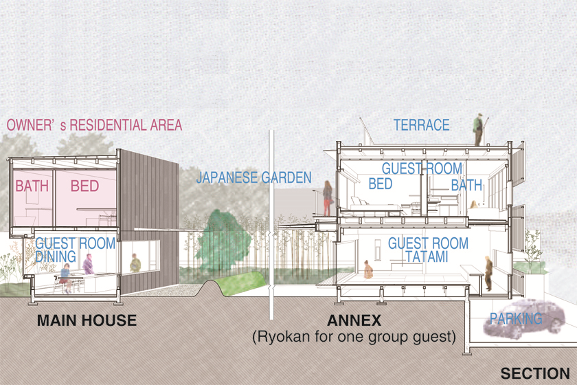
- 017岸家| Small houses for ”RYOKAN”
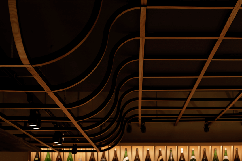
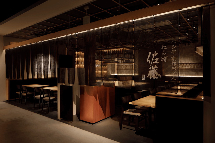
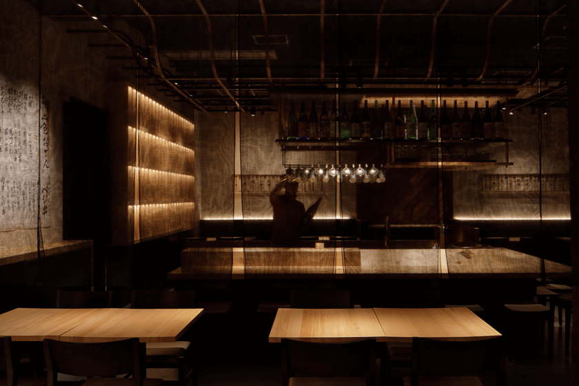
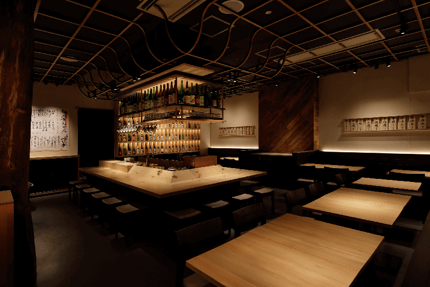
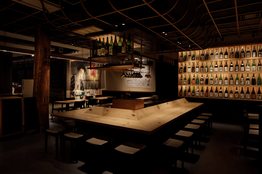
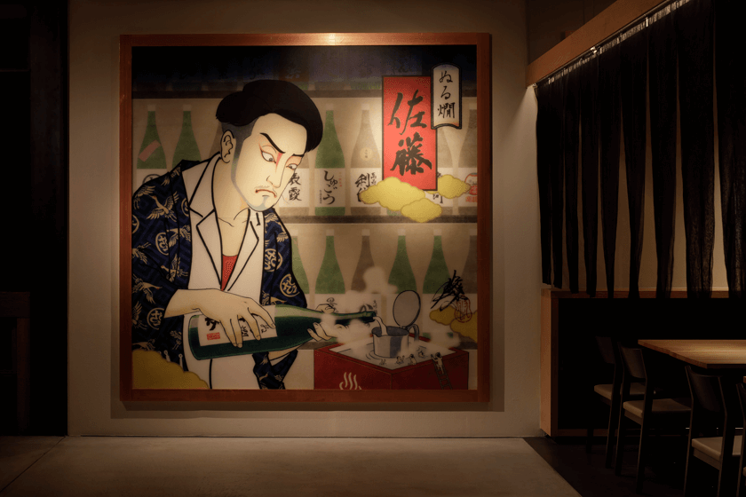
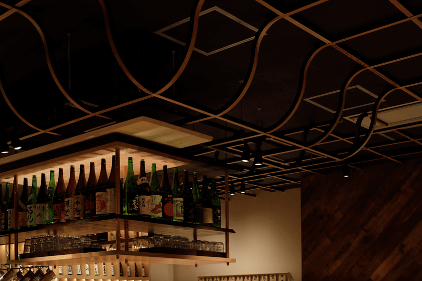
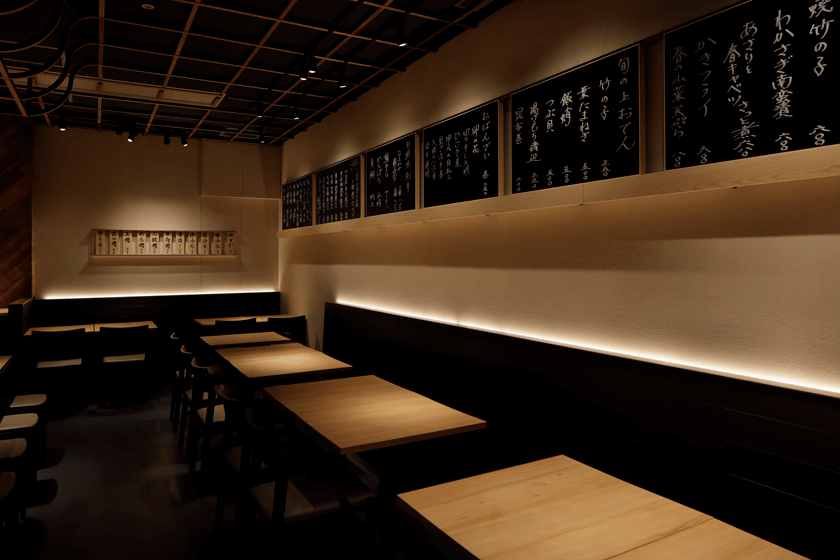
- 016ぬる燗佐藤ヒカリエ|NURUKAN shibuya
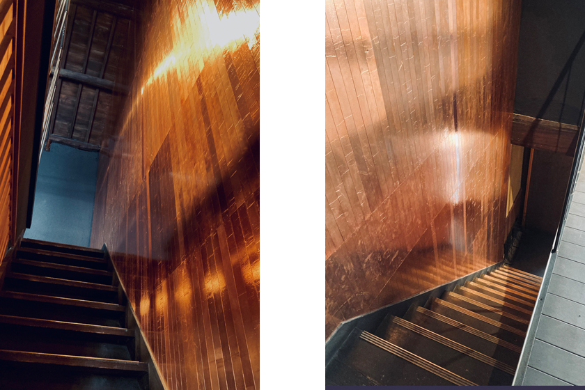
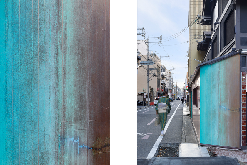
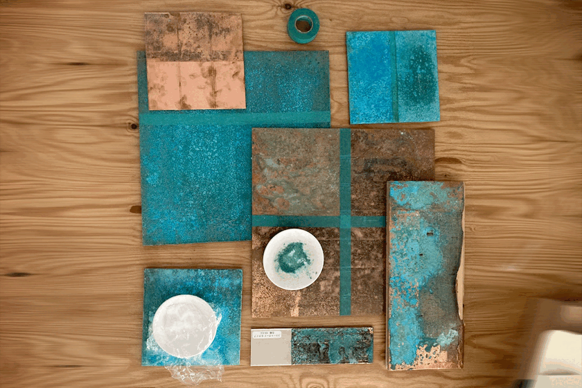
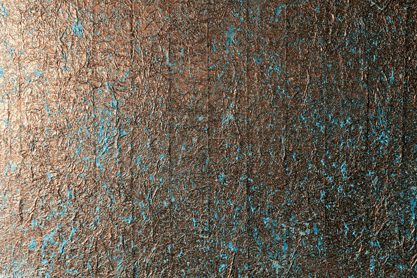
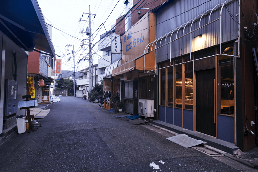
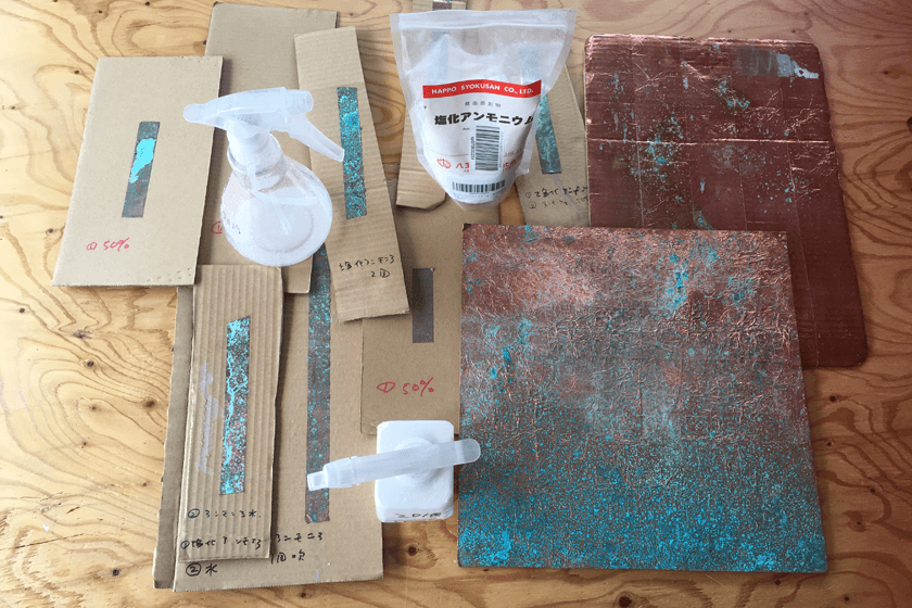
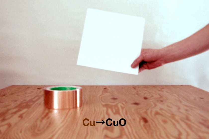
- 015アカガネの水屋 | Copper pavilion
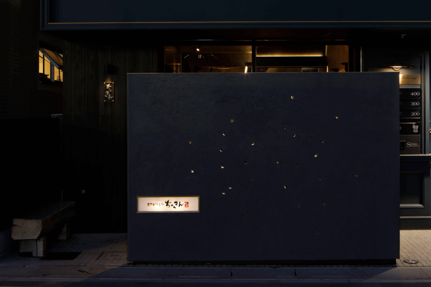
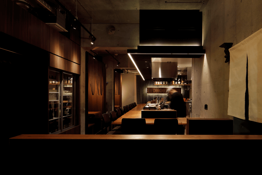
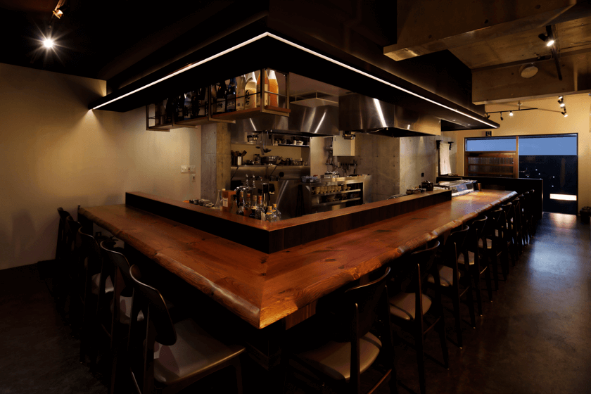
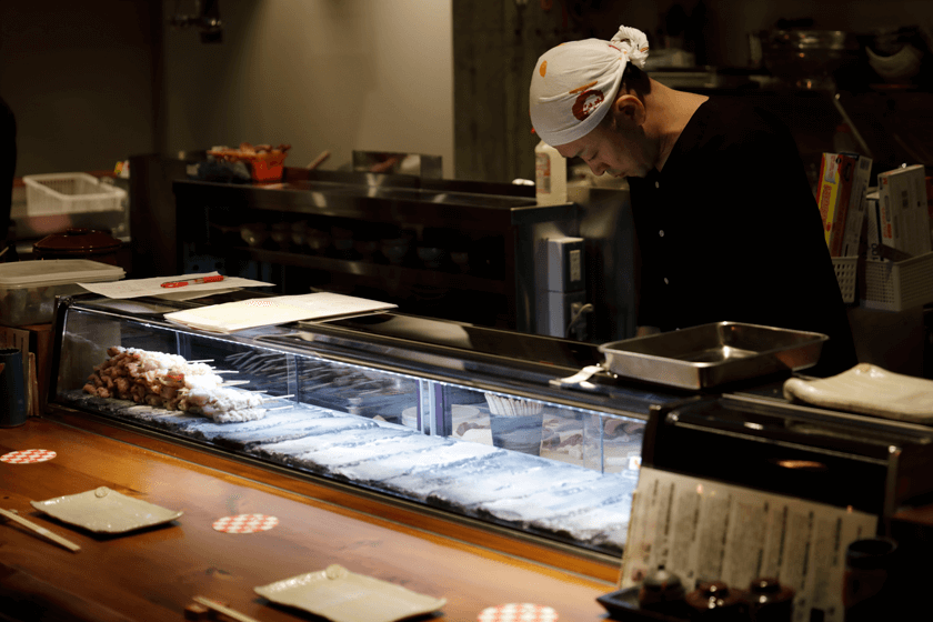
- 014炭火焼鳥 ちっきん はなれ|CHIKKIN
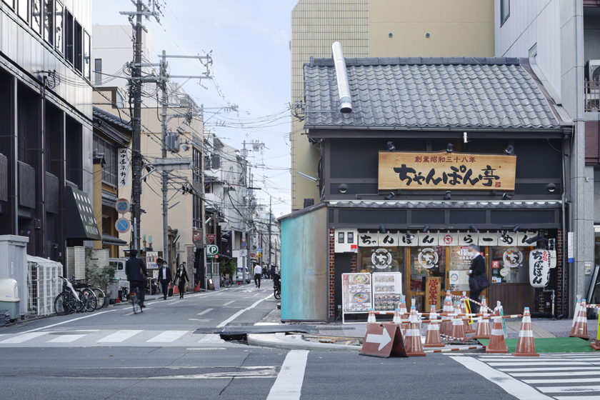
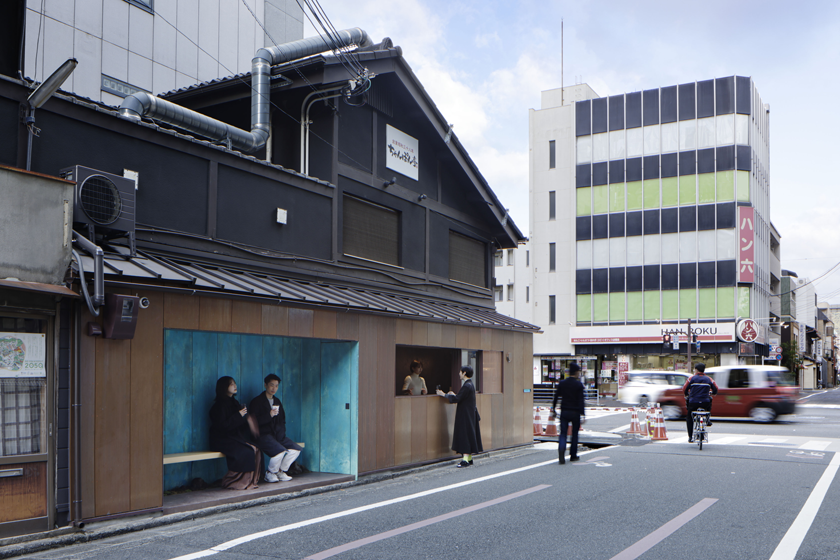
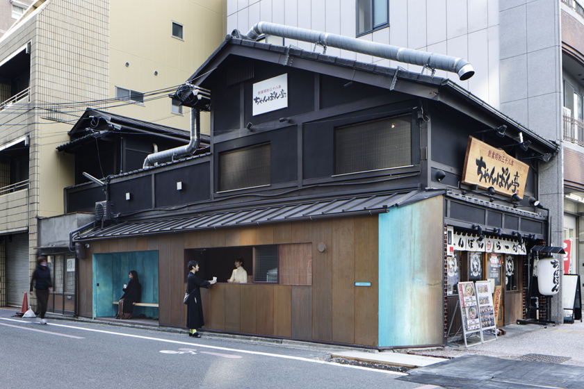
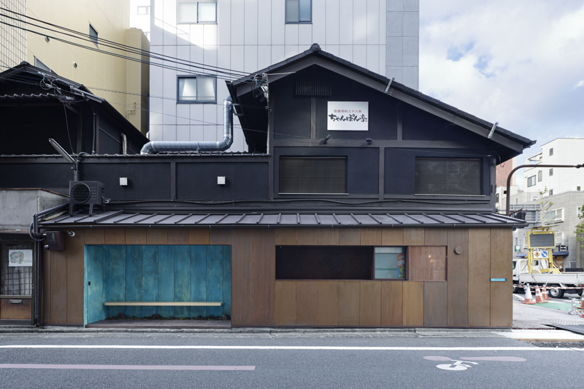
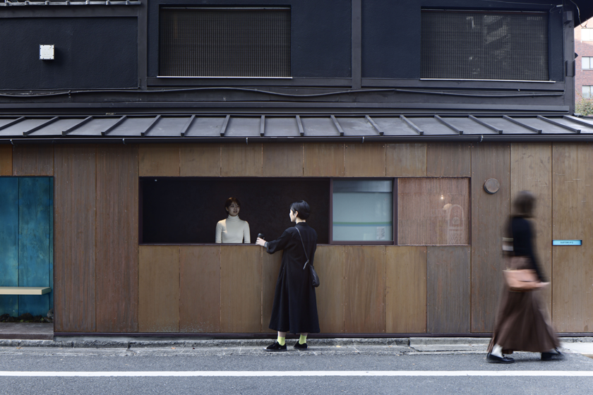
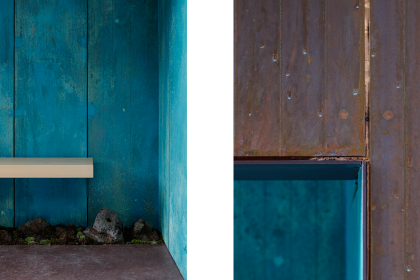
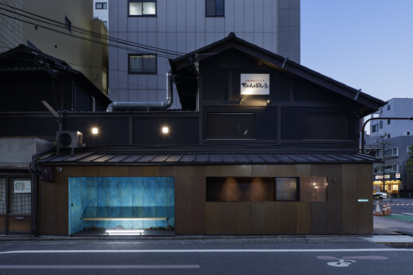
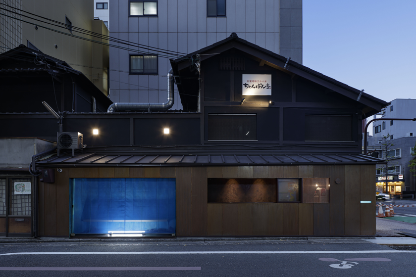
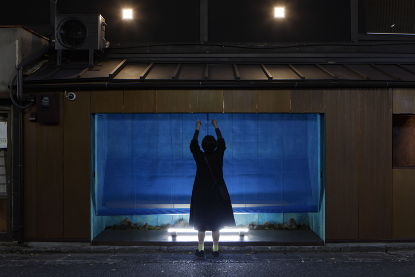
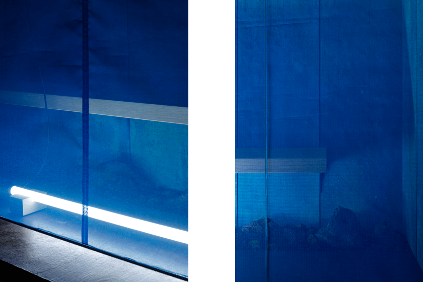
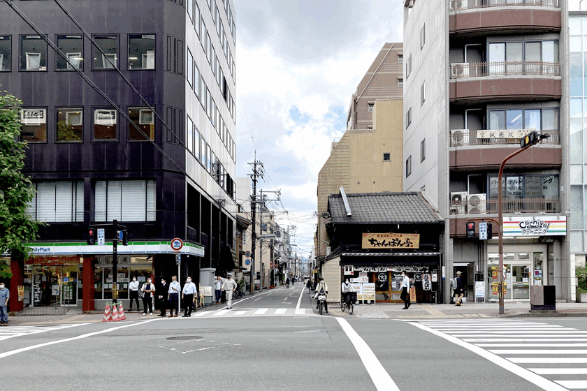
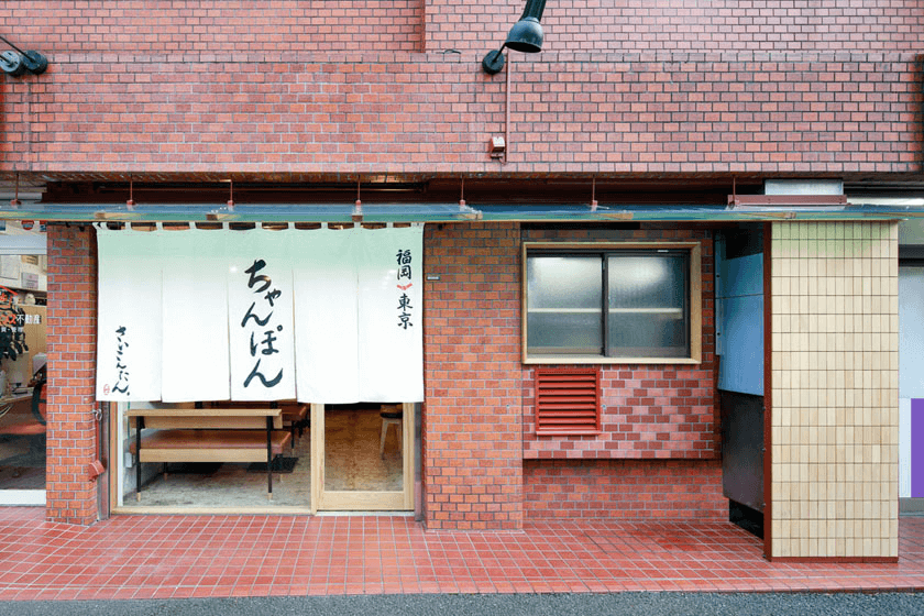
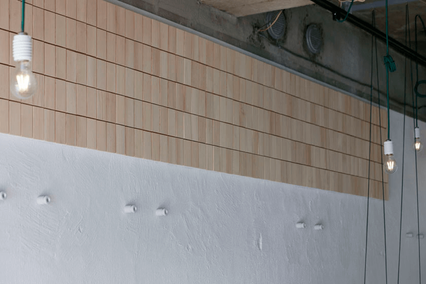
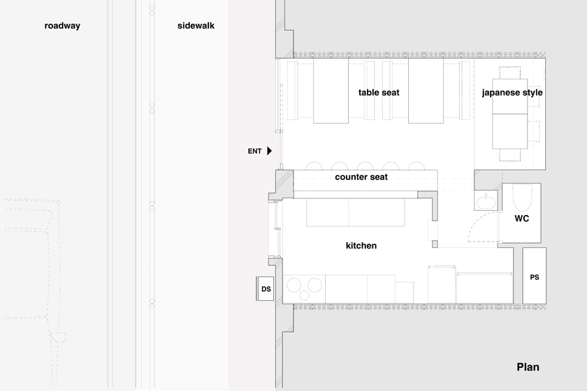
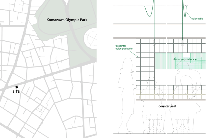
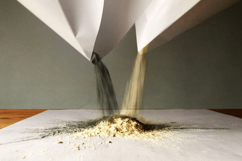
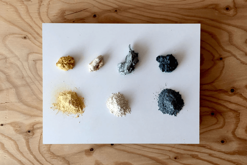
- 013駒沢通りのチャンポン|CHANPON
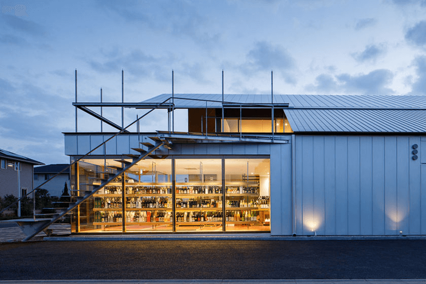
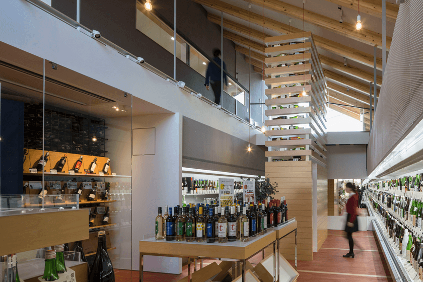
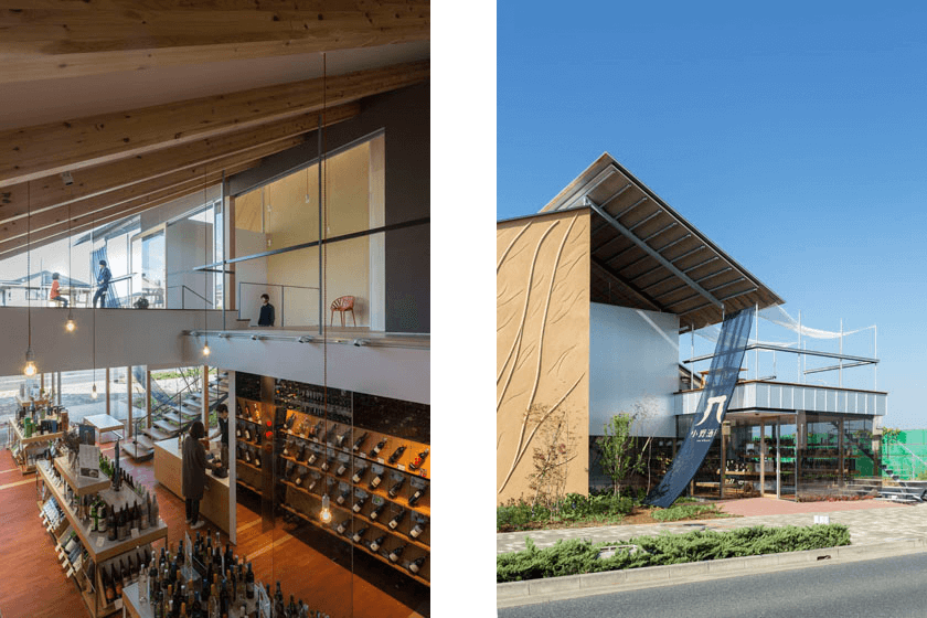
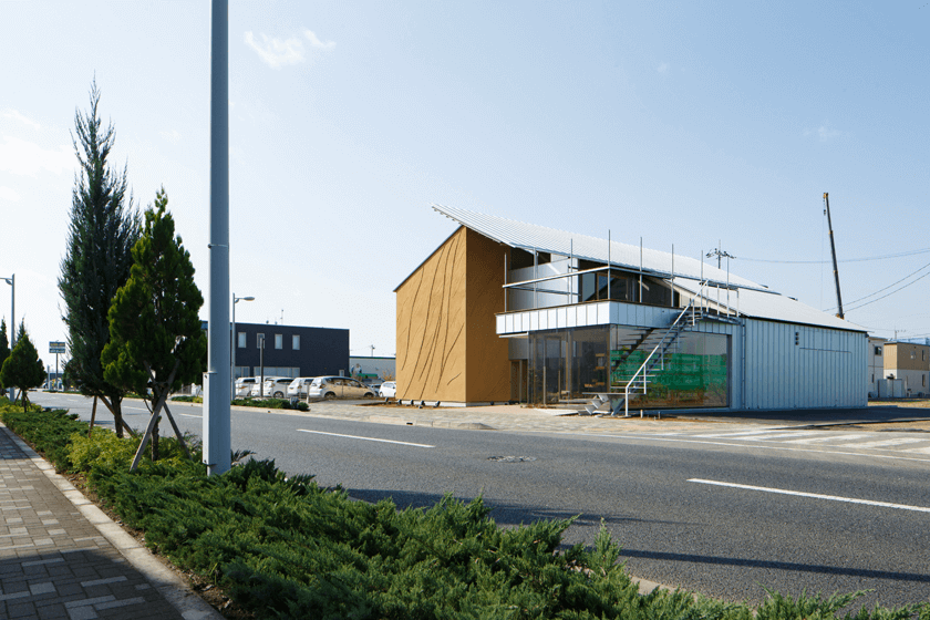
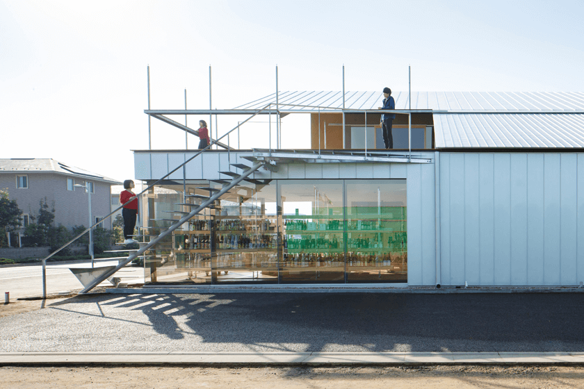
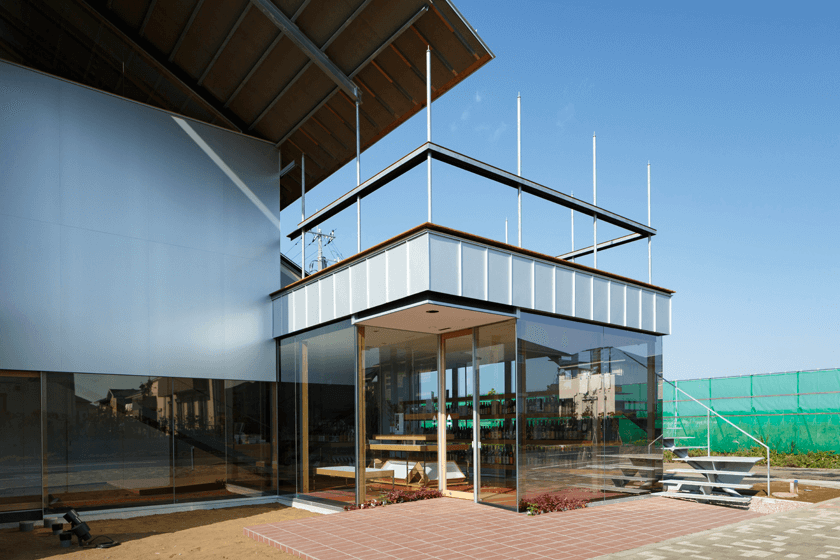
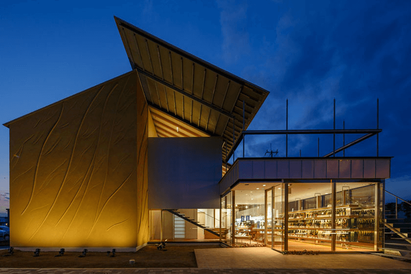
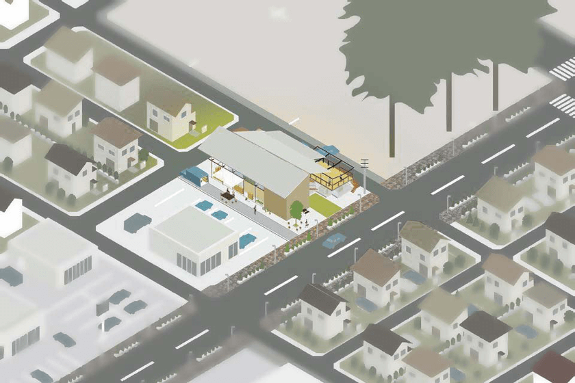
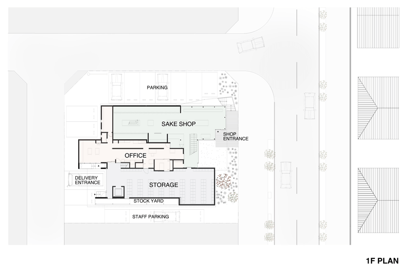
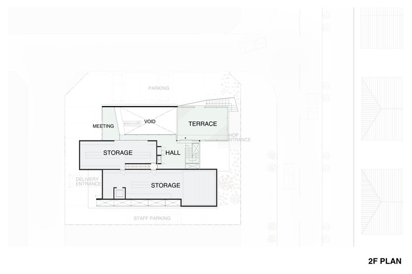
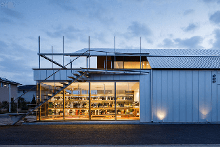
- 012Ono-Sake Warehouse
- 011丘の上のコーナーレジデンス
- 010ビコロールの家|bico
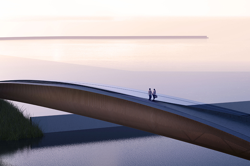
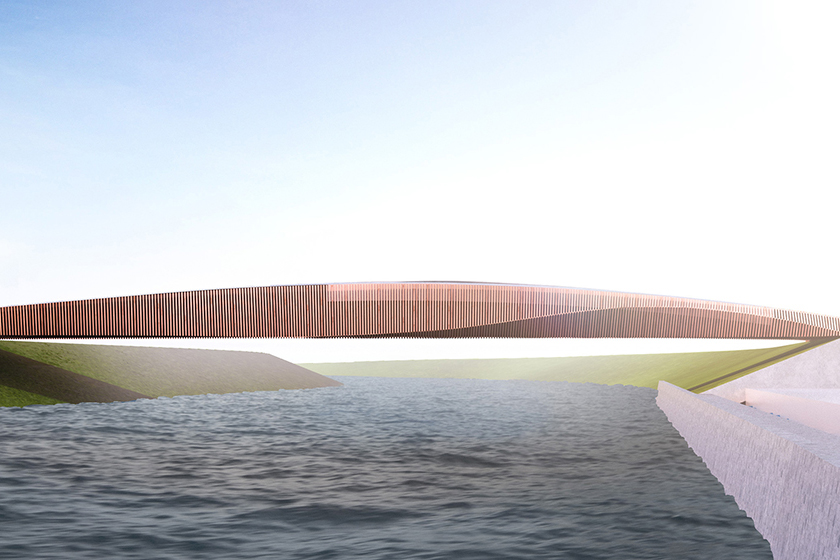
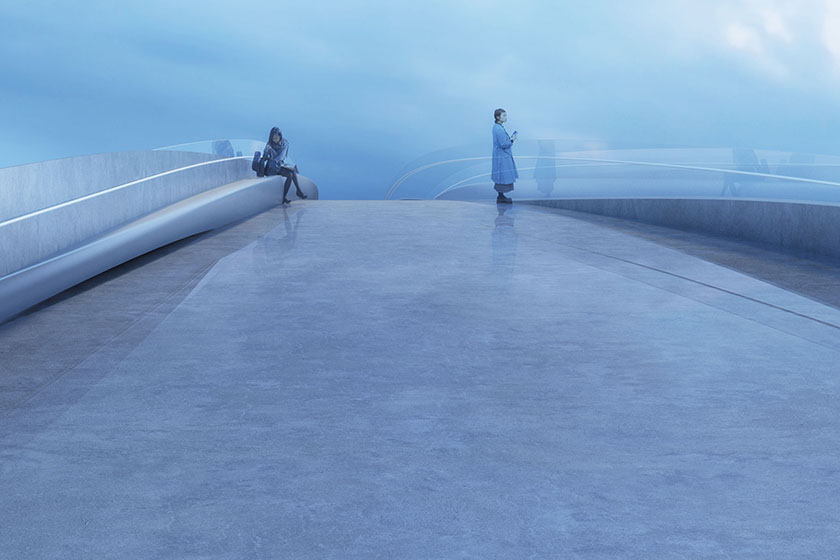
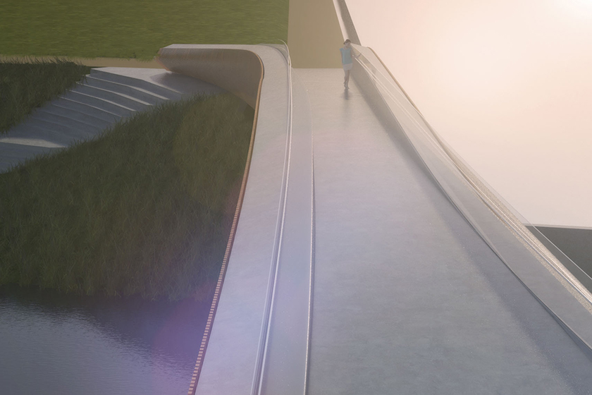
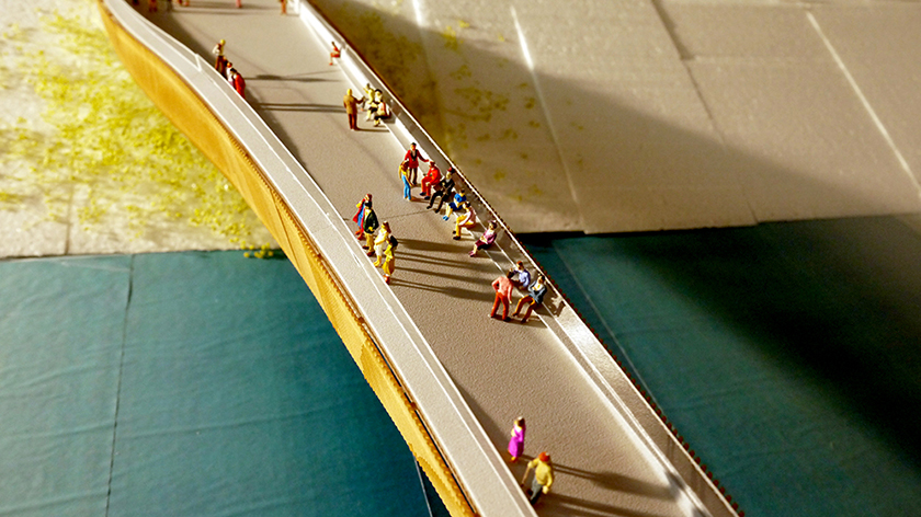
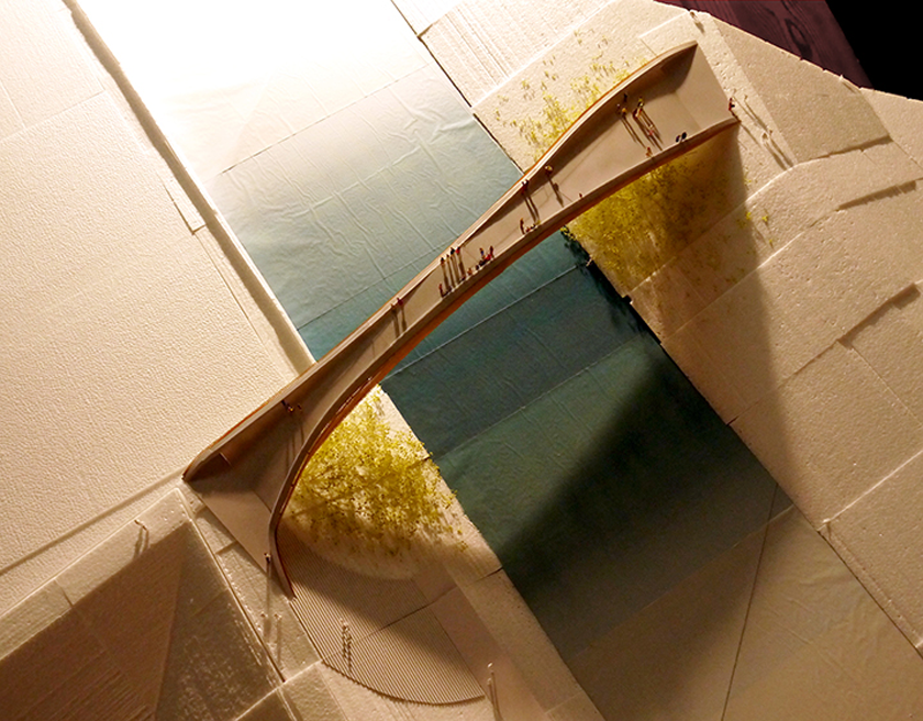
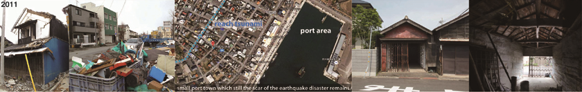
- 009南三陸町 復興の橋 | The Bridge in MINAMI-SANRIKU
- 008housing_Buttress
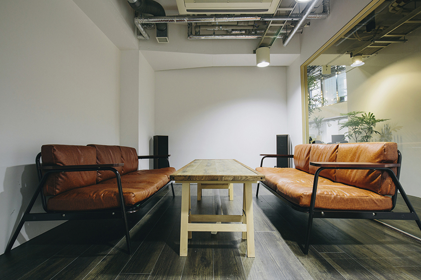
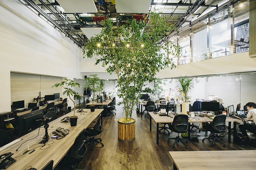
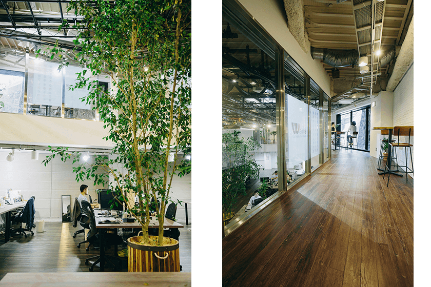
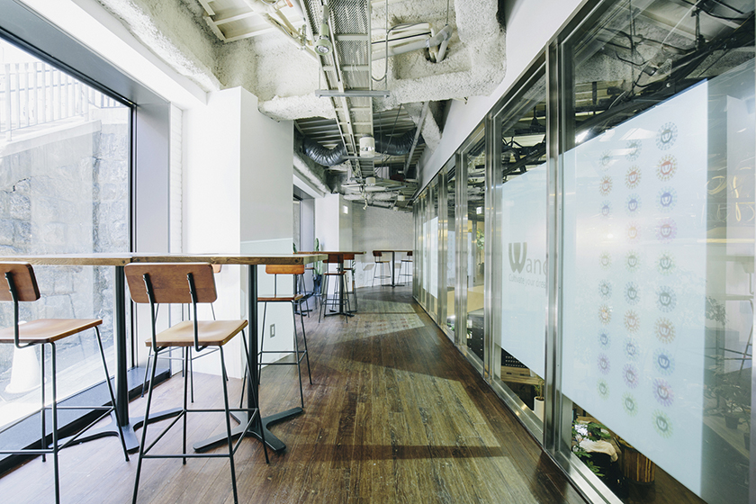
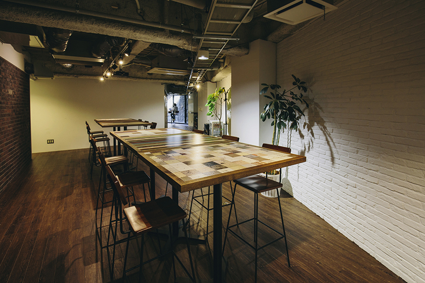
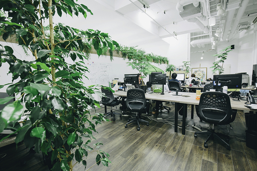
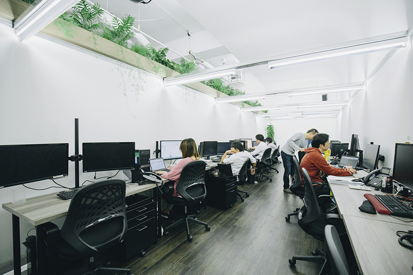
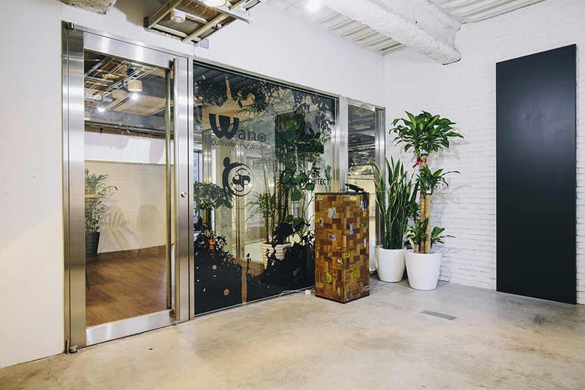
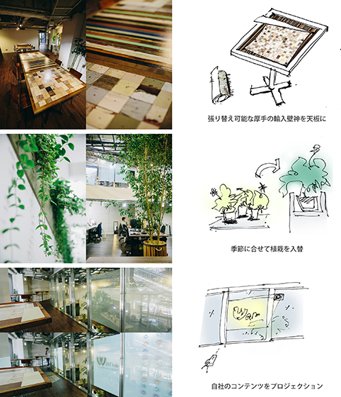
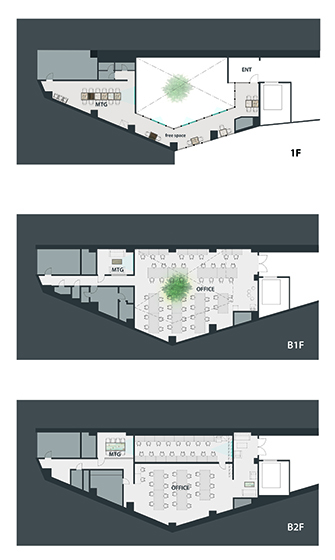
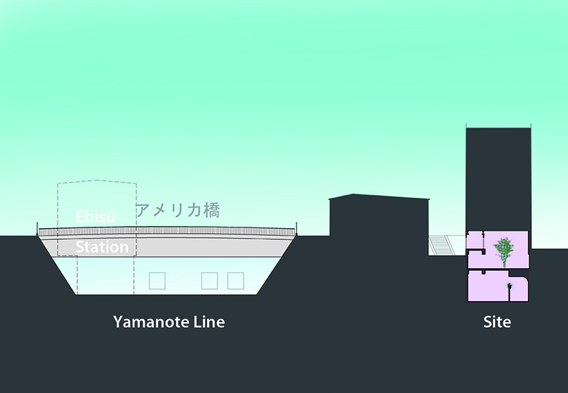
- 007Wano Head Office
- 006トーキョーロフト|tokyo LOFT
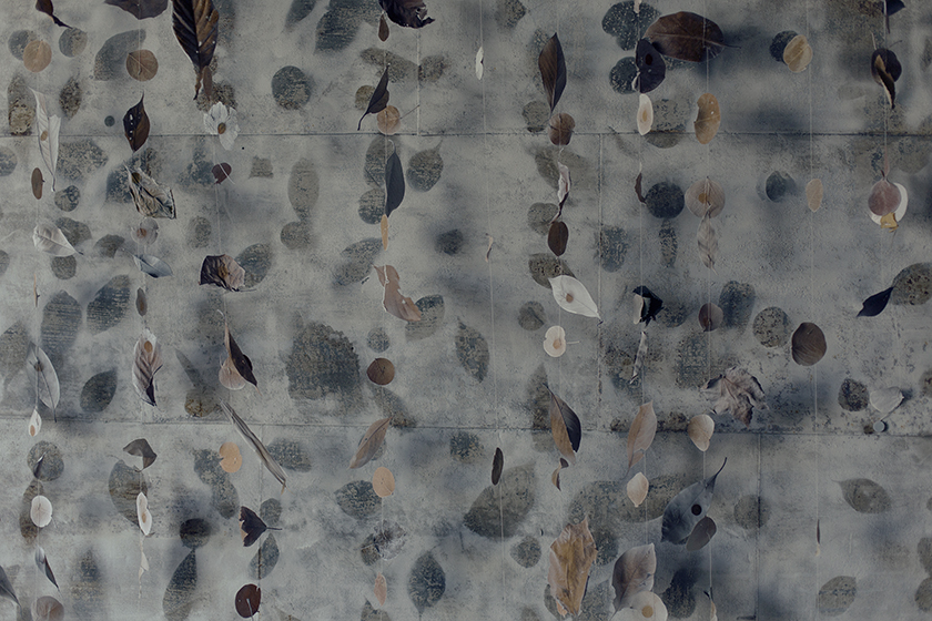
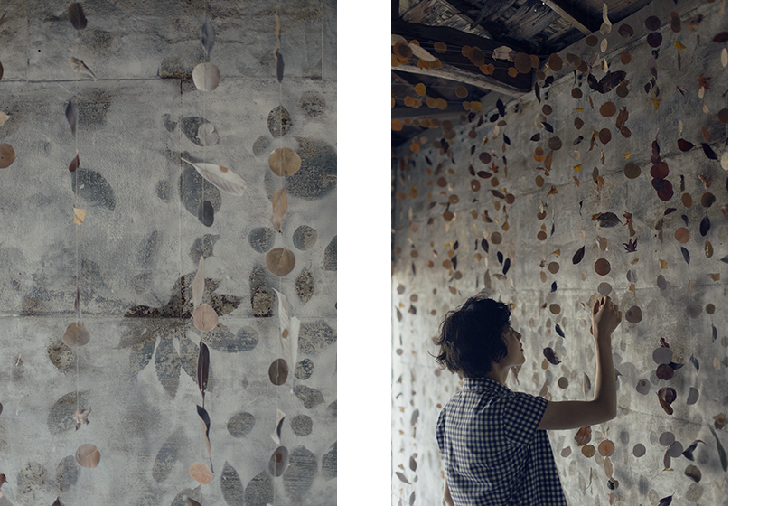
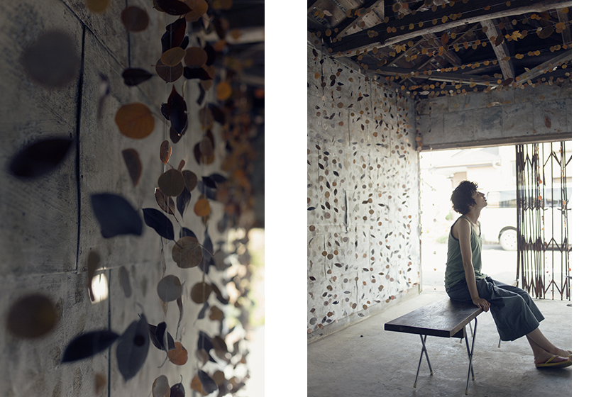
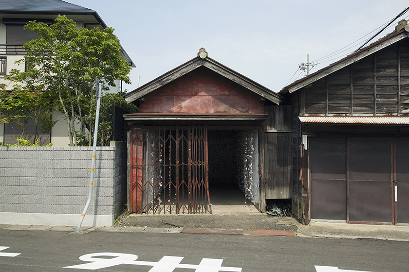
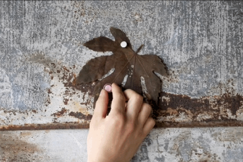
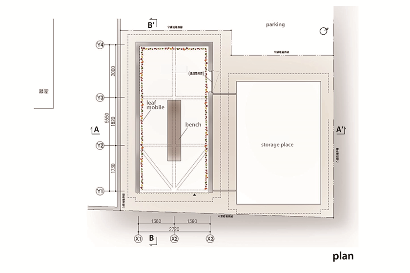
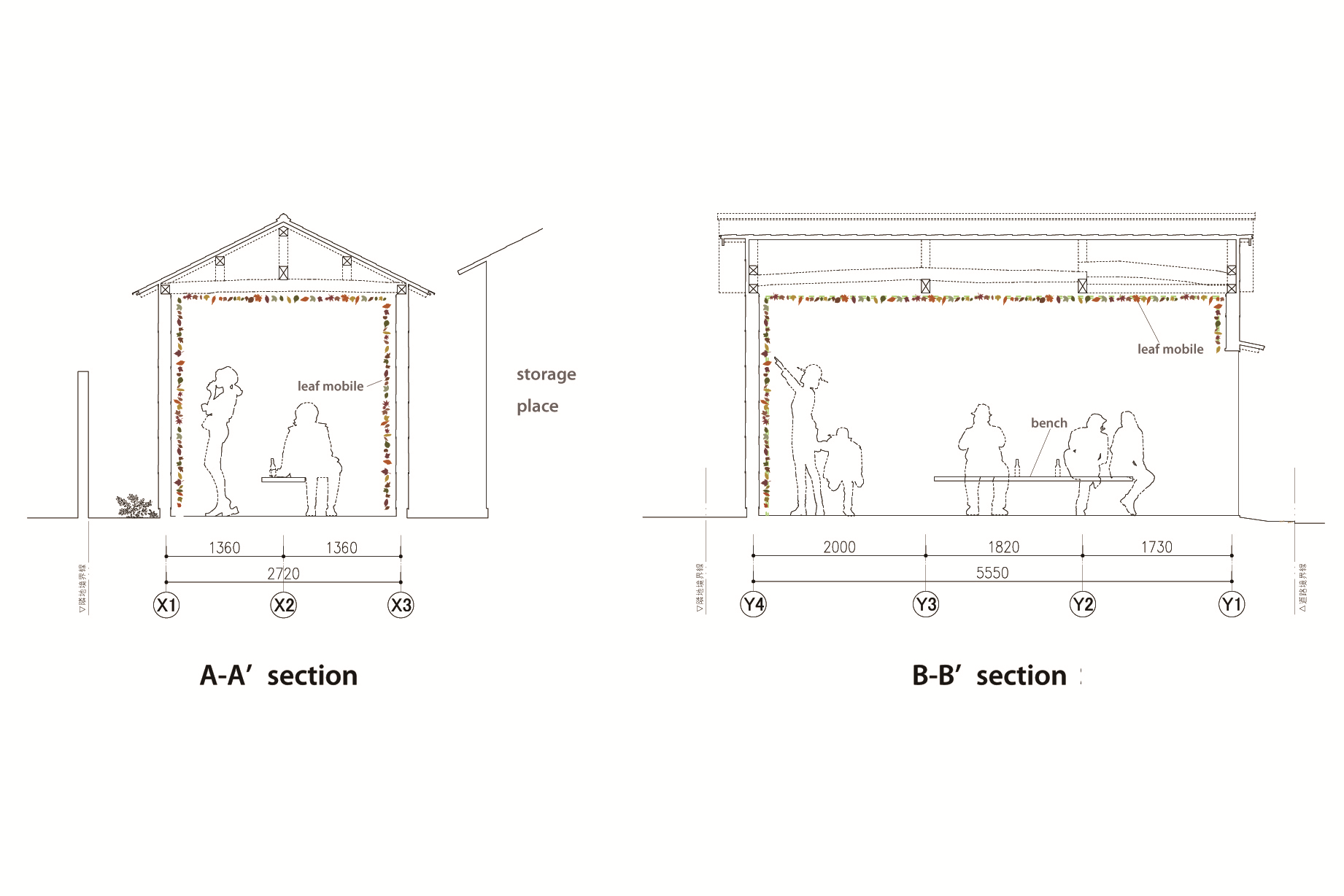
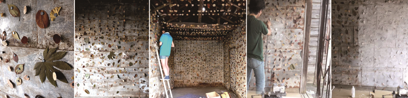
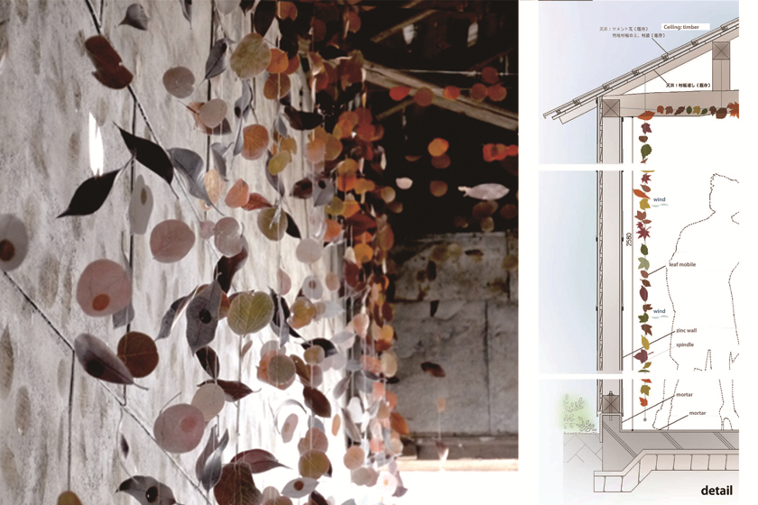
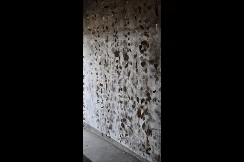
- 005葉っぱの涼屋|Shed of leaf mobile
- 004名古屋のアトリエ | pRC Painting Studio
- 003伊豆アネックス |IZU ANNEX
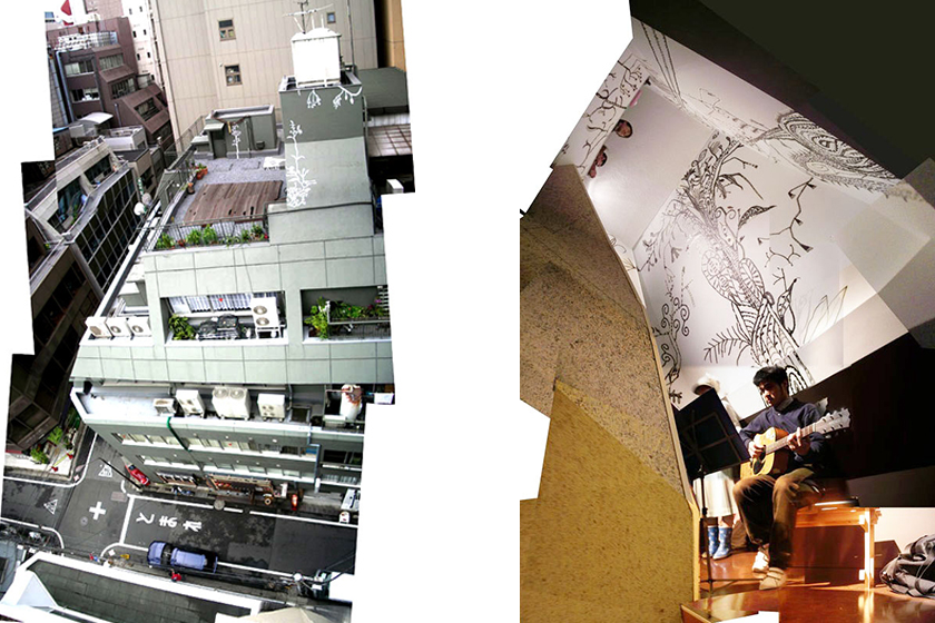
- 002街の階段室|Stair Case in Kanda
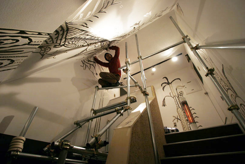
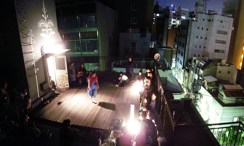
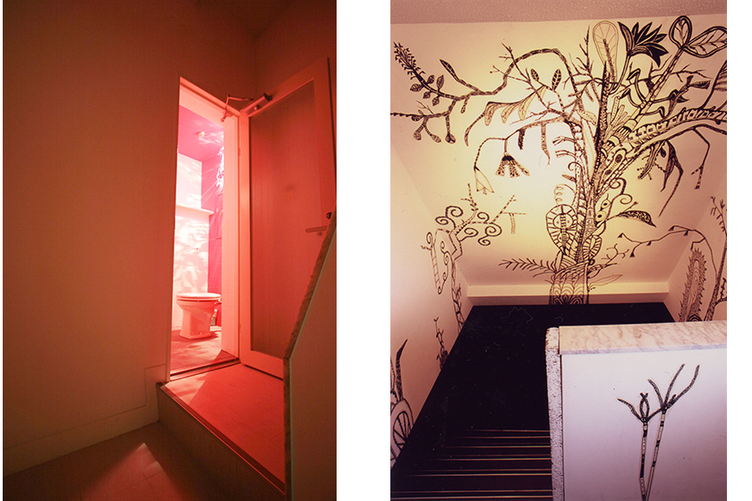
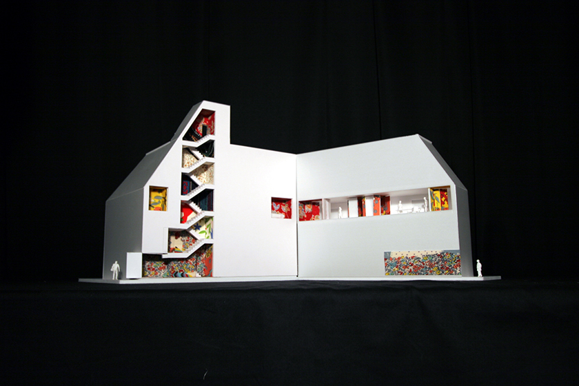
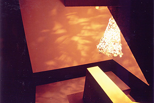
- 001メビウスの卵展 -芸術と科学の展覧会|Eggs of Mobius Science in Art Exhibition
-
-

G ARCHITECTS STUDIOは一級建築設計事務所です。
建築周辺に付帯するあらゆるご相談をお受けします。
略歴
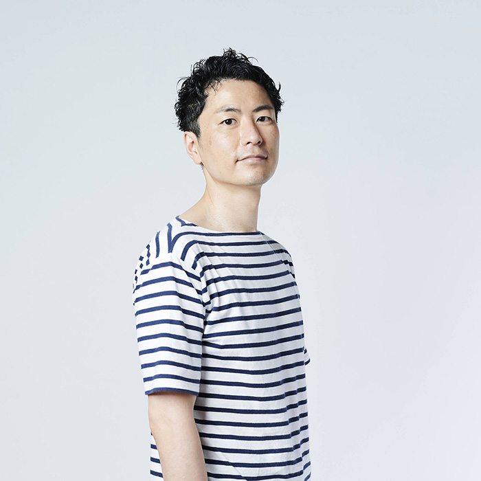
- 田中亮平
- 一級建築士 登録 365462号
- 建築士事務所登録:一級 東京都知事登録 第66438号
-
1981
岡山生まれ
-
2004
名古屋市立大学芸術工学部 卒業
-
2006
東京都立大学大学院修士課程 修了
- 2006-2013
-
2013
G ARCHITECTS STUDIO 設立
-
2014-2022
名古屋市立大学非常勤講師
-
2021-
日本大学非常勤講師
-
2023
法人化により株式会社G ARCHITECTS STUDIOに改称
-
2023-
東京都立大学非常勤講師
- Ryohei Tanaka | Architect
-
1981-
Born in Okayama, Japan
-
2004
Graduated Nagoya City University
School of Design & Architecture -
2006
Completed the Master Course, Department of Architecture, School of Engineering, Tokyo Metropolitan University
- 2006-2013
-
2013
Established G ARCHITECTS STUDIO
受賞
-
2005
- グッドデザイン賞
- 木質空間デザインコンテスト テーマ部門賞
-
2013
- 鋸南町都市交流施設整備事業設計プロポーザル 最終選考案
-
2014
- サンポート高松北側街区利活用アイデア・デザインコンペ 優秀賞
- JCD design award 2014 銀賞+新人賞
- アイカ施工例コンテスト2013 優秀賞
- 2015
-
2018
- アイカ施工例コンテスト2017 入賞
- 第4回これからの建築士賞 受賞
- 茨城建築文化賞 入賞
- ArchiDaily 2018 Building of the Year Awards ,nominated
- 豊後高田昭和の町新拠点実施設計業務プロポーザル 最終選考案
-
2019
- SKY DESIGN AWARDS 2019 shortlist
- Dezeen Award 2019 longlist
- 日本空間デザイン賞 longlist
- 日本建築学会 作品選集 新人賞 受賞
- 日本建築学会 デザイン発表 優秀発表
- JID AWARD 2019 スペース部門 部門賞
- 日本建築設計学会 Architects of the year 選出
- GOOD DESIGN AWARD 2019
- 三島キャンプ場リニューアル基本計画策定・基本設計作成業務 最終選考案
-
2020
- アイカ施工例コンテスト2019 優秀賞
- Golden Trezzini Award :winner(nomination best constructed private residence)
- The Architectural Review, AR house2020 longlist
-
2021
- Dezeen Awards 2021 the emerging architecture studio of the year longlist
- ArchiDaily Building of the Year 2021 nominated
- 韓国展望所リニューアル整備事業 設計業務委託に係る公募型プロポーザル 3位
- 肥前浜宿交流拠点施設内店舗スペースの内装改修に係る実施設計等業務委託に関する公募型プロポーザル 最終選考案
- つくばセンタービル公共施設基本計画検討業務委託に係るプロポーザル 最終選考案
-
2022
- Dezeen Award 2022 Apartment interior longlist
- FRAME AWARDS 2022 Large Apartment of the Year Winner
- 11th SPACE DESIGN AWARD Second prize
- 2023
- 2024
前職での担当作品
-
ガーデンテラス長崎
- 用途ホテル
- 総延床面積7,104.18m²
- 竣工2009年
-
根津美術館
- 用途美術館
- 延床面積4,014.08m²
- 竣工2010年
-
デザイン物産店ニッポン
- 用途展覧会(会場構成)
- 会場松屋銀座 大催場
- 竣工2008年
-
Green Cast
- 用途店舗、クリニック、事務所、住宅
- 延床面積1,047.80m²
- 竣工2011年
-
代官山蔦屋書店 T-site デザインコンペ
- 用途店舗
- ※最終選考案(11選)
-
オリーブベイホテル
- 用途ホテル
- 延床面積6,531m²
- 竣工2013年
-

-
10 Dec 2025
-
22 Nov 2025
-
21 Nov 2025
-
25 Oct 2025
-
01 Oct 2025
-
23 Jun 2025
-
05 Jun 2025
-
22 Apr 2025
-
01 Apr 2025
-
19 Mar 2025
-
01 Feb 2025
-
15 Jan 2025
-
24 Oct 2024
-
09 Sep 2024
-
09 Sep 2024
-
24 Aug 2024
-
01 Aug 2024
-
20 Oct 2023
-
17 May 2024
-
13 Dec 2023
-
04 Jul 2024
-
21 Sep 2023
-
19 Sep 2023
-
14 Sep 2023
-
12 Sep 2023
-
11 Sep 2023
-
01 Sep 2023
-
01 Jan 1970
-
06 Apr 2023
-
15 Dec 2022
-
22 Dec 2022
-
21 Oct 2022
-
15 Sep 2022
-
11 Aug 2022
-
23 Jun 2022
-
11 Jun 2022
-
31 May 2022
-
08 Mar 2022
-
03 Mar 2022
-
25 Jan 2022
-
24 Dec 2021
-
15 Sep 2021
-
04 Jun 2021
-
13 Jun 2021
-
18 Aug 2021
-
15 Jan 2021
-
19 Aug 2020
-
18 Jun 2020
-
19 May 2020
-
18 May 2020
-
02 Mar 2020
-
31 Jan 2020
-
19 Mar 2020
-
11 Dec 2019
-
26 Oct 2019
-
11 Oct 2019
-
09 Jul 2019
-
28 Jun 2019
-
11 Jun 2019
-
19 Apr 2019
-
11 Mar 2019
-
03 Jul 2018
-
26 Jun 2018
-
22 May 2018
-
30 Mar 2018
-
13 Mar 2018
-
06 Mar 2018
-
19 Jan 2018
-
23 Jan 2018
-
23 Jan 2018
-
24 Jan 2018
-
12 Feb 2018
-
19 Nov 2017
-
20 Oct 2017
-
20 Oct 2017
-
20 Oct 2017
-
13 Oct 2017
-
13 Sep 2017
-
13 Sep 2017
-
08 Sep 2017
-
28 Jun 2017
-
12 Jun 2017
-
21 Dec 2016
-
26 Nov 2016
-
02 Feb 2016
-
30 Jan 2016
-
26 Jan 2016
-
17 Sep 2015
-
19 Jul 2015
-
15 Feb 2015
-
15 Feb 2015
-
15 Feb 2015
-
06 Feb 2015
-
05 Sep 2014
-
05 Sep 2014
-
04 Jul 2014
-
02 Apr 2014
-
04 Feb 2014
-
16 Jan 2014
-
26 Dec 2013
-
29 Jan 2013
-
16 Sep 2013
-
04 Jul 2013
-
25 Jun 2013
-
04 Jun 2013
-
28 Apr 2013
-
13 Aug 2012
-
-

-
MAIL ADDRESS
-
TEL / FAX
-
--
-
東京事務所150-0032東京都渋谷区鶯谷町19-18 201
-
--
-
TOKYO OFFICE150-0032Uguisudani-cho Shibuya-ku 19-18 201 Tokyo Japan
-
-